The U.S. County Mortgage Cost Burden Map shows where mortgaged owner households devote a comparatively large share of income to selected monthly owner costs. Using the 2024 American Community Survey 5-year table B25091, a value can be calculated for 3,141 of 3,144 U.S. counties and county-equivalents in the supplied geography set.
Summing the county numerators and denominators produces a count-weighted share of about 28.1%. The median county is lower at 25.0%. That gap matters: populous counties do not carry the same weight as small rural counties, and several of the nation’s largest counties also have relatively high burden rates.
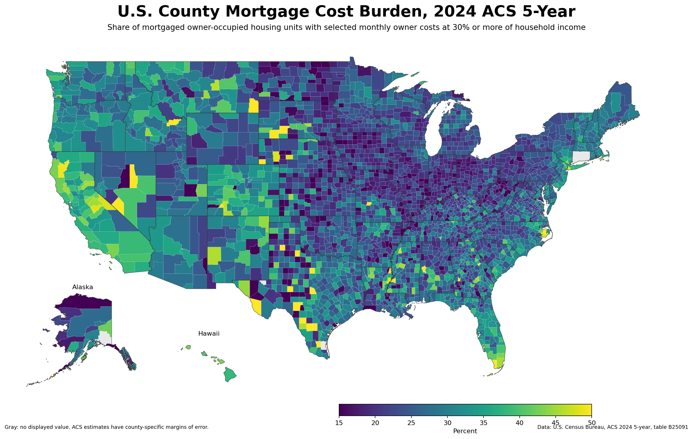
Table of Contents
What stands out on the U.S. County Mortgage Cost Burden Map
The strongest pattern is not a clean coastal-versus-interior split. Instead, the map contains broad high-burden clusters alongside sharp local breaks. California is the clearest statewide cluster: 55 of its 58 counties are at or above 30%, and none of the counties with an estimate falls below 20%. Florida also has a wide high-burden footprint, with 45 of 67 counties at 30% or more.
The New York metropolitan area supplies some of the most prominent large-county values. Queens is 48.7%, the Bronx 47.8%, and Kings County (Brooklyn) 46.1%. Yet New York County (Manhattan) is 31.0%, creating an unusually large difference within the same urban region. New Jersey’s county-weighted state summary is also elevated at 32.3%.
A different picture appears across parts of the Midwest. Fifty-one of Indiana’s 92 counties are below 20%; Iowa has 46 of 99 below that mark, and Ohio has 38 of 88. The resulting map has a broad band of lower values across many interior counties, though it is interrupted by higher pockets rather than forming a uniform region.
What the 30% measure actually counts
The source is U.S. Census Bureau ACS detailed table B25091, “Mortgage Status by Selected Monthly Owner Costs as a Percentage of Household Income in the Past 12 Months.” The numerator adds the four mortgage categories beginning at 30.0–34.9% and continuing through 50.0% or more. The denominator is the number of housing units with a mortgage after removing cases where the cost-to-income percentage is not computed.
That definition prevents a common misreading. A county value of 40% does not mean 40% of every household in the county is mortgage-burdened. It refers only to mortgaged owner-occupied housing units with a computable ratio. Renters and owners without a mortgage are outside this particular percentage.
The time frame also deserves care. The 2024 ACS 5-year product is a 2020–2024 period estimate built from 60 months of data. It should not be treated as a point-in-time reading of mortgage rates or housing costs in calendar year 2024.
Higher and lower values among counties with larger samples
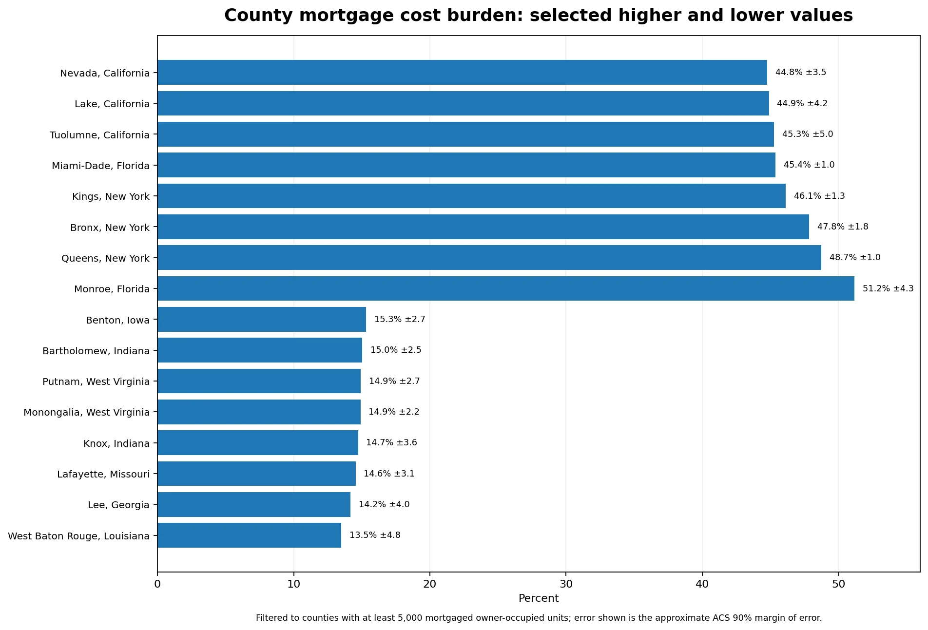
Raw county rankings can be dominated by places with very small numbers of mortgaged households. For a more stable comparison, the table below limits the list to counties with at least 5,000 mortgaged owner-occupied units in the denominator. Monroe County, Florida leads this filtered group at 51.2%, followed by Queens at 48.7%, the Bronx at 47.8%, Kings County at 46.1%, and Miami-Dade at 45.4%.
| Higher-burden county | Share | Approx. 90% MOE | Denominator |
|---|---|---|---|
| Monroe County, Florida | 51.2% | ±4.3 pp | 10,405 |
| Queens County, New York | 48.7% | ±1.0 pp | 202,985 |
| Bronx County, New York | 47.8% | ±1.8 pp | 59,707 |
| Kings County, New York | 46.1% | ±1.3 pp | 172,626 |
| Miami-Dade County, Florida | 45.4% | ±1.0 pp | 297,426 |
At the other end of the same filter, West Baton Rouge Parish is 13.5%, Lee County, Georgia 14.2%, Lafayette County, Missouri 14.6%, Knox County, Indiana 14.7%, and Monongalia County, West Virginia 14.9%. These are not merely small differences around a national average; the spread between the filtered high and low ends exceeds 30 percentage points.
| Lower-burden county | Share | Approx. 90% MOE | Denominator |
|---|---|---|---|
| West Baton Rouge Parish, Louisiana | 13.5% | ±4.8 pp | 5,021 |
| Lee County, Georgia | 14.2% | ±4.0 pp | 6,259 |
| Lafayette County, Missouri | 14.6% | ±3.1 pp | 5,189 |
| Knox County, Indiana | 14.7% | ±3.6 pp | 5,806 |
| Monongalia County, West Virginia | 14.9% | ±2.2 pp | 14,447 |
Neighboring counties can diverge sharply
County geography adds information that a state ranking cannot show. Queens at 48.7% is about 17.7 percentage points above neighboring New York County at 31.0%. The Bronx is about 16.9 points above New York County, while Kings County is about 15.1 points higher. These contrasts are large even before leaving New York City.
The same type of local break appears elsewhere. Dougherty County, Georgia is 30.9% while adjacent Lee County is 14.2%, a gap of about 16.8 points. East Baton Rouge Parish, Louisiana is 28.9% versus 13.5% in West Baton Rouge Parish. Charles County, Maryland is 32.4% compared with 18.7% in neighboring St. Mary’s County.
These differences should be read as geographic contrasts, not as proof of a single cause. The burden percentage combines owner costs with household income, and neighboring counties can differ in both. Housing stock, the mix of mortgaged households, and local income distributions may also vary, so the map is best used to identify where further comparison is worthwhile.
State summaries reveal a broad coastal tilt
If the county numerators and denominators are summed within each state, Hawaii has the highest recomputed share at 40.4%, followed by California at 38.2%, Florida at 35.2%, New York at 33.2%, and New Jersey at 32.3%. The lowest five in this same county-aggregated calculation are West Virginia at 19.5%, Indiana at 20.2%, Iowa at 20.3%, North Dakota at 20.8%, and Ohio at 21.2%.
| State | County-aggregated share |
|---|---|
| Hawaii | 40.4% |
| California | 38.2% |
| Florida | 35.2% |
| New York | 33.2% |
| New Jersey | 32.3% |
| Ohio | 21.2% |
| North Dakota | 20.8% |
| Iowa | 20.3% |
| Indiana | 20.2% |
| West Virginia | 19.5% |
Those state figures are a summary calculated from the county counts, not a separately retrieved state estimate. They are useful for orientation, but they can hide substantial variation. California, for example, is high overall while individual counties range widely within that elevated band. Florida also contains both very high South Florida values and counties closer to the middle of the national distribution.
Why extreme small-county values need caution
ACS estimates come with sampling uncertainty. Of the 3,141 counties with a calculated value, 2,941 are stable enough for ranking under the uncertainty screen used here, while the remainder carry more uncertainty or other ranking limitations. The difference can be dramatic even when point estimates look precise.
Zavala County, Texas has a point estimate of 68.3%, but its approximate 90% margin of error is ±23.3 percentage points and the denominator is only 757 mortgaged owner-occupied units. Queens, by comparison, is 48.7% with an approximate ±1.0-point margin of error and a denominator above 200,000. A headline based only on the point estimate would treat those two numbers as more comparable than they really are.
For that reason, the map can display estimates broadly, while ranked tables should apply an explicit reliability or size rule and show uncertainty. The 5,000-unit filter used here is a reader-oriented comparison choice rather than a new Census category.
What this map can and cannot tell you
The map is useful for locating clusters of high mortgage cost burden, identifying lower-burden interiors, spotting local outliers, and comparing adjacent counties. It is especially valuable in metropolitan regions where state averages can conceal large county-level differences.
It is not a home-price map, a mortgage-rate map, or a delinquency and foreclosure map. A high burden rate can reflect higher owner costs, lower household income, or both, and the dataset alone does not isolate causation. A low value likewise does not prove that housing is inexpensive for every household. Comparisons with other economic measures should use compatible periods, definitions, and geographic units.
Source, period, and update method
The underlying data come from the U.S. Census Bureau 2024 ACS 5-year Detailed Table B25091. The 2024 five-year estimates cover data collected from January 2020 through December 2024. The county percentage is calculated as the sum of the four 30%-and-higher mortgage categories divided by mortgaged housing units after excluding cases where the percentage is not computed.
Three of the 3,144 target county geographies have a zero denominator and therefore retain no percentage. For future updates, the cleanest comparison is to use the same B25091 definition with the newest available ACS 5-year release rather than mixing a different housing-cost metric into the series.
Frequently asked questions
What does a mortgage cost burden of 30% or more mean?
It is the share of mortgaged owner-occupied housing units with computable selected monthly owner costs whose costs equal at least 30% of household income. It is not a share of all households.
Is the 2024 ACS 5-year estimate a one-year 2024 snapshot?
No. The 2024 ACS 5-year estimate pools 60 months of data collected from 2020 through 2024, so it describes a period rather than a single calendar year.
Does a high burden rate mean a county has the highest home prices?
Not necessarily. The measure is a cost-to-income ratio for mortgaged owner households. It does not directly measure home prices, delinquency, foreclosure risk, or the finances of renters and mortgage-free owners.
Related Articles
- U.S. County Population Growth vs. Housing Costs, 2019–2024
- Tattnall County Georgia Land Cover Map — Wetlands, Agriculture, and River-Edge Patterns
- Lee County Arkansas Land Cover Map: Agriculture, Wetlands and River-Corridor Patterns
- Jerome County Idaho Land Cover Map: 48.68% Agriculture, Open Grassland, and City Impervious Patterns
Green Map creates custom-edited map images using open geographic data sources such as geoBoundaries, Natural Earth, OpenStreetMap, and government open data.
These maps are edited visual materials, not raw data files, and are provided for education, documents, presentations, and graphic reference.