Taliaferro County is predominantly forested in the supplied 2025 land-cover summary. Forest accounts for 66.61% of the county, while shrubland, agriculture, grassland, wetlands, developed cover, and water occupy much smaller shares. The county therefore reads as a wooded landscape at first glance, yet the map also contains many open patches and several small developed concentrations that are useful to compare rather than treating the county as one continuous forest block.
This page brings together four views of the same county boundary: current land cover, forest and farmland, impervious/developed surface, and a 1985–2025 class-difference layer. WebP images are used for on-page viewing, and the four original JPG maps are available together in one ZIP. The set works well for county overviews, classroom comparisons, planning context, watershed discussion, and presentations where readers need to distinguish mapped development from the smaller amount of pavement and rooftop surface.
Table of Contents
Forest covers 66.61%, while the remaining landscape is split among several smaller classes
The right-hand summary on the current land-cover map identifies forest as the dominant 2025 class at 66.61%. Shrubland is 8.33%, agriculture 8.15%, grassland 7.14%, and wetlands 5.32%. The impervious/developed panel separately reports developed cover at 4.15%, and the forest-and-farmland panel lists open water at 0.21%. Barren land appears in the legend but does not receive a separate percentage in the supplied summary, so no remainder has been assigned to it.
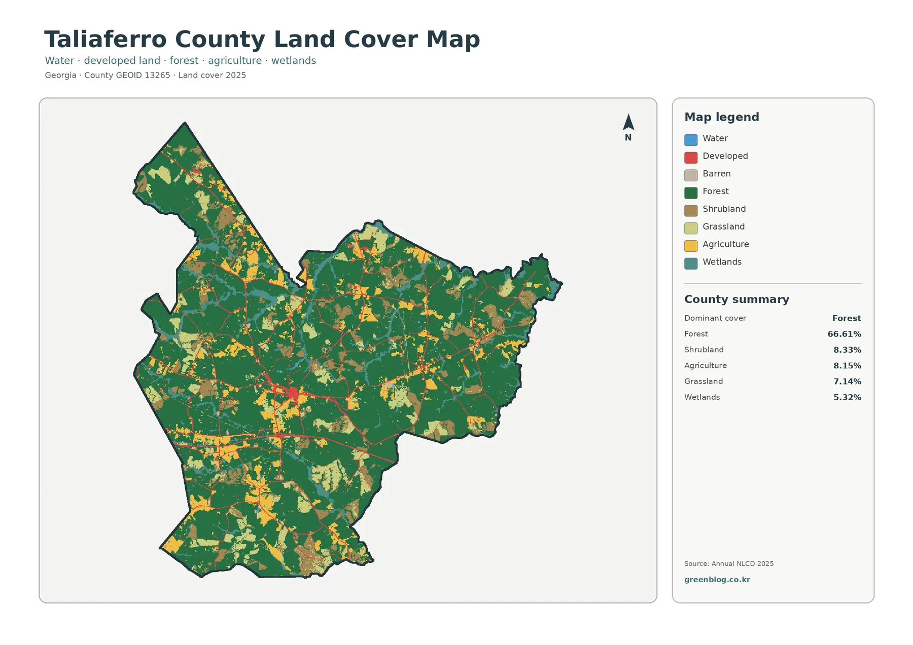
Dark green covers most of the county outline, but it is interrupted repeatedly by yellow agriculture, light green grassland, brown shrubland, and teal wetlands. Open classes appear in patches through the central and southwestern portions, with additional breaks in the long northern extension. Some eastern areas contain broader runs of forest. The pattern matters because a countywide percentage cannot show whether nonforest land is evenly dispersed or grouped into particular pockets.
Developed cover has a much narrower footprint than forest or open rural cover. Small red concentrations appear within the county, and thin red traces extend along linear routes. No roads or town names are printed on this map, so those traces should not be assigned to a named highway from the image alone. A separate road or municipal map is needed when the task requires exact street names, town boundaries, or navigation rather than land-cover interpretation.
Wetlands and open water should also remain separate. Wetlands account for 5.32% in the supplied summary, whereas open water is only 0.21%. The wetland class represents surfaces identified by their wet conditions and vegetation, while the water class represents open water. Neither one is a regulatory wetland delineation, a FEMA flood zone, a property boundary, or a statement about public access.
| 2025 map summary | Share |
|---|---|
| Forest | 66.61% |
| Shrubland | 8.33% |
| Agriculture | 8.15% |
| Grassland | 7.14% |
| Wetlands | 5.32% |
| Developed | 4.15% |
| Water | 0.21% |
These percentages describe land cover—what is physically covering the ground—not zoning or ownership. A forest-classified cell may be private or public and may sit inside a parcel with a legal use that is not “forest.” An agriculture-classified cell does not establish a farm boundary or agricultural zoning. Parcel records, zoning maps, permits, easements, and ownership questions require records created for those purposes.
Open rural land is not a single category: shrubland, agriculture, and grassland are all substantial enough to compare
The forest-and-farmland view makes the nonforest pattern easier to read because it simplifies the color scheme. Forest still dominates at 66.61%, but shrubland at 8.33%, agriculture at 8.15%, and grassland at 7.14% are close enough in size that none should be used as a stand-in for all open land. A reader who looks only for cropland would miss large areas classified as shrub or grass and would come away with an incomplete picture of the county.
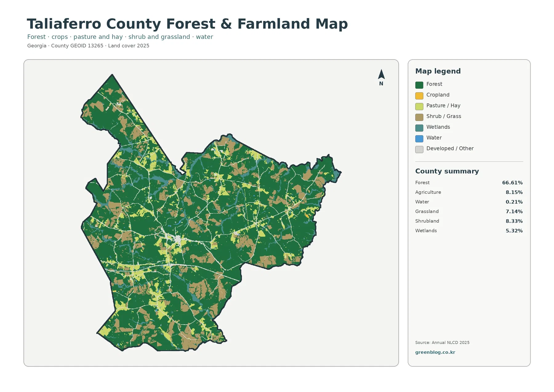
Yellow and light-green patches occur in several parts of the county, often beside or within larger forest areas. Brown shrub/grass patches are also common and vary greatly in size. The southwest and central portions contain a noticeable mix of these open classes, while the long northern section remains largely forested but is not uniform. Broader green areas in parts of the east contrast with more fragmented sections elsewhere. Those descriptions are based on the supplied county-scale image rather than parcel boundaries.
The 8.15% agriculture value is useful for a broad surface comparison, but it does not identify crops, farm operators, irrigation systems, or the legal limits of farms. The same caution applies to grassland and shrubland. Pasture, managed grass, early regrowth, fallow ground, and naturally open vegetation can look different on the ground while still being grouped into broad remote-sensing classes. Agricultural statistics or field information are needed when the question is about production rather than surface cover.
Wetlands appear as a separate teal class in this view. At 5.32%, they are smaller than forest, shrubland, agriculture, or grassland, but their distribution is still useful for environmental context. Thin wetland traces and small clusters can help a reader identify places that deserve closer comparison with hydrology or wetland datasets. They should not be used as a substitute for jurisdictional wetland review or site-specific delineation.
For local follow-up, the University of Georgia Extension maintains a Taliaferro County Agriculture and Natural Resources program. That type of county resource serves a different purpose from a land-cover map: the map shows broad surface patterns, while Extension information can help readers find education and guidance about soils, plants, agriculture, and natural-resource topics. Keeping those roles separate prevents a map classification from being mistaken for management advice.
Mean impervious cover is only 0.74%, far below the 4.15% developed-land share
Impervious surface means hard cover such as pavement and rooftops where rainfall cannot easily soak into the ground. The supplied county summary reports a mean impervious value of 0.74%. Only 0.21% of the county is in cells with at least 50% impervious cover, while developed land accounts for 4.15%. The difference is expected because a developed cell can contain lawns, trees, bare soil, and other permeable surfaces alongside buildings and paved areas.
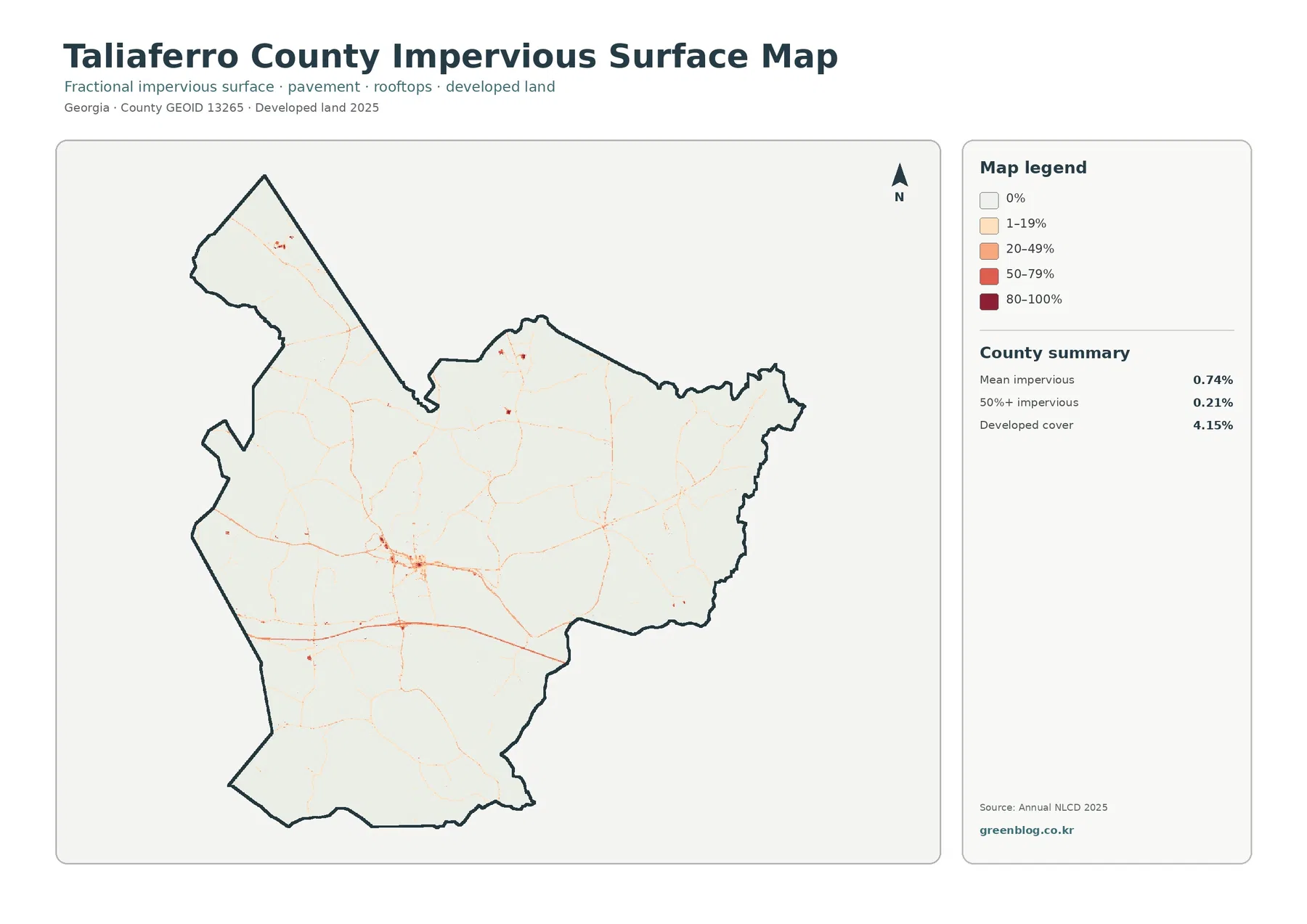
Most of the county is very light on the impervious map, with stronger orange and red confined to a few small locations and narrow lines. A compact cluster in the west-central part of the outline is especially noticeable, while smaller points and traces occur elsewhere, including the northern extension. The visual pattern is consistent with a county where hard surface is sparse at the county scale rather than spread across a large metropolitan area.
A linear impervious feature often follows transportation infrastructure, but this image does not name roads. It is therefore more accurate to describe visible hard-surface corridors without assigning them to a specific highway unless a separate transportation source is used. The distinction matters in presentations because a land-cover product answers “where are hard surfaces concentrated?” more directly than “which road is this?”
The 0.74% mean should not be read as though every place in the county is 0.74% impervious. Broad forest and rural cells can contain almost no hard surface, while a small settlement, parking area, or road cell may fall into the 20–49%, 50–79%, or 80–100% legend categories. The mean compresses all of that variation into one countywide number, so the color pattern is essential for understanding where the higher values actually occur.
The 37.20% 1985–2025 class difference is mostly not a shift to developed land
The change map compares the 1985 and 2025 classifications. Its county summary reports class difference across 37.20% of the mapped area, but only 0.77% is labeled as changing to developed. Forest loss is reported at 12.38%, agricultural loss at 1.20%, and other class difference at 22.47%. Wetland difference is included in the legend but is not given a separate percentage in the summary, so a residual value has not been calculated for it.
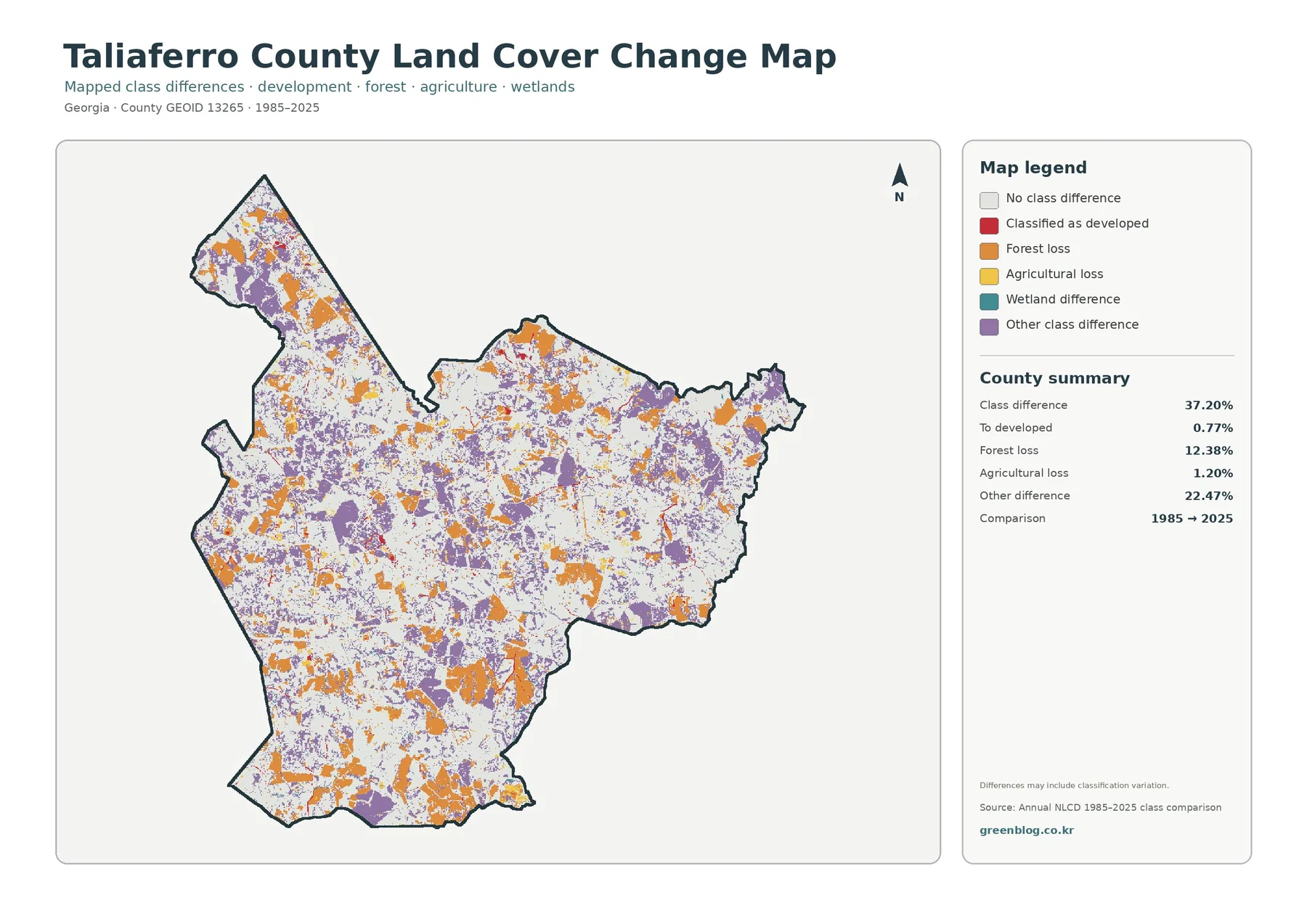
White areas indicate no mapped class difference between the two endpoints. Orange forest-loss patches and purple other-difference patches are scattered widely, while red change-to-developed cells occupy a much smaller portion of the map. That balance is why the 37.20% headline number cannot be treated as an urbanization rate. The layer combines several kinds of classification difference, not a single “development” category.
The map also warns that differences may include classification variation. A forest-loss color is therefore not automatic proof of permanent clearing, construction, or a particular land-management event. Seasonal vegetation, imagery conditions, class definitions, and the way a mixed pixel is assigned can contribute to differences between two mapped years. Confirming a specific change requires intermediate imagery, local records, or field evidence.
Other class difference, at 22.47%, is the largest named component in the summary. Because it groups changes outside the explicitly labeled developed, forest-loss, agriculture-loss, and wetland-difference categories, it should not be given one simple cause. The layer is better used as a screening map: it identifies where the 1985 and 2025 classifications differ so that a reader can decide where a closer time-series comparison would be worthwhile.
Crawfordville and Sharon provide useful county context, but the supplied maps do not label municipal boundaries
Georgia Department of Revenue county information lists Crawfordville and Sharon for Taliaferro County, and the UGA Extension county office is located in Crawfordville. Those names are useful when organizing local research, but the four supplied map images do not print town labels. For that reason, a colored cluster in this article is described by its position within the county rather than assigned to a municipal boundary without an additional reference map.
This distinction is especially useful when someone wants to combine land cover with roads, addresses, or planning information. A boundary or transportation map can identify named places, while the land-cover layers show forest, agriculture, wetlands, development, and hard surface. Placing the maps side by side is more reliable than trying to infer every local name from the land-cover colors alone.
The same approach works for agriculture and natural-resource questions. The map can point to large forest areas or a concentration of open land, and a county-specific source such as UGA Extension can provide follow-up information in its own area of expertise. Neither source replaces the other. The map is a visual comparison tool; local agencies and programs provide the records, guidance, and services needed for decisions that go beyond surface classification.
Each of the four maps answers a different practical question about the county
For a first overview, the current land-cover map is the most efficient starting point because it places forest, development, agriculture, grassland, shrubland, wetlands, water, and barren land in one legend. It quickly establishes the 66.61% forest share and shows how the smaller classes break up that broad wooded pattern. This is usually the clearest choice for an introductory slide or a general county profile.
The forest-and-farmland view is better when the question is about rural surface types. It makes it easier to compare agriculture at 8.15% with shrubland and grassland rather than assuming all open land is cultivated. The impervious map is the better choice for hard surfaces because its 0.74% mean and higher-intensity classes show something that a simple developed-land percentage cannot. Pairing those two maps can separate “open rural land” from “built and paved surface” without forcing either into a single broad category.
Use the 1985–2025 class-difference layer when the question is where endpoint classifications changed. It should usually be shown beside the current map so readers can see both present cover and change categories. The 0.77% change-to-developed figure is especially important context for the much larger 37.20% overall class-difference value. A slide that presents only the larger number could easily imply more development than the supplied summary supports.
In environmental education, the same set can support discussions about forest cover, wetlands, hard surface, and the limits of remotely sensed classifications. In a presentation, the four maps share the same county identity and similar layout, which makes visual comparison straightforward. For site-level planning, however, these maps should be paired with parcel, zoning, flood, wetland, road, and recent imagery sources as appropriate.
The ZIP contains four 2480×1754 JPG maps for documents, presentations, and side-by-side comparison
The on-page images are 1800-pixel WebP previews. The download archive contains four original JPGs: current land cover, forest and farmland, impervious/developed land, and 1985–2025 land-cover change. The asset manifest records each JPG at 2480×1754 pixels. Because the files use the same county outline and a consistent layout, they can be placed at matching sizes in a report or presentation without rebuilding the map set from separate screenshots.
The asset manifest does not mark these JPGs as meeting an A3 high-resolution reference. They are useful for screen viewing, common documents, and presentations, but anyone planning a large print should test the output first. Thin impervious lines, small wetland cells, and fine change-map patches can become visibly pixelated or generalized when enlarged far beyond the source dimensions.
Keep the title, legend, and summary panel whenever possible when cropping or placing a map in a document. Red on the current land-cover map means developed cover, while red on the change map means a location classified as changing to developed. Removing the legend can therefore turn two different concepts into what looks like the same color. The map year is equally important, especially for the change layer.
A 30-meter-style raster, mixed pixels, and observation dates set clear limits on map precision
Annual NLCD products use raster cells at roughly 30-meter scale to generalize surface conditions. A raster divides the landscape into small grid cells and assigns each cell a class or related value. One cell can contain trees, a narrow road, grass, and a small building at the same time. The classification therefore simplifies what exists on the ground and should not be treated as a survey-grade parcel boundary.
The current cover and impervious summaries are labeled 2025, while the change map compares 1985 with 2025. Construction, forestry activity, crop rotation, regrowth, storm damage, or other changes after the observation year are not represented. For a decision that depends on current site conditions, recent aerial imagery, local records, and field inspection should be added rather than assuming the 2025 classification is a live map.
Mixed pixels are another reason to avoid over-reading tiny features. A forest edge may share a cell with grassland, or a residential cell may include both a roof and a lawn. The classification must generalize that mixture. At county scale this is useful because it reveals broad patterns, but a single small colored patch should not be treated as an exact legal boundary or as proof that one land-cover type occupies every square meter inside the cell.
Land cover is also different from land use. A wooded property may be zoned for residential or another use, and an agriculture-colored area may cross multiple parcels. The maps can support questions about what covers the ground and where broad patterns occur. Ownership, permits, taxes, zoning, access, and regulatory status require the corresponding official records.
Frequently Asked Questions
What is the dominant 2025 land-cover class in Taliaferro County?
Forest is the dominant supplied class at 66.61%. Shrubland is 8.33%, agriculture 8.15%, grassland 7.14%, and wetlands 5.32%. Developed cover is 4.15%, while open water is reported at 0.21% in the forest-and-farmland summary.
Why is developed cover 4.15% while mean impervious surface is only 0.74%?
A developed raster cell can include lawns, trees, bare soil, and other permeable surfaces as well as buildings and pavement. The impervious layer estimates the hard-surface fraction, so low-density developed cells can count as developed while remaining only lightly impervious.
Does the 37.20% 1985–2025 class difference mean 37.20% of the county became developed?
No. Only 0.77% is summarized as changing to developed. The map separately reports 12.38% forest loss, 1.20% agricultural loss, and 22.47% other class difference, and it warns that classification variation may be included in mapped differences.
Map File Information
The four original Taliaferro County JPG maps are packaged in one ZIP: current land cover, forest and farmland, impervious/developed land, and 1985–2025 land-cover change.
- Printable Size: 2480×1754 pixels each
Related Maps
- Appling County Georgia Land Cover Map
- Atkinson County Georgia Land Cover Map
- Bacon County Georgia Land Cover Map
Sources and references
- MRLC Annual NLCD Data – Official access point for Annual NLCD land-cover and related products used for the supplied 2025 mapping.
- USGS Annual NLCD Land Cover Classification – Official explanation of Annual NLCD classes including forest, developed land, agriculture, and wetlands.
- U.S. Census Bureau TIGER/Line Shapefiles – Official source for county boundaries and other geographic reference layers.
- UGA Extension Taliaferro County Agriculture & Natural Resources – University of Georgia county resource for agriculture and natural-resource education.
- Georgia Department of Revenue County Property Tax Facts – Official Georgia county reference that lists Crawfordville and Sharon for Taliaferro County.
Green Map creates custom-edited map images using open geographic data sources such as geoBoundaries, Natural Earth, OpenStreetMap, and government open data.
These maps are edited visual materials, not raw data files, and are provided for education, documents, presentations, and graphic reference.