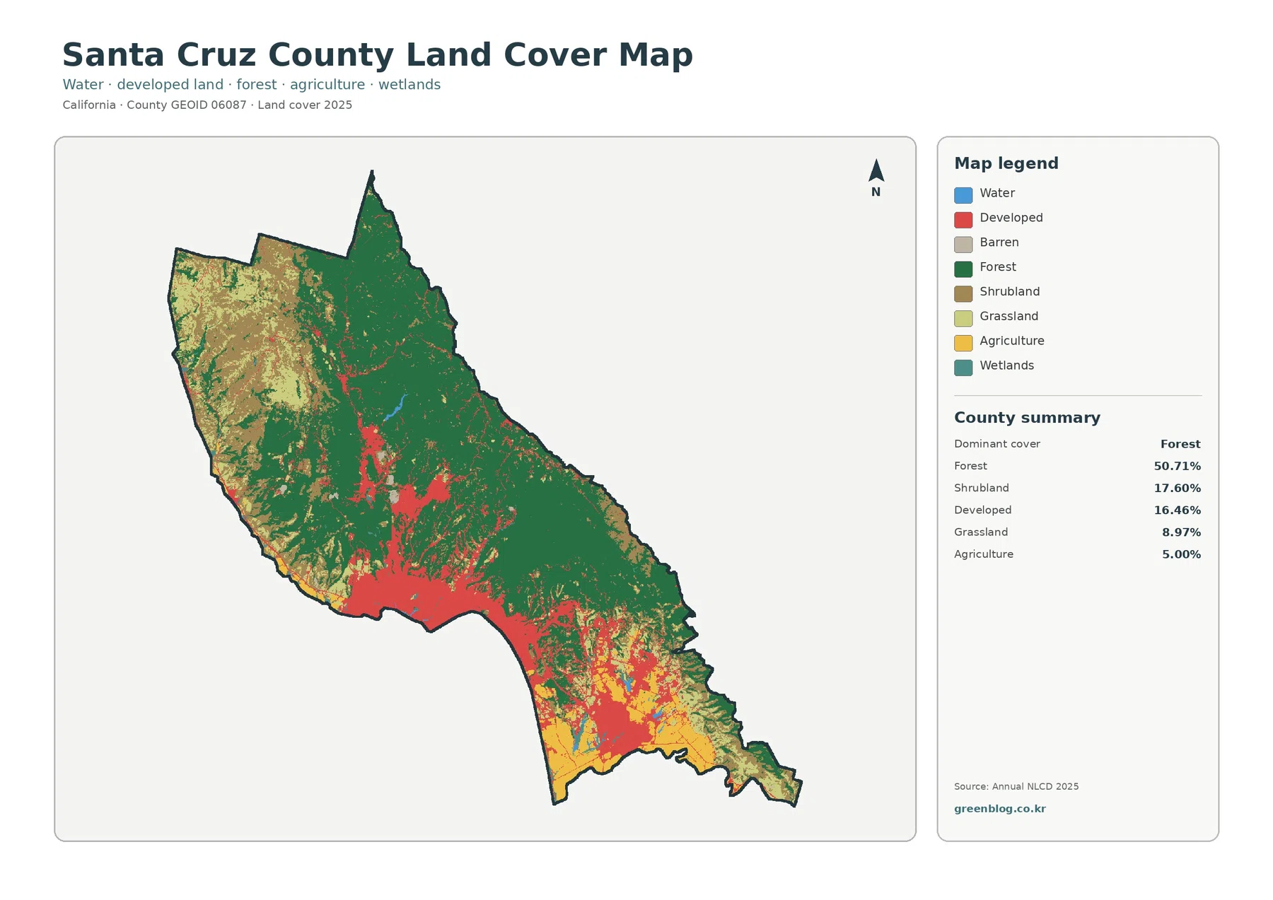
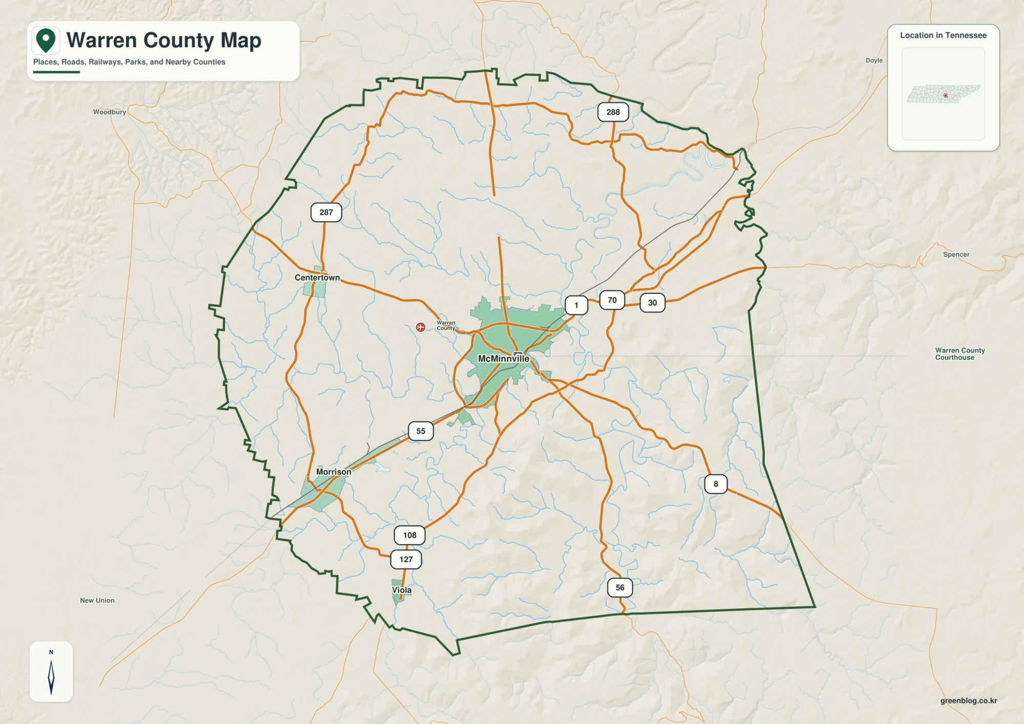
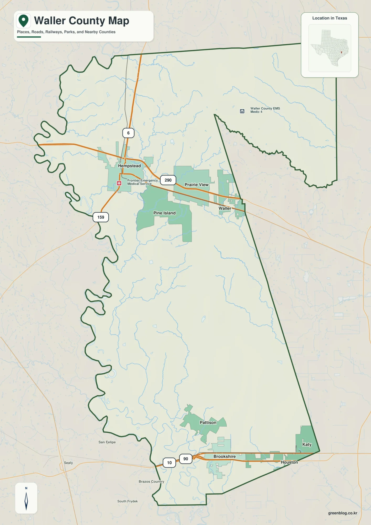
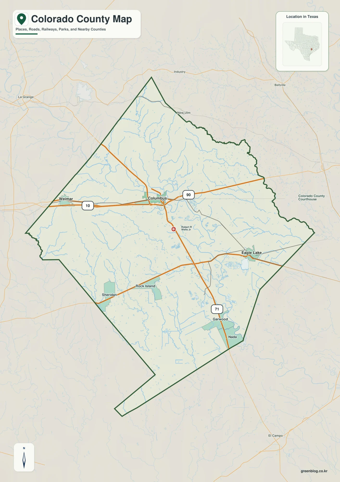
Candler County is a small inland county in southeast Georgia, but its 2025 land-cover map is unusually balanced rather than being dominated by a single class. Wetlands account for 30.57% of the county and agriculture follows closely at 28.61%, while forest covers 19.97%. Around the center, a compact developed area stands out from the surrounding patchwork of wet ground, farm fields, woods, and open land.
This page includes four views of the same county: general land cover, forest and farmland, impervious/developed land, and class differences between 1985 and 2025. The article uses WebP previews for quick viewing, while the four original JPG maps are available together in one download below. They can be used for county comparison, classroom work, presentations, planning context, and other projects that need a clear overview rather than parcel-level detail.
Table of Contents
The 2025 map is almost evenly split between wetlands and agriculture
The first useful comparison is 30.57% wetlands versus 28.61% agriculture. Those two classes are close enough that neither one visually overwhelms the county. Teal wetland cover spreads through many parts of Candler County in broad patches and narrow branches, while yellow agricultural areas appear as repeated blocks between wet areas and forest. The result is a varied rural pattern in which the dominant colors change over relatively short distances.
Forest is the third-largest class at 19.97%. It appears in patches of many sizes rather than as one continuous wooded half of the county. Shrubland contributes 5.74% and grassland 5.39%, adding more open or transitional land between the larger classes. Open water is only 1.41%, so the large teal areas should not be mistaken for lakes and rivers; most of that color represents wetland rather than exposed water.
The general map makes the central developed area easy to find
On the general land-cover map, agriculture, wetland, and forest repeat across both the northern and southern portions of the county. There is no simple line where farmland stops and wetland begins. Instead, agricultural blocks are cut by wetter corridors and wooded patches, and those same classes reappear around the county edges. This is the best map to use when you need the full mix before focusing on a single topic.
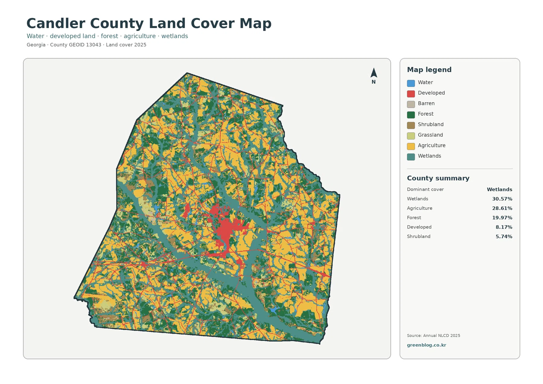
A red developed cluster near the middle is the most concentrated built-up pattern on the map. Georgia’s Department of Community Affairs identifies Metter as the county seat in central Candler County and notes that Georgia Highways 46, 23, and 121 pass through the city, with Interstate 16 crossing its southern portion. The NLCD map does not label those roads or draw the city limit, but that official location context helps orient the central cluster and the thin linear developed traces that extend away from it.
Impervious surface separates Metter’s hard-surface footprint from the wider developed class
Impervious surface means pavement, rooftops, parking areas, and other hard surfaces that reduce direct infiltration of rainfall into the ground. Candler County’s mean imperviousness is 1.61%, and land at 50% or greater imperviousness accounts for 0.45%. Both numbers are much smaller than the 8.17% developed land-cover share because a developed class can include lawns, trees, bare soil, and other permeable surfaces mixed with buildings and pavement.
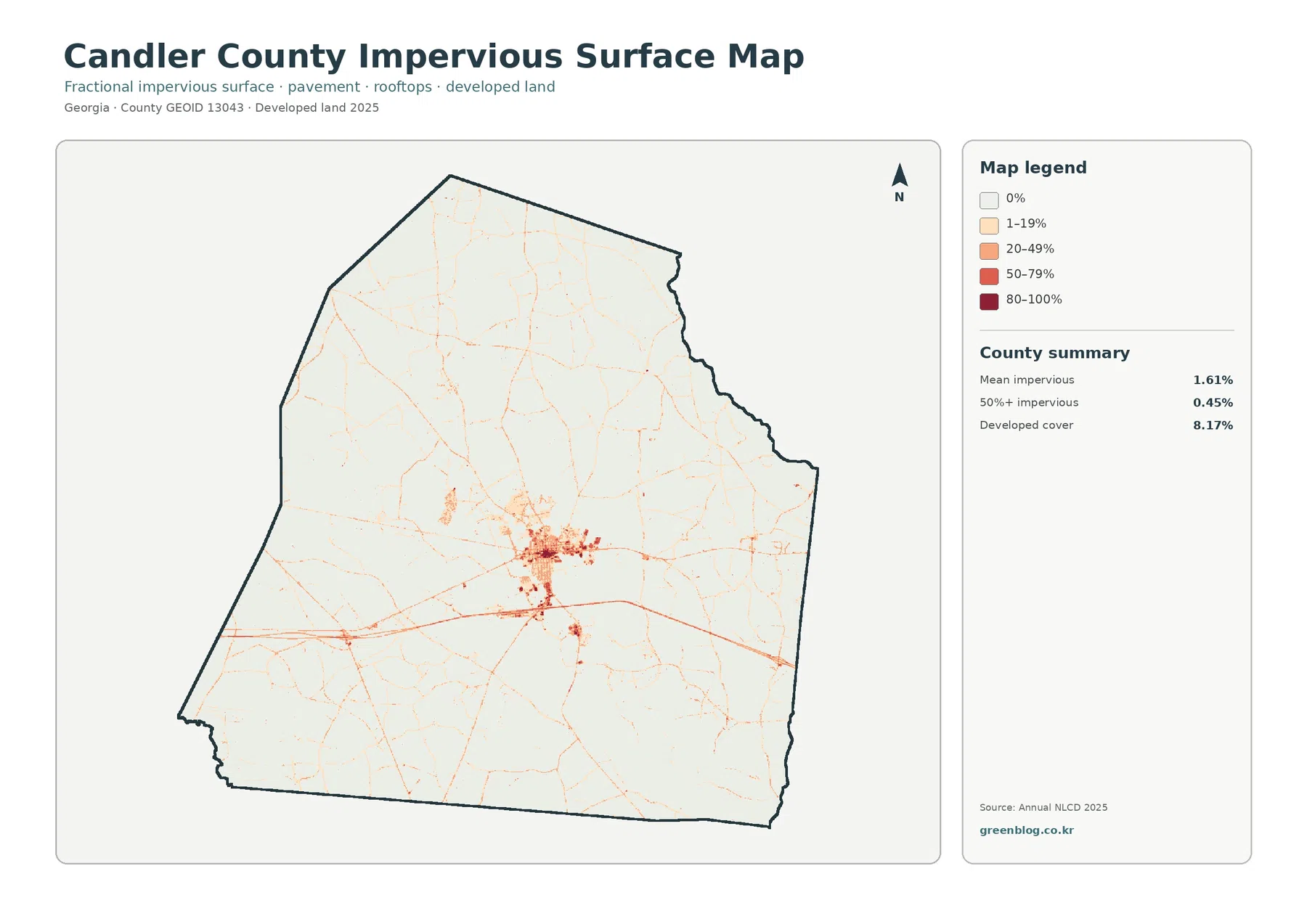
The darkest hard-surface values concentrate around the middle of the county, matching the general location of Metter. Away from that center, most of the map is very light, with narrow lines and small nodes tracing transportation and scattered developed locations. A stronger east-west line passes just south of the central cluster, consistent with the DCA plan’s description of Interstate 16 through the southern part of Metter. That comparison is useful for orientation, but the raster should not be treated as a road centerline or city-boundary map.
Farmland is widespread, but it is broken by wetland and forest throughout the county
The forest-and-farmland map simplifies the color scheme and makes the 28.61% agricultural share easier to follow. Cropland and other agricultural cover appear across much of Candler County, yet the yellow areas are repeatedly interrupted by wetland and forest. This matters when comparing the county with places where large fields create a more continuous agricultural surface. Here, the pattern is closer to a mosaic, with farm blocks, wet ground, wooded patches, and smaller open classes sharing the same rural landscape.
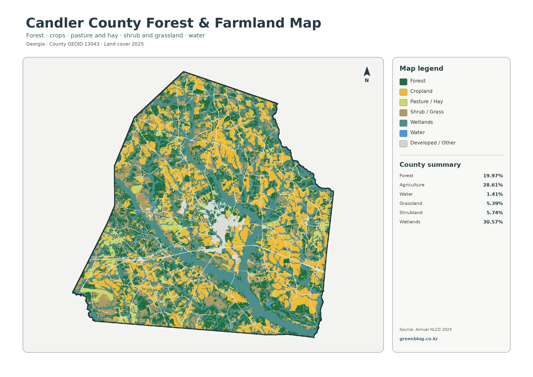
Local agricultural information supports the importance of farming in the county without turning the map into a crop-specific acreage source. UGA Cooperative Extension provides a Candler County Agriculture and Natural Resources program, and its recent county impact report lists onions, cotton, and peanuts among leading commodities. That context helps explain why an agricultural land-cover view is useful here, but the NLCD agriculture percentage cannot be divided into those crops. It is a remotely sensed land-cover classification, not a field-by-field farm inventory.
The 1985–2025 map highlights many small class differences rather than one single change zone
The change map compares the classified land cover at two endpoints, 1985 and 2025. The supplied summary reports class differences across 26.91% of the county. Agricultural loss is 8.80%, forest loss 7.36%, areas classified as developed 2.20%, and other differences 6.50%. Orange and yellow change patches are scattered broadly across the county, while red developed-change areas are more concentrated around the central built-up zone and along a few linear corridors.
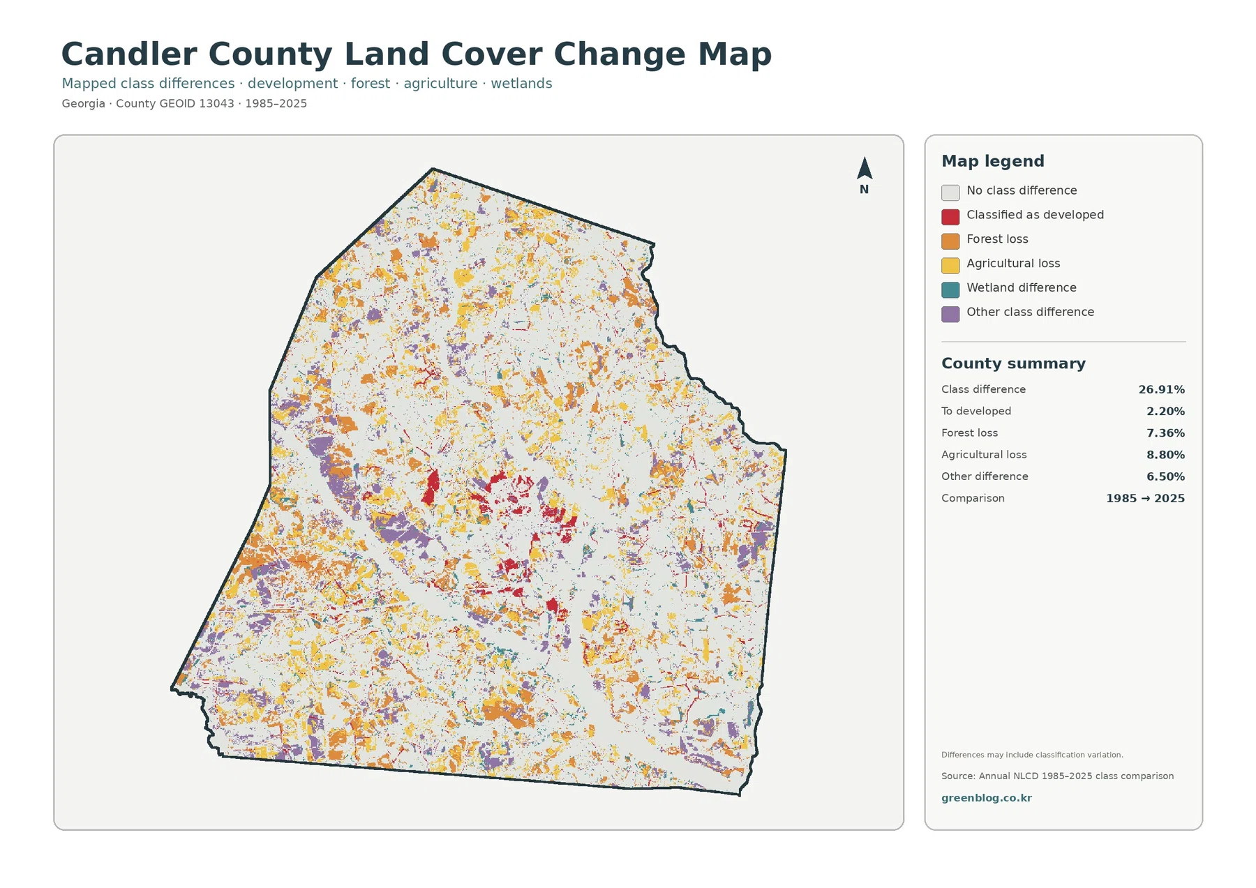
Those percentages should be read as mapped class differences first, not as a complete explanation of what happened on the ground. The supplied map itself warns that classification variation may be included in the differences. Mixed pixels, edge locations, image conditions, and classification updates can cause a cell to move from one class to another even when the real-world change is subtle. A red or orange patch therefore identifies a place for further checking; it does not by itself prove a specific development project, logging event, or farm conversion.
How the four maps can be used together
Start with the general map for a county-wide overview, then switch to a thematic view based on the question. The forest-and-farmland map is best when agriculture and woodland relationships matter, while the impervious map is clearer for concentrated pavement and rooftops. The change map is useful for screening locations that differ between the two comparison years. Moving between them is more informative than trying to extract every detail from the busiest map.
For environmental education, the maps provide a practical example of why wetland and open water are separate categories. For regional planning or watershed discussions, they can show where extensive wetland cover lies near agricultural and developed areas at a broad scale. In a classroom, students can compare the 30.57% wetland share with the 1.41% open-water share, or examine why developed cover and imperviousness are not the same measurement. Presentation graphics can use the simpler thematic maps when the full legend would be too dense for a slide.
The downloadable JPG files are larger than the WebP previews, but check print size before A3 use
The ZIP package contains the original JPG versions of all four maps. According to the supplied asset manifest, each JPG is 2480×1754 pixels, while the smaller WebP versions are used in the page body for efficient display. The manifest does not mark these JPGs as meeting the project’s A3 high-resolution reference. They are appropriate for screen viewing, documents, many presentations, and moderate-size printing, but an A3 layout should be tested at its intended size before final output.
Thirty-meter cells are useful for county patterns, not property boundaries
Annual NLCD is a Landsat-based raster product with 30-meter cells. A raster divides the landscape into a grid and assigns a representative class or value to each cell. In the real world, one cell can contain field edge, trees, a small road, wet soil, lawn, and part of a building at the same time. Narrow features and complicated boundaries can therefore be simplified, and mixed pixels can look different from what a person sees at ground level.
Land cover also should not be confused with zoning, ownership, legal land use, or development permission. A yellow agricultural cell does not prove that a parcel is legally restricted to farming, and a red developed cell does not define a municipality or building permit area. Parcel questions require current local records, surveys, zoning information, or other authoritative sources. The maps on this page are best used to compare broad surface patterns across Candler County.
Frequently Asked Questions
Why are wetlands 30.57% when open water is only 1.41%?
Wetlands and open water are separate land-cover classes. Open water generally represents visible water surfaces such as ponds, rivers, or larger channels, while wetland classes can include saturated ground and wetland vegetation. Candler County has many teal wetland areas but relatively few broad blue water surfaces, so the wetland percentage can be high even when open water remains small.
Which map should I use to compare development around Metter?
Use the impervious-surface map first if the question is where pavement, rooftops, and other hard surfaces are most concentrated. The central Metter cluster is easy to distinguish there, and the general land-cover map can then add the surrounding wetland, agricultural, and forest context. For exact road names, city limits, parcels, or zoning, use official DCA, Census, county, or municipal mapping instead of relying on the NLCD raster alone. Map File Information The downloadable ZIP contains the four original JPG maps for Candler County: general land cover, forest and farmland, impervious/developed land, and 1985–2025 land-cover change.
Map File Information
Download the map files associated with this page for reference, printing, and compatible visual projects.
- Included Files: Use only the versions confirmed in the article and supplied images
- File Type: Use the confirmed download contents
- Intended Use: Printing, education, presentations, and map-based projects
Related Maps
- Appling County Georgia Land Cover Map
- Atkinson County Georgia Land Cover Map
- Bacon County Georgia Land Cover Map
Sources and References
- MRLC Annual NLCD Data – Annual NLCD data access and product information for the supplied 2025 maps
- USGS Annual NLCD Land Cover Classification – official class definitions and guidance for interpreting the 30-meter product
- Georgia DCA – Candler County, Metter & Pulaski Comprehensive Plan – official planning context for Metter, major roads, and county development
- UGA Extension – Candler County Agriculture & Natural Resources – county-specific agriculture and natural-resource programming
- UGA Extension – Candler County 2026 Agriculture Impact Report – local commodity and agriculture context
Green Map creates custom-edited map images using open geographic data sources such as geoBoundaries, Natural Earth, OpenStreetMap, and government open data.
These maps are edited visual materials, not raw data files, and are provided for education, documents, presentations, and graphic reference.