Forest is the largest surface on the supplied 2025 Wilkinson County maps, but the county is not a single uninterrupted green block. Wetlands form a major second layer, open land is scattered through several parts of the county, and developed cover is concentrated in a few distinct clusters. This page compares those patterns across the current land-cover map, a forest-and-farmland view, an impervious-surface map, and a 1985–2025 class-difference map.
The four original JPG maps are available together in one ZIP below. Use the general map for a countywide overview, the vegetation-focused file when forest and open land are the main subject, the impervious map when hard surfaces matter, and the change map when the question concerns differences between the 1985 and 2025 endpoints. Keeping the views separate makes the colors and county-scale patterns easier to read.
Table of Contents
A forest majority with wetlands occupying almost one-fifth of the county
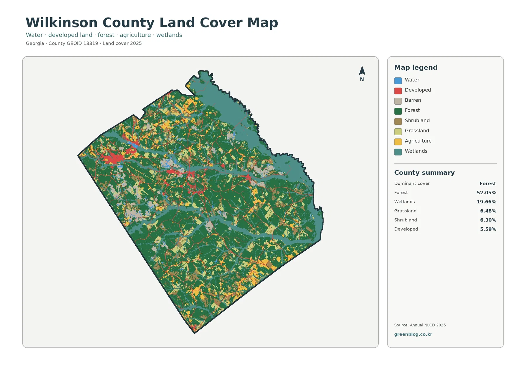
The county summary places forest at 52.05%, clearly ahead of every other class. Wetlands follow at 19.66%, while grassland is 6.48%, shrubland 6.30%, developed cover 5.59%, agriculture 5.49%, and water 1.13%. Those percentages are useful, but the map adds an important second part of the story: the smaller classes are not evenly sprinkled across the county. Some form broad zones, some follow narrow bands, and some are concentrated around a handful of built areas.
Dark-green forest occupies much of the interior and becomes especially continuous through large central and southern sections. The northwest contains more frequent yellow, pale-green, and tan patches, so the forest there is interrupted by agriculture, grassland, and shrub or open-cover classes. Similar open patches appear toward the southeast. In contrast, teal wetlands are especially broad near the northeastern side and also cut across the middle and lower parts of the county in branching bands. The result is a landscape that is forest-led but strongly shaped by wet ground and smaller openings.
Wetland bands separate and border many of the larger forest blocks
Wetlands are the most visually important class after forest. The largest continuous teal area lies toward the northeast, where it occupies a wide part of the county rather than a thin strip. Elsewhere, wetland colors form elongated branches through the center and toward the southeast. In several places those branches sit directly beside forest, which makes the two covers look interwoven rather than divided into neat northern and southern zones. A county profile that discusses only the forest percentage would miss this broad wetland framework.
Land cover should not be confused with legal land use. A wetland-colored cell indicates the surface class assigned by the land-cover dataset; it does not establish a regulated wetland boundary, ownership, zoning, building permission, or parcel condition. The same caution applies to the other colors. These maps are useful for county-scale comparison and screening, but a property-level decision needs current imagery and the appropriate official records.
Open land is more noticeable in the northwest and along the southeastern side
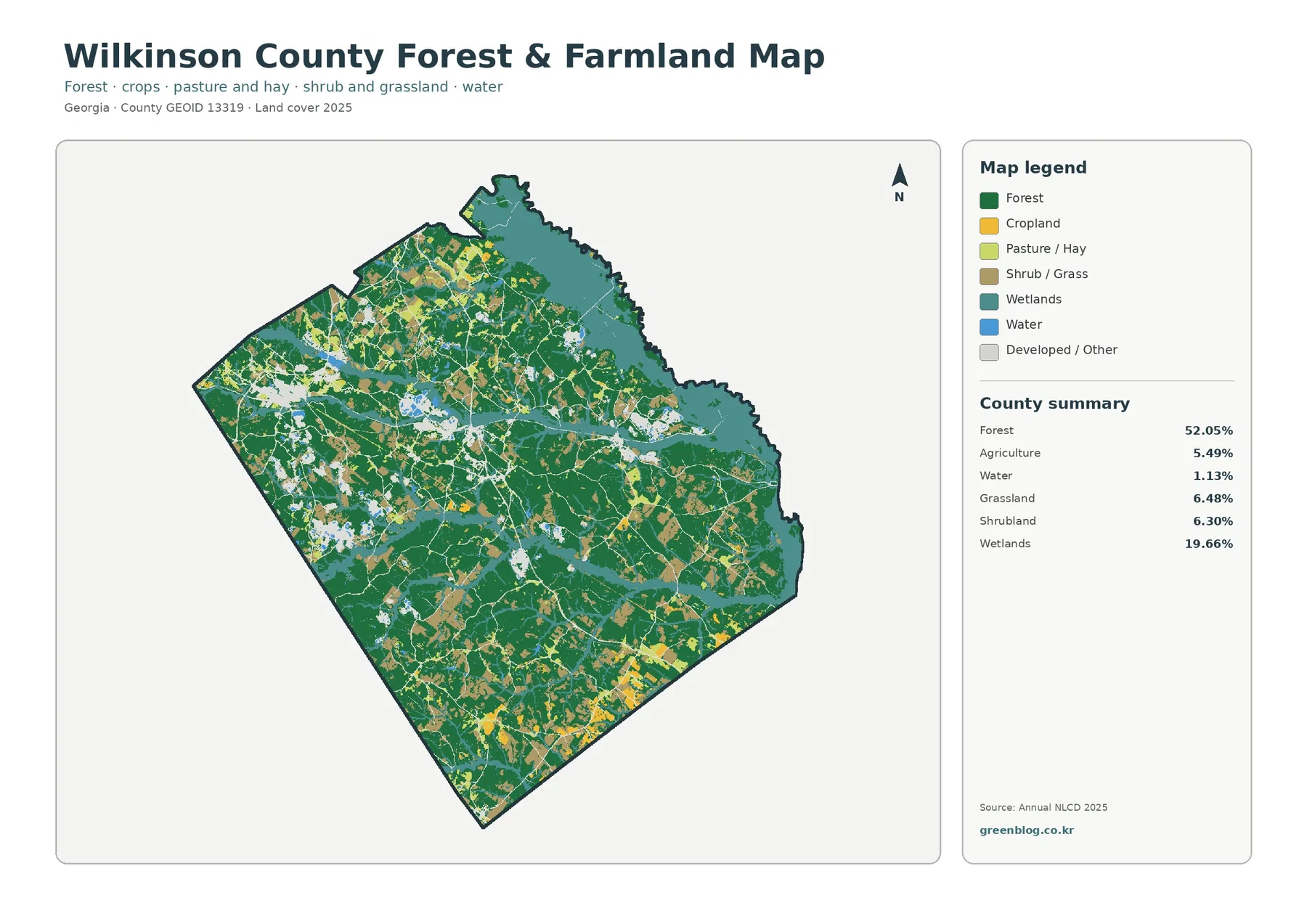
The forest-and-farmland view removes some of the visual competition from the general map and makes open land easier to trace. Forest still forms the background across much of Wilkinson County, but the northwest contains a noticeably denser patchwork of cropland, pasture or hay, and shrub or grass cover. Toward the southeast, larger bright agricultural pieces also appear near the county edge. Between those areas, many smaller openings are embedded in the forest rather than forming one continuous farm belt.
Agriculture accounts for 5.49% of the county, so it is not one of the two dominant classes. Yet its location makes it locally prominent. Grassland at 6.48% and shrubland at 6.30% are similarly important because they create a broad category of open or semi-open ground that is larger than agriculture alone. When using the map in a lesson or report, it is better to keep these categories distinct. Calling every light-colored patch “farmland” would overstate the mapped agricultural area and hide the difference between crops, pasture-like cover, and shrub or grass surfaces.
Built cover is small countywide but strongly concentrated in a few places
Developed land represents 5.59% of the 2025 summary, yet the red areas stand out because they are clustered. The largest concentration appears on the western side, with another set of compact developed areas through the center. A smaller cluster appears farther east. Thin developed lines connect or extend away from those centers, creating a network-like pattern across an otherwise lightly developed county. The map does not label roads or municipal limits, so those lines should be described as mapped developed corridors rather than assigned to a specific road name without another verified layer.
This concentration matters when the county is described using percentages. Saying only that developed cover is 5.59% can make the built landscape sound almost absent. The map shows something more specific: hard and developed surfaces are limited in total area, but they form distinct nodes that are visually and functionally different from the surrounding forest, wetlands, and open land. That distinction becomes even clearer on the impervious-surface image.
Impervious cover averages 1.20%, with the strongest values around the same built clusters
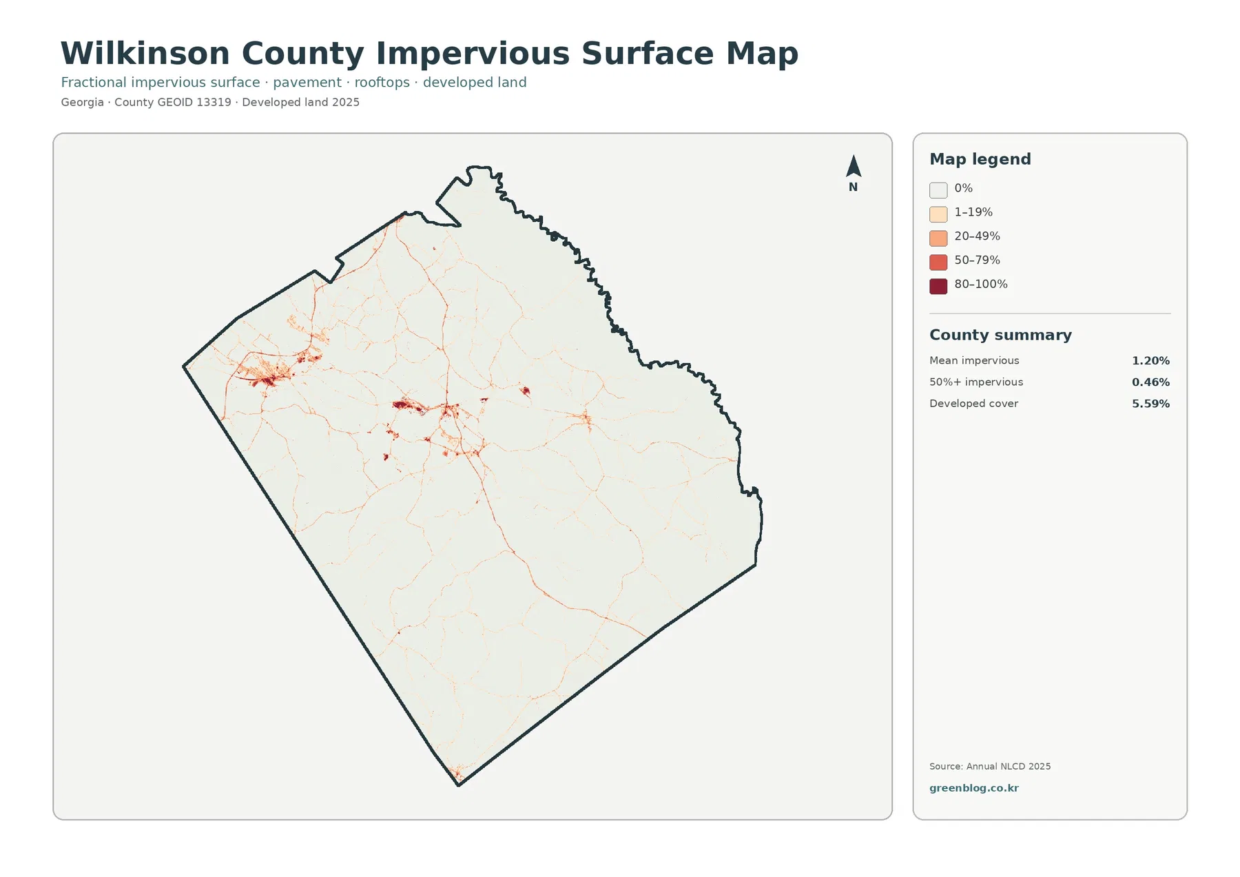
The countywide mean impervious value is 1.20%, and only 0.46% of the county is mapped at 50% or more impervious surface. Most of the map is therefore very light. The strongest orange and red concentrations appear in the western built area and in several central clusters, matching the places where developed cover was most visible on the general map. Fine pale-orange lines extend away from those centers and continue through other parts of the county, showing that hard surfaces can be spatially connected even when their overall share is low.
Developed cover and impervious cover measure related but different things. A developed land-cover class can include lawns, trees, bare soil, or other permeable surfaces around buildings and roads. Impervious percentage focuses more directly on rooftops, pavement, parking areas, and similar hard surfaces. That is why a county can have 5.59% developed cover while its mean impervious value is only 1.20%. The two maps should be read together rather than treated as competing estimates of the same quantity.
The 1985–2025 comparison shows widespread differences, not one simple change front
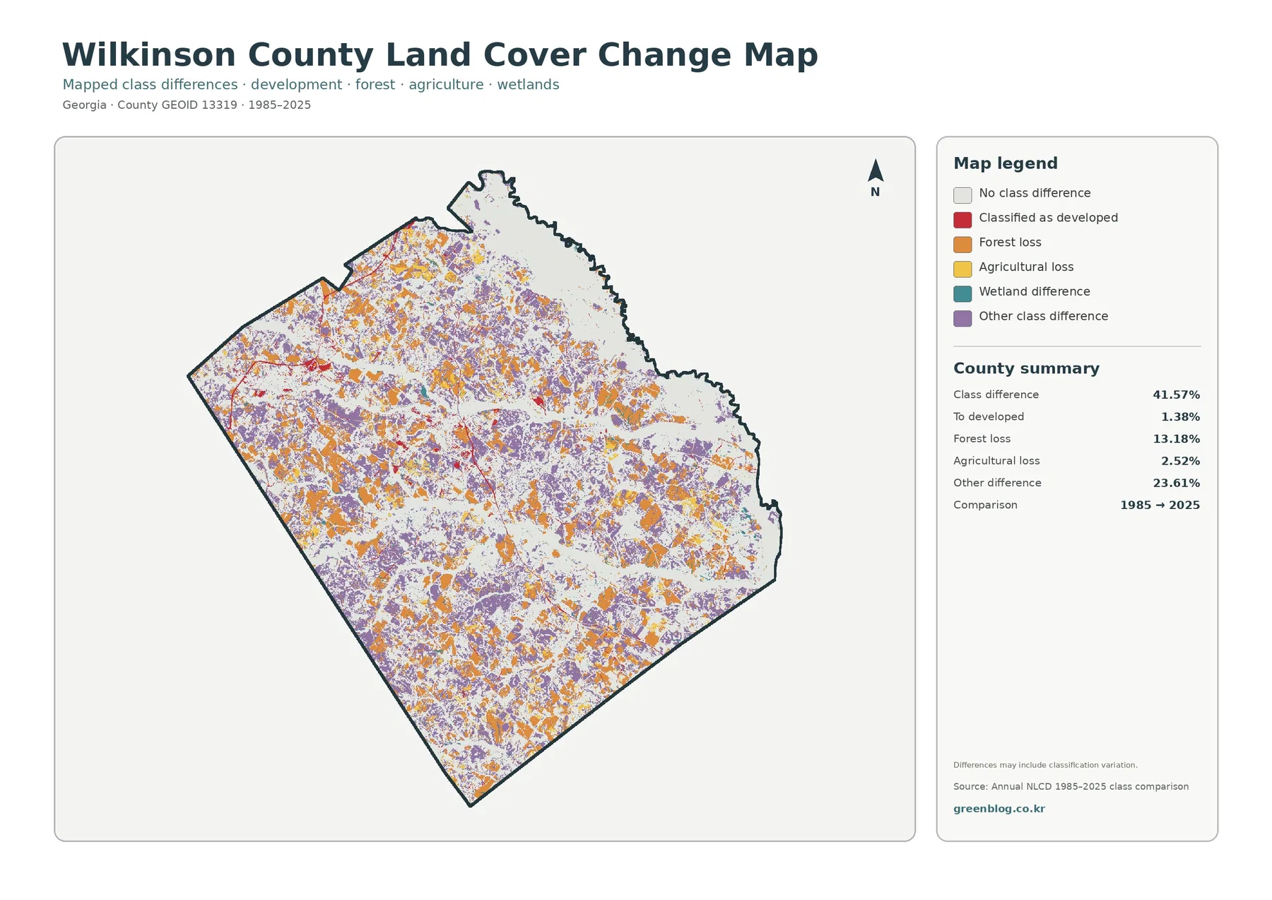
The endpoint comparison reports a total class difference of 41.57%. Forest loss accounts for 13.18%, land classified as developed for 1.38%, agricultural loss for 2.52%, and other class difference for 23.61%. The orange forest-loss patches and purple other-difference areas are spread across much of the county instead of forming a single edge that moves in one direction. They are especially numerous through the northwest, central interior, and southern half, with additional patches continuing eastward.
Red developed-change cells are much less extensive than the orange and purple categories, but they tend to be more noticeable near the western and central built concentrations. That relationship is useful for a broad visual comparison, yet it should not be used to assign an exact construction date to a neighborhood or road. The map compares only the 1985 and 2025 endpoints. A location may have changed several times between those years, and the map notes that classification variation can also contribute to the differences.
What the four views reveal when they are compared in sequence
A useful reading order begins with the current land-cover overview. That establishes the forest majority and the large wetland share. The vegetation-focused image can then show where open land interrupts the forest, especially in the northwest and southeast. The impervious map narrows attention to the western and central hard-surface clusters, making it easier to separate developed intensity from the broader developed land-cover class. Only after those current patterns are clear does the 1985–2025 image make sense as an endpoint comparison.
This sequence also prevents a common mistake: treating change colors as present-day land-cover classes. Purple on the comparison map does not mean that the current surface is a special “purple” type. It means the endpoint classifications differ in a way grouped under other class difference. Orange marks cells grouped as forest loss in the comparison, not every place that is currently open. Keeping the current map beside the change map makes those distinctions much easier for an audience to understand.
County-scale raster cells are useful for patterns, not parcel conclusions
Annual NLCD products use raster cells that assign a predominant class to each location. On the ground, one cell-sized area can contain trees, grass, a narrow road, drainage, a building, or water at the same time. The map simplifies that mixture into the class or percentage represented by the source product. Narrow features may look wider or thinner than expected, and small ponds or short road segments may disappear into neighboring classes. Enlarging the JPG improves readability but does not create parcel detail that was absent from the underlying data.
The current images represent the supplied 2025 observation year. Construction, vegetation recovery, timber activity, crop rotation, flooding, or other conditions after that date may not be shown. The two-date comparison also does not provide a year-by-year history. For property boundaries, wetland jurisdiction, engineering, permits, zoning, or a current field condition, use newer aerial imagery and the relevant official local or state source in addition to these countywide reference maps.
Choosing a JPG for a report, classroom handout, or presentation
The downloadable set contains the four original JPG maps discussed on this page: 2025 land cover, forest and farmland, impervious surface and developed land, and the 1985–2025 land-cover comparison. Each JPG is 2480 × 1754 pixels. The supplied asset manifest does not mark these files as meeting an A3 high-resolution reference, so a proof print is sensible before using them as large posters. Their dimensions are well suited to screen reference, ordinary documents, classroom materials, and presentation slides.
For a county profile, start with the general 2025 view because it carries the widest range of classes. For a forestry or rural-land discussion, the forest-and-farmland file reduces clutter and makes open patches easier to compare. Use the impervious image when the audience needs to see where rooftops and pavement are concentrated rather than where the broader developed class occurs. The change map works best as a second or third figure after the present-day conditions have been explained. Showing one large map and one supporting comparison is usually clearer than shrinking all four into a single crowded panel.
Frequently Asked Questions
What is the largest land-cover class in Wilkinson County?
Forest is the largest class in the supplied 2025 summary at 52.05%, followed by wetlands at 19.66%. Together they cover more than 70% of the county, although open land and developed clusters create clear local contrasts in the northwest, center, west, and southeast.
Why is developed cover 5.59% when mean impervious cover is only 1.20%?
Developed land can include lawns, trees, soil, and other permeable surfaces around roads and buildings. Impervious percentage focuses on hard surfaces such as rooftops, pavement, and parking areas. The two measures describe different parts of the built landscape, so the impervious average can be much lower.
Does 41.57% class difference mean 41.57% of Wilkinson County was developed?
No. The 41.57% figure is the total share of cells classified differently at the 1985 and 2025 endpoints. Only 1.38% is listed as classified to developed. The total also includes 13.18% forest loss, 2.52% agricultural loss, 23.61% other difference, and other mapped comparison categories. Establishing timing or cause requires additional evidence.
Sources and Reference Data
- MRLC Annual NLCD Data – official access to the annual land-cover products used for current and comparison mapping.
- USGS Annual NLCD Land Cover Classification – definitions for forest, wetlands, developed land, agriculture, and other mapped classes.
- U.S. Census Bureau TIGER/Line Shapefiles – official geographic boundary data reference for counties and other areas.
Map File Information
The ZIP contains the four original Wilkinson County JPG maps used for the 2025 land-cover, forest and farmland, impervious-surface, and 1985–2025 comparison sections.
- Included Files: General land cover, forest and farmland, impervious/developed surface, and land-cover change maps
- File Type: Four original JPG map files bundled in one ZIP archive
- Intended Use: Printing, education, presentations, and map-based projects
Related Maps
- Appling County Georgia Land Cover Map
- Atkinson County Georgia Land Cover Map
- Bacon County Georgia Land Cover Map
Green Map creates custom-edited map images using open geographic data sources such as geoBoundaries, Natural Earth, OpenStreetMap, and government open data. These maps are edited visual materials, not raw data files, and are provided for education, documents, presentations, and graphic reference.