The employment-to-population ratio answers a broader question than the unemployment rate: what share of the working-age or adult population is actually employed? For the World Bank series used here, the population is men age 15 and older. In the 2024 national-estimate data, 104 countries and separately reported economies have a value. Their ratios range from about 37 percent to more than 95 percent, showing that the share of adult men who are employed varies enormously across reporting economies.
The indicator code is SL.EMP.TOTL.SP.MA.NE.ZS, “Employment to population ratio, 15+, male (%) (national estimate).” The unit is percent. The source inventory contains 217 country or economy rows for 2024, but only 104 have observations; 113 remain missing exactly as supplied by the source. A missing observation is therefore not treated as zero and does not enter the rankings, averages, or quartiles below.
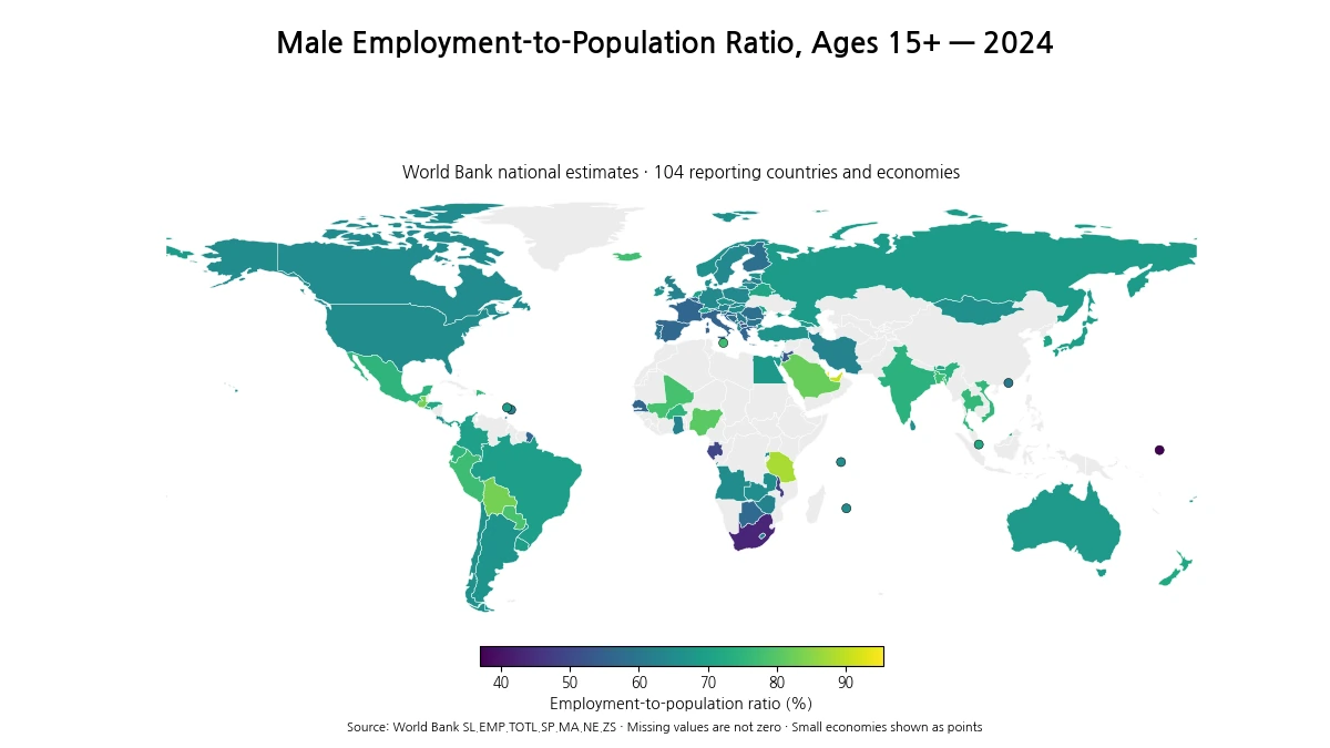
Table of Contents
What the employment-to-population ratio measures
An employment-to-population ratio of 70 percent means that roughly 70 out of every 100 men age 15 or older are employed. The denominator includes people who are not in the labor force, so the ratio is not simply one minus the unemployment rate. Students, retirees, people who have stopped looking for work, and others outside the labor force remain part of the population denominator. This distinction matters whenever countries differ in education duration, retirement patterns, age structure, or labor-force participation.
The “national estimate” label also matters. These observations draw on national statistical estimates rather than a single harmonized modeled series. National sources can differ in survey design, treatment of informal work, reference periods, and operational definitions. The data are useful for comparing broad patterns, but small decimal differences should not be interpreted as precise rankings of labor-market performance without checking national methodology.
The 2024 distribution centers near 66 percent
Across the 104 reporting economies, the unweighted mean is 66.3% and the median is 65.8%. The first quartile is about 61.9% and the third quartile about 71.1%, so the middle half of observations lies within a range of roughly 9.2 percentage points. The full range is much wider: 37.0% to 95.5%, a spread of 58.5 percentage points.
Because the mean and median are close, the center of the observed distribution is not dominated by a single extreme tail. Even so, the extremes are meaningful for interpretation. Several economies exceed 80 percent, while a small group is below 50 percent. That combination makes a map more informative than one global summary number: neighboring economies can sit in very different parts of the distribution.
| Position | Country or economy | 2024 value |
|---|---|---|
| Top 1 | Qatar | 95.5% |
| Top 2 | United Arab Emirates | 90.9% |
| Top 3 | Tanzania | 87.9% |
| Top 4 | Bolivia | 83.2% |
| Top 5 | Guatemala | 82.9% |
| Bottom 1 | Naoero | 37.0% |
| Bottom 2 | South Africa | 43.0% |
| Bottom 3 | Malawi | 48.1% |
| Bottom 4 | Gabon | 49.2% |
| Bottom 5 | Kosovo | 49.5% |
Highest and lowest reported values
Qatar has the highest 2024 observation at 95.5 percent, followed by the United Arab Emirates at 90.9 percent and Tanzania at 87.9 percent. Bolivia records 83.2 percent and Guatemala 82.9 percent. These figures do not mean that every dimension of the labor market is stronger in the highest-ranked economies. They say only that a very large share of men age 15 and older were classified as employed under the national-estimate measure.
At the other end, Nauru is at 37.0 percent and South Africa at 43.0 percent. Malawi, Gabon, and Kosovo are all just below 50 percent. A low employment-to-population ratio can reflect unemployment, schooling, retirement, disability, discouraged workers, demographic structure, or other reasons for being outside employment. The indicator by itself cannot separate those mechanisms.
A map of sharp differences inside the same region
The Gulf and nearby Middle Eastern economies illustrate why regional averages can hide major contrasts. Qatar and the United Arab Emirates are above 90 percent, and Saudi Arabia is 82.0 percent, while Jordan is 52.6 percent and the West Bank and Gaza is 50.1 percent. Labor migration, population composition, sector structure, and participation patterns differ substantially across these economies, so geographic proximity does not produce a common level.
South America also contains a broad spread. Bolivia is 83.2 percent, Paraguay 78.3 percent, Peru 77.3 percent, and Ecuador 74.9 percent. Brazil is 69.5 percent, Uruguay 69.1 percent, Argentina 67.2 percent, and Chile 66.3 percent. The pattern suggests that even within one continental labor market context, the share of adult men in employment can differ by more than ten percentage points.
Europe shows a different patchwork. Italy, Greece, Spain, France, and Belgium are clustered in the mid-50s, while Portugal is about 59.0 percent. By contrast, the Netherlands is 70.6 percent and Iceland 77.8 percent. These differences should not be read as a direct measure of job quality or economic prosperity; longer education, retirement behavior, part-time employment, and demographic structure all affect the population denominator.
Selected Asian observations also show that high ratios are not confined to one income group. Bangladesh is 77.0 percent, Thailand 76.0 percent, Viet Nam 75.8 percent, India 74.3 percent, and Japan 69.6 percent. The ratio does not measure wages or productivity, so two economies with similar employment-to-population ratios can still have very different income levels, hours worked, employment security, and occupational structures.
North America and Africa show why context matters
Mexico stands at 75.1 percent, roughly ten percentage points above the United States at 65.2 percent and Canada at 65.1 percent. That gap should not be treated as a simple scorecard. A higher share of men in employment can coexist with different schooling patterns, retirement systems, informality, social protection, or hours of work. Employment quantity and employment quality are separate questions.
Africa contains some of the widest contrasts in the dataset. Tanzania is 87.9 percent, Nigeria 80.5 percent, Mali 78.3 percent, and Burkina Faso 74.7 percent. South Africa is 43.0 percent, Malawi 48.1 percent, Gabon 49.2 percent, Senegal 55.6 percent, and Ghana 63.2 percent. The continent therefore cannot be summarized with one employment-to-population profile. Country-specific labor-force institutions and demographic conditions remain essential to interpretation.
Why a higher ratio is not automatically a better outcome
A high ratio means employment is widespread among adult men, but it does not reveal whether jobs are formal, stable, well paid, productive, or adequately protected. In some settings, people may enter work early because there are limited opportunities to remain in education. In others, high retirement ages or weak pension coverage may keep older people employed. Conversely, a lower ratio can partly reflect longer schooling or earlier retirement rather than only a shortage of jobs.
For that reason, the ratio is best paired with unemployment, labor-force participation, wages, hours worked, informal employment, and age-specific employment rates. Those indicators answer different questions. The employment-to-population ratio is valuable precisely because it combines employment and non-participation into one population-based measure, but that same breadth prevents it from identifying the cause of a high or low value.
This series is male-only. It should not be used as a proxy for the whole population or for gender equality in employment. A separate female or total-population series is needed to study gender gaps. The present map is intentionally limited to the geographic distribution of male employment among people age 15 and older in 2024.
How missing values and small economies are shown
The source file contains 217 country and economy rows. Of those, 113 have no 2024 value and remain missing. They are shown as no-data areas rather than zeros. The low-resolution world boundary file directly matches 96 of the 104 observed economies after name correction. Eight very small or geographically tiny economies—such as Malta, Singapore, Hong Kong, Barbados, Saint Lucia, Mauritius, Nauru, and Seychelles—are plotted as points so that their real observations are not silently dropped.
The map should also be read as a set of ratios, not as an area-weighted display. Large countries occupy more screen space because they have more land, not because they count more in the summary statistics. The mean and median used here are simple economy-level summaries. They are not population-weighted global employment rates. A population-weighted calculation would answer a different question and require male population counts for each economy.
Using the 2024 snapshot responsibly
A single year is useful for cross-sectional comparison, but it cannot show whether a country is improving or deteriorating. Business cycles, migration, demographic shifts, survey redesigns, and temporary disruptions can all move the ratio. For any country of particular interest, comparing several prior years is the next logical step. A short time series can reveal whether the 2024 observation is typical or unusual.
The main takeaway is descriptive: among the 104 reporting economies, the typical 2024 male employment-to-population ratio is around two-thirds, but the observed range spans almost sixty percentage points. The map helps identify clusters and outliers, while the indicator definition prevents overinterpretation. Read together, they show where employment among adult men is more or less common without claiming that one number captures the full quality or health of a labor market.
Frequently Asked Questions
What does the male employment-to-population ratio measure?
It is the percentage of men age 15 and older who are employed. Its denominator is the population, not only the labor force, so it differs from the unemployment rate.
How many economies have a 2024 value in this comparison?
The source list contains 217 country and economy rows. A 2024 value is available for 104, while 113 remain source-missing and are not treated as zero.
Does a higher employment-to-population ratio mean a better labor market?
Not necessarily. The ratio shows how common employment is, but it does not measure wages, job quality, productivity, informality, schooling, retirement, or the reasons people are outside employment.
Related Articles
Green Map creates custom-edited map images using open geographic data sources such as geoBoundaries, Natural Earth, OpenStreetMap, and government open data. These maps are edited visual materials, not raw data files, and are provided for education, documents, presentations, and graphic reference.