Advanced education does not eliminate unemployment risk. The World Bank indicator SL.UEM.ADVN.ZS measures the share of the labor force with advanced education that is unemployed. Advanced education includes short-cycle tertiary education, bachelor’s or equivalent programs, master’s or equivalent programs, and doctoral or equivalent education under ISCED 2011. The indicator therefore focuses on people with higher levels of education who are participating in the labor market, not on the entire population of graduates.
This comparison uses the latest non-empty observation for 188 economies in the supplied World Bank data. The observation years are not synchronized: they range from 2000 to 2025. That distinction matters. The map and tables are useful for seeing how the latest available values differ across economies, but they should not be read as a strict same-year league table. A 2024 observation and a 2012 observation can appear side by side because each is the most recent value available for that economy in this dataset.
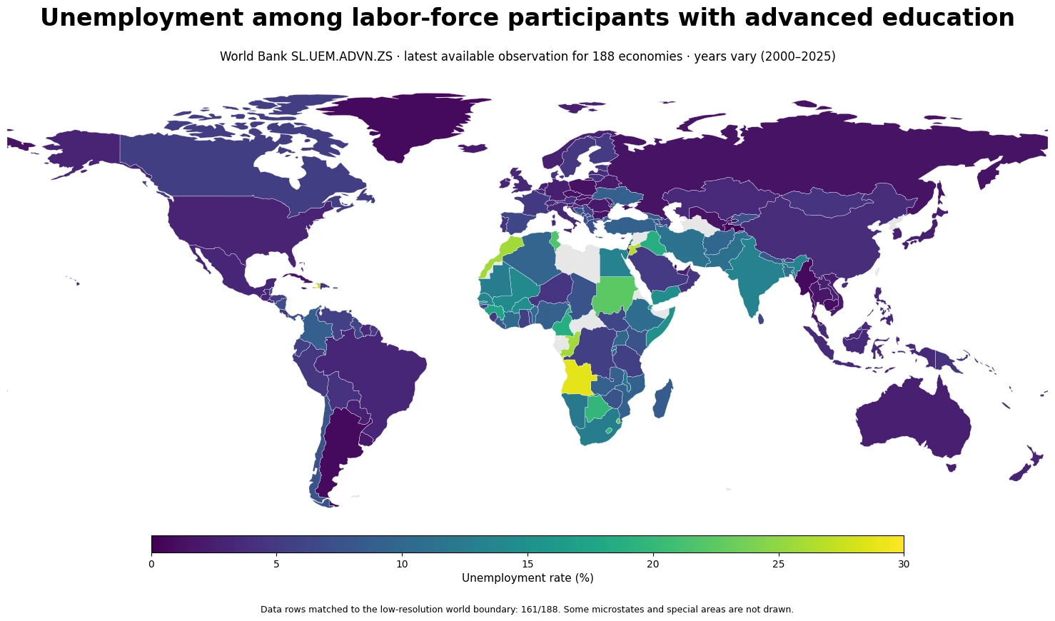
Table of Contents
What this indicator actually measures
The denominator is the labor force with advanced education, not the total population and not everyone who has ever completed tertiary education. Someone must be participating in the labor market to be included in this rate. The numerator is the unemployed portion of that same advanced-education labor force. As a result, the indicator combines education status, labor-force participation, and unemployment status in a way that is different from a general unemployment rate.
A country can have a large university-educated population and still record a high value if professional job creation is weak, graduate labor supply expands faster than suitable vacancies, or a cyclical downturn hits sectors that employ many highly educated workers. The reverse is also possible. A low rate does not by itself prove that wages are high, jobs are stable, or graduates are working in fields that match their training. Labor-force exit, informal work, migration, and measurement practices can all shape what the rate looks like.
Why observation year comes before ranking
Of the 188 latest observations, 95 come from 2024 or 2025, which is 50.5% of the dataset. Expanding the window through 2023 raises the count to 110, or 58.5%. At the same time, 39 economies have a latest observation from 2019 or earlier. “Latest available” therefore means the newest non-empty value for each economy, not a common 2025 reference year.
| Observation period | Economies | Share of all observations |
|---|---|---|
| 2024–2025 | 95 | 50.5% |
| 2023 | 15 | 8.0% |
| 2020–2022 | 39 | 20.7% |
| 2019 or earlier | 39 | 20.7% |
This mixed-year structure changes how the numbers should be used. A high value from an older observation can still be informative about the last measured situation in that economy, but it should not be presented as evidence of the country’s current 2026 labor-market condition. For current policy comparisons, analysts should restrict the sample to a common year or a narrow period whenever enough data are available. For broad geographic exploration, the latest-available approach remains useful as long as the year is shown next to the value.
What the distribution looks like across 188 latest observations
The median value is 4.87%, while the mean is 6.78%. The mean being higher than the median indicates a right-skewed distribution in which a smaller group of high values pulls the average upward. 95 economies are below 5%, while 37 are at 10% or above. There are 16 observations at or above 15% and 9 at or above 20%. The dataset therefore contains both a large low-rate group and a smaller but substantial group where unemployment among advanced-education labor-force participants is in double digits.
- Below 5%: 95 economies
- Below 2%: 23 economies
- 10% or higher: 37 economies
- 15% or higher: 16 economies
- 20% or higher: 9 economies
The spread is a reminder that educational attainment and labor-market outcomes are related but not interchangeable. A labor market may produce many graduates without generating enough positions that use their skills. Another country may have a smaller advanced-education labor force and a low measured unemployment rate, yet still face problems with underemployment, low wages, or limited access to high-productivity work. This indicator captures one dimension of that system rather than a complete assessment of graduate outcomes.
Examples with the largest latest-available values
The following table lists some of the largest values in this extract. It is deliberately labeled as a set of latest-available observations rather than a current ranking because the years differ. Angola is represented by a 2024 observation, while Haiti is represented by 2012 and the Republic of Congo by 2009. Comparing the percentages without the year would create a false sense of simultaneity.
| Economy | Observation year | Unemployment rate among advanced-education labor force |
|---|---|---|
| Angola | 2024 | 28.808% |
| Haiti | 2012 | 26.802% |
| Jordan | 2023 | 26.608% |
| Morocco | 2022 | 25.850% |
| Congo, Rep. | 2009 | 25.768% |
| West Bank and Gaza | 2025 | 25.563% |
| Eswatini | 2023 | 22.458% |
| Sudan | 2022 | 22.381% |
A large value can be consistent with weak absorption of highly educated job seekers, but the indicator does not identify a single cause. Graduate cohort size, public-sector hiring, private investment, occupational mismatch, regional concentration of jobs, migration, and cyclical conditions may all matter. Establishing which mechanism dominates would require additional country-specific evidence and preferably a time series rather than one latest observation.
Very low values also need context
The smallest values in the dataset are also not a simple “best outcomes” list. Several are based on older observations, and a low unemployment rate says nothing directly about earnings, hours, job security, occupational match, or the share of educated adults who are outside the labor force. It only says that among advanced-education labor-force participants in the measured period, a relatively small share was unemployed.
| Economy | Observation year | Unemployment rate among advanced-education labor force |
|---|---|---|
| Tajikistan | 2016 | 0.241% |
| Qatar | 2020 | 0.300% |
| Palau | 2020 | 0.509% |
| Argentina | 2024 | 0.708% |
| Greenland | 2015 | 0.751% |
| Myanmar | 2020 | 0.780% |
| Tonga | 2023 | 0.826% |
| Solomon Islands | 2013 | 0.969% |
Labor-force participation is especially important when interpreting low rates. A person who stops looking for work may no longer count as unemployed under standard labor-force definitions. For that reason, a fuller assessment of outcomes for people with advanced education should pair this indicator with employment rates, labor-force participation, earnings, and where available measures of underemployment or skills mismatch.
What this dataset can and cannot tell you
The dataset is well suited to showing the scale of cross-country variation in the latest reported unemployment rate for people with advanced education. It can highlight economies with unusually high or low measured values and reveal where recent data are available. It cannot tell you which university majors are most affected, whether young graduates face different risks from mid-career workers, whether women and men experience the same outcomes, or whether unemployment is concentrated in specific regions within a country. Those questions require more detailed microdata or disaggregated indicators.
It also does not measure change over time. One 2024 value cannot tell you whether an economy improved from 2023 or deteriorated from 2019. A trend analysis needs multiple observations for the same economy using a consistent definition. For research on labor-market resilience or the effect of a recession, the time dimension is often more informative than a single cross-section.
How to use the data responsibly
The source is the World Bank indicator SL.UEM.ADVN.ZS. If you reuse the data, keep the observation year attached to every value. Do not convert missing values to zero, because “no observation” and “0% unemployment” are fundamentally different statements. Visualizations based on each economy’s latest observation should also say explicitly that years vary. That one sentence prevents many misleading comparisons.
The map uses a low-resolution world boundary, and 161 of the 188 data rows can be joined to polygons in that boundary. Most missing map shapes are microstates or special areas that are not represented in the low-resolution geometry. The full calculations and tables still use all 188 data observations. In other words, the map is a quick spatial overview, while the underlying table is the better source for an exact economy-level value and year.
Key takeaway
Unemployment among labor-force participants with advanced education varies widely across economies. The median latest-available value in this dataset is 4.87%, and 37 economies have values of 10% or more. But the observation years span 2000–2025, so the figures should not be treated as a synchronized current ranking. The most reliable way to read the comparison is to keep three things together: the percentage, the observation year, and the denominator. For a fuller labor-market picture, add employment, participation, earnings, and time-series context.
Frequently Asked Questions
Is this the same as the overall unemployment rate?
No. The denominator is limited to labor-force participants with advanced education, so it describes a specific education group rather than the whole labor force.
Are all country values from 2025?
No. The latest available observation differs by economy and spans 2000–2025 in this dataset. The year should be read alongside every percentage.
Does a low rate mean highly educated workers have good jobs?
Not necessarily. The indicator does not measure wages, job security, occupational match, hours, or labor-force participation. Those dimensions require additional indicators.
Related Articles
Green Map creates custom-edited map images using open geographic data sources such as geoBoundaries, Natural Earth, OpenStreetMap, and government open data.
These maps are edited visual materials, not raw data files, and are provided for education, documents, presentations, and graphic reference.