The share of income or consumption received by the highest 20% is a compact way to compare how strongly resources are concentrated toward the top of a distribution. World Bank indicator SI.DST.05TH.20 divides the population into quintiles and reports the percentage of total income or consumption accruing to the highest quintile. A larger percentage means the top fifth receives a larger share of the total measured resources; a smaller percentage means that share is more limited.
This comparison uses the latest non-missing observation available for 171 economies. Coverage is complete across those 171 rows, but the observation years are not synchronized. Only 4 economies have a 2025 value, 21 have 2024 and 37 have 2023. In total, 107 observations fall in 2021–2025, while 37 are from 2017 or earlier. The map is therefore a latest-available snapshot rather than a single-year world ranking.
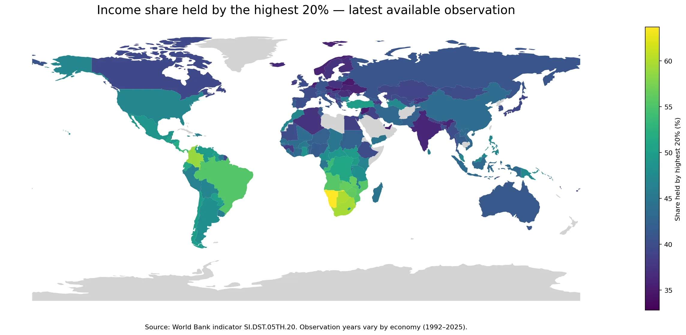
Table of Contents
What the highest-20% share actually measures
The indicator does not measure the size of the population in the top group; that group is always 20% of the population. It measures the fraction of total income or consumption that flows to that fifth. A value of 50% means the highest quintile receives half of the measured total, while a value of 35% means it receives a little more than one third. In that sense, the measure is directly useful for comparing concentration at the upper end of the distribution.
Cross-country interpretation still requires care. Household-distribution statistics can be based on income or consumption depending on the underlying survey and national statistical practice. Survey timing and design also differ. A one- or two-percentage-point gap between two economies should not automatically be treated as a precise structural difference, especially when the observation years are far apart. The map is strongest for identifying broad contrasts, clusters and outliers.
How wide is the distribution across 171 economies?
The median latest observation is 42.9%. The first quartile is 39.4% and the third quartile is 47.0%, so the middle half of the observations lies within a band of roughly 7.6 percentage points. The full range is much wider: 32.8% at the low end and 63.7% at the high end, a spread of 30.9 percentage points. The maximum is about 1.9 times the minimum.
There are 22 economies at or above 50%, 52 below 40%, and 97 between 40% and 50%. This makes the low-40s a useful reference point for the middle of the current latest-available distribution, but it is not a policy target or a universal benchmark. Different tax systems, transfer systems, labor markets, household structures and survey conventions can all affect the observed share.
Economies with the largest latest shares
Namibia has the largest latest observation at 63.7%. Eswatini follows at 60.2%, Botswana at 59.9% and South Africa at 59.5%. Colombia is next at 58.9%, followed by Zambia at 56.4%, Zimbabwe at 56.1%, Angola at 55.6%, Mozambique at 55.5% and Brazil at 55.4%. The concentration of several high values in southern Africa is one of the clearest geographic patterns on the map.
| Economy | Highest 20% share | Observation year |
|---|---|---|
| Namibia | 63.7% | 2015 |
| Eswatini | 60.2% | 2016 |
| Botswana | 59.9% | 2015 |
| South Africa | 59.5% | 2022 |
| Colombia | 58.9% | 2024 |
| Zambia | 56.4% | 2022 |
| Zimbabwe | 56.1% | 2019 |
| Angola | 55.6% | 2018 |
| Mozambique | 55.5% | 2022 |
| Brazil | 55.4% | 2024 |
The observation years matter for this ranking. Namibia and Botswana are represented by 2015 values, Eswatini by 2016, Angola by 2018 and Zimbabwe by 2019. Colombia and Brazil use 2024 observations, while South Africa, Zambia and Mozambique use 2022. These should therefore be described as the largest latest available observations, not as a synchronized statement about which economies have the highest share in 2025.
Economies with the smallest latest shares
At the lower end, the Slovak Republic has the smallest latest observation at 32.8%. The United Arab Emirates, Belarus and Slovenia are each at 34.8%. Kiribati and the Syrian Arab Republic are at 35.1%, the Netherlands at 35.2%, Czechia at 35.5%, Norway at 35.8% and Ukraine at 35.9%. Several Central and Eastern European economies appear toward the low end, although the list also contains economies from very different regions.
| Economy | Highest 20% share | Observation year |
|---|---|---|
| Slovak Republic | 32.8% | 2023 |
| United Arab Emirates | 34.8% | 2018 |
| Belarus | 34.8% | 2020 |
| Slovenia | 34.8% | 2023 |
| Kiribati | 35.1% | 2023 |
| Syrian Arab Republic | 35.1% | 2022 |
| Netherlands | 35.2% | 2021 |
| Czechia | 35.5% | 2023 |
| Norway | 35.8% | 2023 |
| Ukraine | 35.9% | 2020 |
A lower top-quintile share does not mean every kind of inequality is low. This indicator says nothing about how resources are distributed within the highest 20%, within the middle 60%, or within the lowest 20%. It also does not measure wealth concentration. Income, consumption and wealth are related but distinct concepts, so a fuller distributional picture requires additional indicators such as the share held by the lowest 20%, the Gini index and poverty measures.
Geographic clusters and notable exceptions
Southern Africa stands out because several neighboring or nearby economies have very high latest values. Namibia, Eswatini, Botswana and South Africa are all close to 60% or above, while Zambia, Zimbabwe and Mozambique are above 55%. The presence of several high observations in the same broad region makes this more than a single-country outlier. Even so, the years differ, so the pattern should not be mistaken for a perfectly synchronized regional snapshot.
Parts of Latin America also show high top-quintile shares. Colombia is at 58.9%, Brazil at 55.4%, Panama at 54.3% and Ecuador at 51.5%. In contrast, many European economies lie in the upper-30s to low-40s. The Slovak Republic is at 32.8%, Slovenia 34.8%, Czechia 35.5%, Romania 36.9% and Poland 37.3%. France is 39.7%, Spain 40.2%, Germany 40.9%, Portugal 41.8% and Lithuania 42.9%, showing that Europe itself still contains meaningful variation.
There are also exceptions that resist a simple regional story. The United Arab Emirates is at 34.8%, placing it among the lowest latest values in the dataset, but its observation is from 2018. Kiribati is at 35.1% and is a small island economy, while the Republic of Congo is at 53.7% but its latest observation is from 2011. These cases are reminders to check the observation year and statistical context rather than reading map color alone.
Why the observation-year mix changes the interpretation
Only Ecuador, Costa Rica, Indonesia and Uzbekistan have 2025 observations in this latest-value set. Another 21 economies have 2024 values and 37 have 2023 values. Although 107 of the 171 observations are from 2021–2025, a substantial minority is older. The oldest latest observation is Trinidad and Tobago in 1992; Guyana and Turkmenistan are from 1998, Azerbaijan from 2005 and Venezuela from 2006.
The most appropriate use of this dataset is therefore to ask, ‘What is the latest measured top-quintile share available for each economy?’ It is not ideal for producing a strict global league table for one calendar year or for inferring recent changes. A synchronized comparison would require selecting one common year and accepting lower country coverage, while a change analysis would require at least two comparable observations per economy.
What this indicator can and cannot tell you
A higher value directly indicates that the highest fifth receives a larger share of measured income or consumption. A difference between 60% and 35%, for example, is a 25-percentage-point gap in the portion accruing to the top quintile. Differences of that magnitude are useful for identifying broad distributional contrasts across regions and economies.
The indicator does not identify the causes of those differences. Taxation, public transfers, wage dispersion, employment structures, household composition, informality, education, demographics and many other factors may be relevant, but this single series cannot isolate their effects. It also should not be used as a substitute for wealth inequality, which concerns ownership of assets rather than the flow of income or consumption captured here.
Source and comparison method
The source is the World Bank indicator Income share held by highest 20% (SI.DST.05TH.20). For each economy, the most recent non-missing observation is used, and the unit is percent. The 171 values range from 32.8% to 63.7%. The world map connects values to country boundaries where those boundaries are represented at the map scale; very small island economies can be difficult to display even though their observations are included in the overall statistics and tables.
Rankings are calculated by sorting the latest available observations from largest to smallest. The median and quartiles are calculated across all 171 latest values. No attempt is made to force older observations into a common year or to interpolate missing years. That is why the observation year is shown alongside the values and should remain part of any comparison.
Frequently Asked Questions
What does a high income share held by the highest 20% mean?
It means the highest fifth of the population receives a larger share of total measured income or consumption. The indicator does not by itself explain wealth inequality or the causes of the distribution.
Are all country values from the same year?
No. The comparison uses each economy’s latest non-missing observation, so years range from 1992 to 2025. Only four observations are from 2025, while 107 are from 2021–2025.
Can this be read as a current global inequality ranking?
Not strictly. Survey years and income-versus-consumption concepts can differ across economies. The data are best used for broad contrasts, clusters and outliers, with observation years kept in view.
Related Articles
Green Map creates custom-edited map images using open geographic data sources such as geoBoundaries, Natural Earth, OpenStreetMap, and government open data.
These maps are edited visual materials, not raw data files, and are provided for education, documents, presentations, and graphic reference.