Comparing external debt only in dollars can be misleading because countries differ enormously in export earnings and economic scale. This article uses the World Bank indicator Present value of external debt (% of exports of goods, services and primary income), code DT.DOD.PVLX.EX.ZS, to compare the present value of external debt with a broad measure of foreign-exchange earning capacity. The map is therefore about the size of the debt burden relative to exports and primary income, not about which country owes the most dollars.
The verified dataset contains 107 country or area observations, all dated 2024. That matters for interpretation. Unlike a latest-value map in which different countries may refer to different years, every observation used for the ranking, distribution, mean, and median here comes from the same reference year. Countries shown in gray are not treated as having zero debt; they simply do not have a 2024 observation in this validated 107-row file.
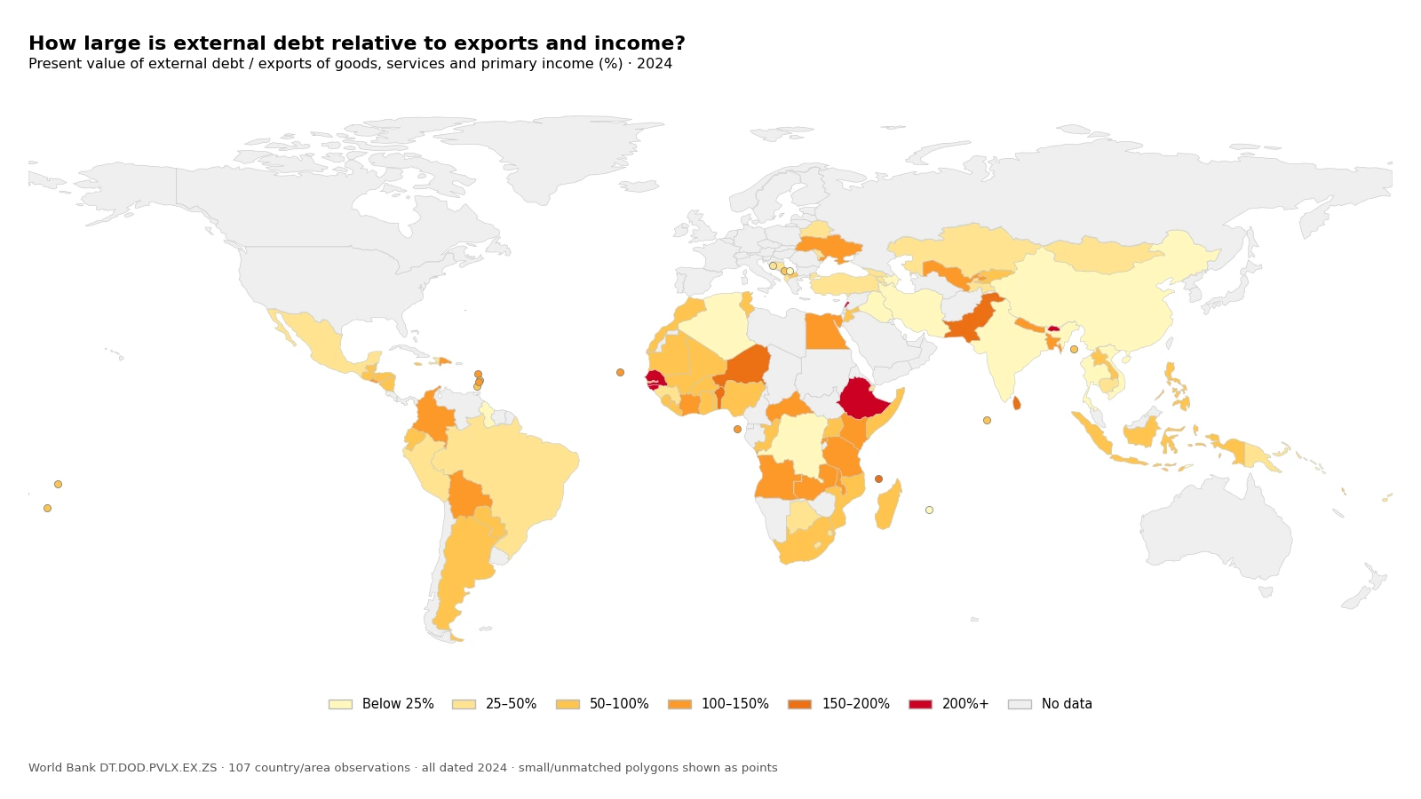
Table of Contents
What “present value of external debt” means
The numerator is more specific than a simple external-debt stock. World Bank metadata defines the present value of external debt as short-term external debt plus the discounted stream of debt-service payments due on public, publicly guaranteed, and private nonguaranteed long-term external debt over the remaining life of existing loans. Discounting converts future payments into a value measured at the present rather than adding future nominal payments without adjustment.
This distinction is especially useful when loan terms differ. Concessional loans may carry below-market interest rates, long maturities, or grace periods, so their nominal face value and present value can tell different stories. A present-value measure tries to reflect those terms. It should not be read as the amount that must be paid immediately in 2024; it is a way to summarize future obligations at a common valuation point.
The denominator is a three-year average, not one year of exports
The denominator combines exports of goods, exports of services, and primary income receipts. The World Bank metadata specifies that this exports-and-income denominator is a three-year average. A 2024 ratio therefore does not simply divide debt by goods exports in calendar year 2024. It compares the debt present value with a broader, smoothed external-earnings measure, which reduces the influence of a single unusually strong or weak export year.
A ratio near 100% means the measured present value of debt is roughly the same size as that denominator. A ratio of 200% means roughly twice the denominator. It does not mean that all export earnings for one or two years must literally be diverted to creditors. Actual debt service is scheduled over time, and the ability to meet payments also depends on reserves, refinancing access, fiscal resources, currency exposure, and the maturity profile of liabilities.
The 2024 distribution centers on a 64.6% median
Across the 107 synchronized observations, the simple unweighted median is 64.6% and the simple unweighted mean is 81.3%. The mean is substantially above the median because a small upper tail reaches well above 200%, with the largest observations above 300%. For describing the middle of the cross-country distribution, the median is therefore useful alongside the mean.
| 2024 ratio band | Number of observations |
|---|---|
| Below 25% | 14 |
| 25% to below 50% | 23 |
| 50% to below 100% | 39 |
| 100% to below 150% | 21 |
| 150% to below 200% | 5 |
| 200% or more | 5 |
In total, 76 of 107 observations are below 100%, while 31 are at or above 100%. The single largest band is 50% to below 100%, with 39 observations. Only 5 observations reach 200% or more, so the darkest class is important but represents a small part of the full distribution.
The ten highest 2024 observations
| Country or area | Present value of debt / exports and primary income |
|---|---|
| Lebanon | 363.6% |
| Guinea-Bissau | 346.3% |
| Bhutan | 295.5% |
| Senegal | 263.0% |
| Ethiopia | 232.5% |
| Pakistan | 195.0% |
| Benin | 178.7% |
| Niger | 168.9% |
| Comoros | 163.4% |
| Sri Lanka | 161.3% |
Lebanon is highest at 363.6%, followed by Guinea-Bissau at 346.3% and Bhutan at 295.5%. Senegal is 263.0% and Ethiopia 232.5%. This is not a ranking of external debt in U.S. dollars. A smaller economy can have a high ratio with a much smaller absolute debt stock than a large economy because the denominator is scaled to its own exports, services, and primary income.
How to interpret the five observations above 200%
The World Bank metadata notes that historical analysis of developing-country experience found debt-service difficulties becoming increasingly likely when the present value of debt reached around 200% of exports. In the verified 2024 data, five observations are at or above 200%: Lebanon, Guinea-Bissau, Bhutan, Senegal, and Ethiopia. That historical reference helps explain why the 200% map class deserves attention.
It is not a universal crisis threshold. The same World Bank discussion stresses that there are no absolute rules for a sustainable debt ratio and that sustainable levels vary by country. Faster-growing economies or countries with rapidly expanding exports may sustain higher debt, while a country with a lower ratio can still face serious problems if reserves are weak, refinancing is difficult, or debt service is concentrated in the near term. The map identifies cases for deeper analysis; it does not assign credit ratings.
Asia spans values from the low teens to above 300%
The Asian observations cover a very wide range. Lebanon is 363.6%, Bhutan 295.5%, Pakistan 195.0%, Sri Lanka 161.3%, and Nepal 130.5%. China is much lower at 11.5% and India at 23.5%, while Bangladesh stands just above 100% at 105.7%. A continental label therefore hides large differences in both debt terms and external-earnings capacity.
The ratio itself does not identify the cause of those differences. A high value can reflect a larger debt present value, a smaller exports-and-income denominator, or both. A low value can come from a large external-earnings base even when the country still has a substantial nominal debt stock. Explaining a country’s position requires the numerator and denominator to be examined separately over time.
High African observations are spread across more than one subregion
Several of the highest observations are in Africa but they are not concentrated in one small area. Guinea-Bissau is 346.3%, Senegal 263.0%, Ethiopia 232.5%, Benin 178.7%, Niger 168.9%, and Kenya 145.4%. Ghana is 81.5%, Nigeria 70.6%, and South Africa 68.0%, placing those three in the 50% to 100% range.
Algeria, by contrast, is only 1.0% in the same 2024 file. That sharp range is a reminder not to substitute a continent-wide story for country evidence. The map is most useful for spotting neighboring contrasts and then following them into country-specific debt and export data.
Latin America also crosses several map classes
Among selected Latin American observations, Colombia is 130.6%, Bolivia 100.0%, and Ecuador 99.7%. Argentina is 65.4%, Peru 46.3%, Brazil 42.2%, and Mexico 39.2%. Guyana is much lower at 8.6%. Countries in the same broad region therefore occupy classes ranging from below 25% to above 100%.
The lowest ten ratios are not a ranking of countries with almost no debt
| Country or area | 2024 ratio |
|---|---|
| Iran, Islamic Rep. | 0.2% |
| Algeria | 1.0% |
| Viet Nam | 6.2% |
| Iraq | 7.9% |
| Thailand | 7.9% |
| Guyana | 8.6% |
| Kosovo | 11.2% |
| China | 11.5% |
| Mauritius | 15.6% |
| Congo, Dem. Rep. | 20.0% |
Iran is 0.2%, Algeria 1.0%, Viet Nam 6.2%, Iraq 7.9%, and Thailand 7.9%. These low ratios should not be translated into “almost no external debt.” The metric is normalized by exports, services, and primary income, so a strong denominator can produce a low ratio even when the absolute debt stock is not small.
This indicator is different from short-term debt to exports
A related World Bank series measures short-term external debt as a percentage of exports of goods, services, and primary income. That metric focuses on liabilities with an original maturity of one year or less. The present-value indicator used here is broader: it includes short-term debt plus the discounted future debt-service stream on long-term external debt. It is therefore closer to a measure of the economic burden of the external-debt stock relative to external earnings.
The two ratios should not be treated as interchangeable. A country can have limited short-term debt but a large long-term external-debt burden. Concessional long-term borrowing can also create a difference between nominal debt and present value. Conversely, a country with a notable short-term-debt ratio does not automatically occupy the same position once long-term obligations are included on a discounted basis.
Gray countries are missing observations, not zeros
The cleaned file contains 107 valid 2024 country or area rows. Other countries are not filled with artificial zeros. World Bank metadata also cautions that a nonreporting country may still have outstanding external debt. On the map, gray means that no observation from this validated 2024 set is available for that polygon; the lightest yellow class represents actual values below 25%. Keeping those states separate prevents missing data from appearing to be very low debt.
Data source and calculation method
The statistical source is World Bank World Development Indicators series DT.DOD.PVLX.EX.ZS, sourced from International Debt Statistics. The package uses the cleaned CSV collected and validated on September 10, 2026. All 107 observations are dated 2024. The mean, median, rankings, and class counts in this article are recalculated directly from those values as unweighted cross-country statistics.
Country codes are joined to a simplified world boundary layer for the map. Small islands and a few places not represented as separate polygons in that low-resolution geometry are shown as points. Statistical analysis still uses all 107 rows, so a missing polygon does not remove a valid observation from the tables or calculations.
- World Bank Data – Present value of external debt (% of exports of goods, services and income)
- World Bank WDI Metadata Glossary – DT.DOD.PVLX.EX.ZS
A practical way to use the map
Start by identifying countries above 100% or 200%, or countries whose color differs sharply from nearby economies. Then separate the ratio into its two sides. Check the present value of external debt itself and the exports-services-primary-income denominator instead of assuming which one caused the result. A change over time can come from debt, external earnings, or both.
For questions about debt sustainability or repayment capacity, add reserves, short-term debt, total debt service, debt relative to GNI, government revenue, and the maturity and currency structure of liabilities. Used this way, the map is a screening and comparison tool that helps direct deeper research rather than a one-number prediction of default or financial crisis.
Frequently Asked Questions
What is the present value of external debt?
It combines short-term external debt with the discounted value of future debt-service payments on long-term external debt. It is not the amount that must be repaid immediately.
Does a ratio above 100% automatically mean a debt crisis?
No. It means the debt present value is larger than the exports-services-primary-income denominator used by the indicator. Reserves, maturity, refinancing, fiscal resources, and other debt measures are also needed to assess sustainability.
Can the 107 observations be ranked directly for 2024?
Yes. Every observation in the verified file is dated 2024, so the cross-country ranking is synchronized by year. It remains a ratio ranking, not a ranking of debt amounts in dollars.
Do gray countries on the map have zero external debt?
No. Gray means there is no observation for that country in the validated 2024 file. Missing values were not converted to zero.
Related Articles
These published Green Blog country-level economic insights provide broader context on economic scale, growth, and labor-market conditions. They measure different concepts and should not be numerically combined with the debt ratio.
- Global GDP Growth Map – Country Patterns in 2025
- Global GDP per Capita Map 2025 – Country Comparison
- Global Unemployment Rate Map – Country Patterns in 2025
Green Map creates custom-edited map images using open geographic data sources such as geoBoundaries, Natural Earth, OpenStreetMap, and government open data.
These maps are edited visual materials, not raw data files, and are provided for education, documents, presentations, and graphic reference.