A large amount of external debt does not mean the same thing in every economy. Absolute debt stocks are difficult to compare across countries with very different trade flows and economic scale. This article uses the World Bank indicator Short-term debt (% of exports of goods, services and primary income), code DT.DOD.DSTC.XP.ZS, to put short-term external debt beside a country’s earnings from goods exports, services exports, and primary income receipts.
The verified file contains 119 country or economy observations, but they do not all refer to the same year. Ninety-eight observations are from 2024, while 21 are the most recent non-empty values from earlier years. That distinction controls how the map should be read: the world map is useful for finding the latest available value for each country, while a fair same-year ranking should use only the 98 observations dated 2024.
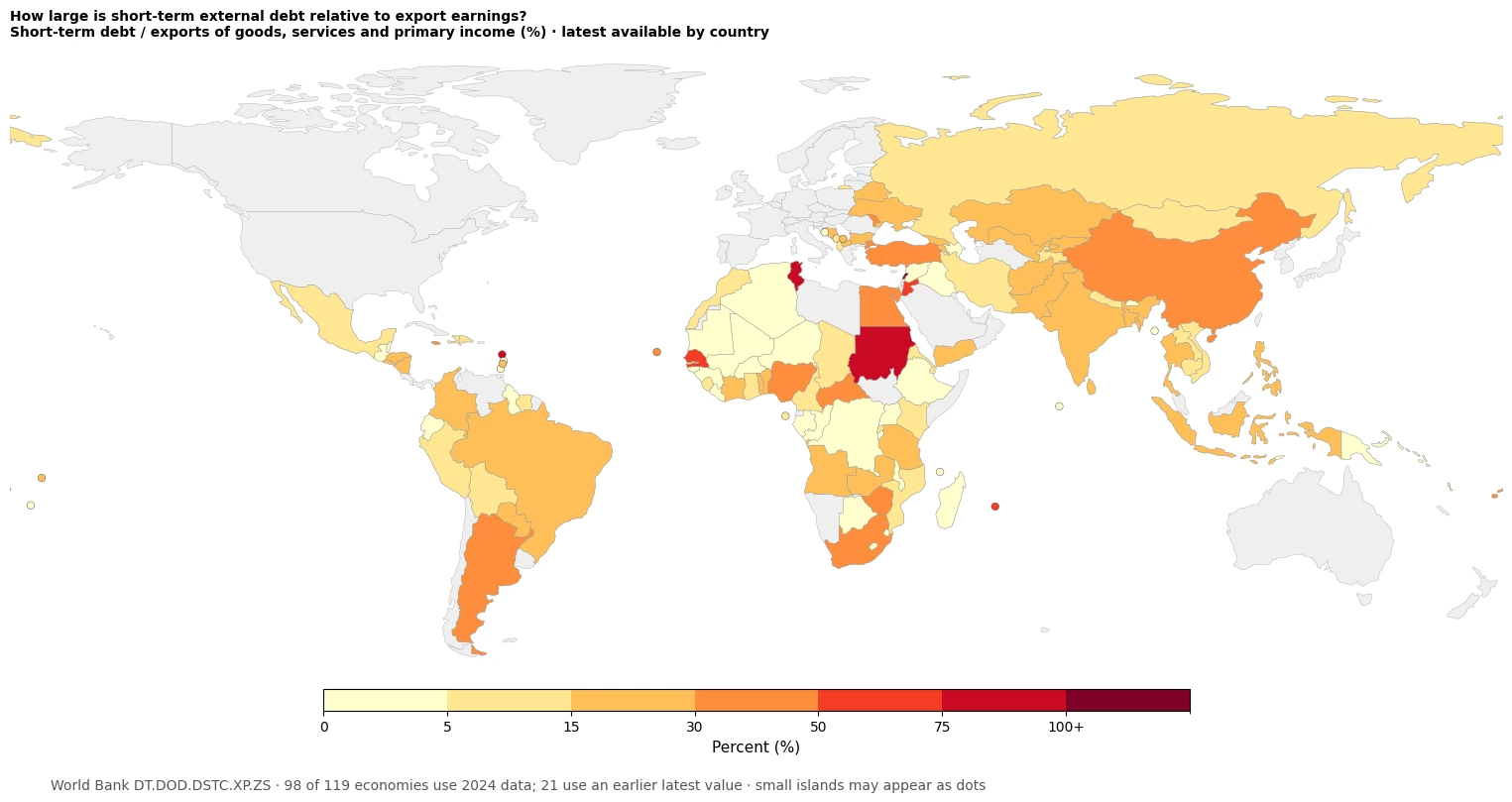
Table of Contents
What this debt-to-exports indicator actually measures
The World Bank defines short-term external debt as external debt with an original maturity of one year or less. The denominator combines exports of goods, exports of services, and primary income receipts. Primary income includes returns associated with providing labor, financial assets, or natural resources across borders. The ratio therefore asks a more specific question than debt-to-GDP: how large is short-term external debt relative to a broad stream of external earnings?
A value of 50% means that the measured short-term debt stock is roughly half the size of the exports-of-goods, services, and primary-income denominator used by the indicator. A value above 100% means the debt stock is larger than that denominator. It does not mean that a country must use every dollar of one year’s exports to repay the debt immediately. Repayment schedules, refinancing, reserves, currency composition, the public-private split, and longer-term liabilities are separate questions.
World Bank metadata places the series in International Debt Statistics and reports it annually. Debt ratios can help identify pressure points and countries that deserve further investigation, but there is no universal cutoff in this indicator that automatically labels a country safe or unsafe. It is best used as one part of an external-debt dashboard rather than as a standalone crisis score.
The 2024 comparison: which observations are highest?
For a synchronized comparison, this article isolates the 98 observations dated 2024. Their simple unweighted median is 12.9% and their simple mean is 16.3%. The mean sits above the median because a small upper group in the 50–75% range pulls the distribution upward. The table below lists the ten highest 2024 observations in the verified file.
| Country or economy | 2024 ratio |
|---|---|
| Tunisia | 75.7% |
| Dominica | 75.1% |
| Jordan | 72.1% |
| Mauritius | 57.1% |
| Zimbabwe | 48.0% |
| Argentina | 47.1% |
| Türkiye | 46.4% |
| Egypt, Arab Rep. | 46.3% |
| Nigeria | 36.2% |
| South Africa | 33.8% |
This is a ratio ranking, not a ranking of the absolute amount of external debt. A smaller economy can post a high percentage while owing far fewer dollars than a larger economy. The ratio can also rise because the denominator weakens, even if short-term debt itself is unchanged. Explaining why a country moved requires the debt stock and the export-and-income denominator to be examined separately over time.
Most 2024 observations are below 30%
The distribution is less extreme than the darkest map colors may suggest. Among the 98 same-year observations, 31 are below 5%, 23 fall from 5% to below 15%, and 29 fall from 15% to below 30%. That puts 83 of 98 observations below 30%. Eleven are between 30% and 50%, and only four are at or above 50%.
| 2024 band | Number of observations |
|---|---|
| 0 to <5% | 31 |
| 5 to <15% | 23 |
| 15 to <30% | 29 |
| 30 to <50% | 11 |
| 50% or more | 4 |
Four 2024 observations are recorded as exactly 0.0%: Burkina Faso, Bhutan, Liberia, and Tonga. Those values are not missing observations converted to zero. They are numeric zeros retained from the cleaned World Bank data. Missing data and low values should remain separate because a blank observation does not imply an absence of debt.
North Africa and the Middle East show sharp neighboring differences
One of the clearest geographic contrasts appears across North Africa and the Middle East. Tunisia is 75.7% in 2024, Jordan 72.1%, and Egypt 46.3%. In the same broad region, Morocco is 10.9%, Algeria 3.1%, and Iraq 0.6%. Proximity therefore does not produce one common debt-to-exports pattern. Neighboring economies can occupy very different classes even when they share exposure to some of the same regional trade and financial conditions.
Lebanon appears in the very top color range at 135.9%, but its observation is dated 2023. It is deliberately excluded from the 2024 ranking. This is a good example of why a latest-value map should be paired with a reference-year check before turning colors into a league table.
Africa contains both high and very low ratios
The African pattern is also mixed. Mauritius is 57.1% in 2024, Zimbabwe 48.0%, Nigeria 36.2%, and South Africa 33.8%. Botswana is only 2.5%, Lesotho 0.2%, Burundi 0.7%, and Mali 0.7%. The continent therefore cannot be summarized by one debt color or one broad regional label.
Several high-looking African observations are older than 2024. Senegal is 63.1% in 2023 and Sudan is 75.4% in 2022. The Central African Republic is 39.3%, but its latest row in the supplied data is from 1993. These cases remain useful for showing data availability, yet they should not be described as current 2024 conditions.
Asia and Eurasia contain broad middle ranges with local exceptions
Among selected 2024 Asian observations, China is 31.0%, Bangladesh 24.4%, Pakistan 23.3%, and India 16.0%. These percentages compare the same metric, but they do not reveal which country has the largest short-term debt stock in dollars. Equal ratios can be produced by very different debt and export-income levels.
Across Türkiye, Eastern Europe, and Central Asia, Türkiye is 46.4%, Moldova 32.5%, Ukraine 27.7%, Kazakhstan 20.5%, and Belarus 19.1%. The map makes these local contrasts easy to spot. It does not, however, identify the cause. Interest rates, exchange rates, bank funding, trade shocks, or policy changes would require country-specific evidence and a time series before they could be used as explanations.
Latin America also spans several map classes
In Latin America, Argentina stands out at 47.1% in 2024. Colombia is 24.2%, Brazil 19.7%, Mexico 8.7%, and Bolivia 6.2%. That spread shows why the ratio is useful geographically: it can point to observations that differ strongly from nearby economies. The next step should be deeper data work, not an automatic prediction about default risk, exchange rates, or market performance.
Why the latest-value map and the 2024 ranking are separate
The year distribution explains the choice. Of the 119 latest non-empty observations, 98 are dated 2024, six are from 2023, four from 2022, one from 2021, two from 2020, and eight are from 2019 or earlier. The oldest latest values in the file are the Central African Republic in 1993 and Chad in 1994.
| Latest observation year | Rows |
|---|---|
| 2024 | 98 |
| 2023 | 6 |
| 2022 | 4 |
| 2021 | 1 |
| 2020 | 2 |
| 2019 or earlier | 8 |
The two views therefore answer different questions. The 119-row map asks, “What is the latest non-empty observation available for each country in this collected dataset?” The 98-row same-year analysis asks, “How did countries with a 2024 observation compare with one another in 2024?” Keeping those questions separate avoids turning old but valid observations into misleading current rankings.
A high ratio is not an automatic debt-crisis label
A high value signals that short-term external debt is large relative to the exports-and-primary-income denominator. That can matter because short maturities create refinancing and foreign-currency needs. But the ratio alone cannot establish whether those needs are manageable. International reserves, the maturity calendar, access to refinancing, the currency of liabilities, bank liquidity, long-term debt, and the split between public and private borrowers can all change the practical risk.
A low ratio is not a complete certificate of external strength either. An economy can have other large liabilities, weak reserves, concentrated exports, or a very different long-term debt profile. This indicator is valuable because it normalizes one liability against one broad source of external earnings, but it is not a composite score of an economy’s financial health.
The denominator also moves. If short-term debt is unchanged but exports of goods and services or primary income receipts fall, the ratio can increase. If external earnings rise strongly, the ratio can fall without any debt repayment. A proper change analysis therefore needs the numerator and denominator series in addition to the ratio itself.
Data source and mapping method
The statistical source is World Bank World Development Indicators series DT.DOD.DSTC.XP.ZS, titled “Short-term debt (% of exports of goods, services and primary income).” The underlying source is International Debt Statistics. World Bank metadata defines short-term external debt by original maturity of one year or less and defines the denominator as goods exports, services exports, and primary income receipts.
This package uses the cleaned CSV collected and validated on September 10, 2026. It retains 119 real country or economy rows with the latest non-empty observation found by the collection recipe. The map displays those latest values. The synchronized rankings, mean, median, and band counts are recalculated only from the 98 rows dated 2024. No older value is pulled into the 2024 table, and missing observations are not replaced by zeros.
Country codes are joined to a simplified world boundary layer for the visual. Small islands and places that are not represented as a separate polygon in that low-resolution geometry are plotted as location points so that their valid statistical observations are not silently dropped from the map. Statistical calculations continue to use the full verified rows rather than only the countries that can be filled as polygons.
- World Bank Data – Short-term debt (% of exports of goods, services and primary income)
- World Bank WDI Metadata Glossary – DT.DOD.DSTC.XP.ZS
How to use this map without overreading it
A practical workflow is to start with the map and locate unusually high colors or sharp differences between neighboring countries. Next, check the reference year. If the value is old, treat it as a data-availability signal rather than a current condition. If the value is from 2024, use the same-year distribution and ranking in this article to understand where it sits relative to the other 2024 observations.
Then separate the ratio into its two sides before explaining a change. Check whether short-term external debt rose, whether exports and primary income weakened, or whether both moved. Finally, pair the result with other official external-sector measures when the question is about resilience or repayment capacity. Used this way, the map becomes a screening tool for deeper country analysis rather than a simplistic debt scoreboard.
Frequently Asked Questions
Does a high short-term debt ratio mean a country is in a debt crisis?
Not by itself. The ratio compares short-term external debt with exports of goods, services and primary income. Reserves, repayment schedules, refinancing access, long-term debt, currency composition and other external-sector indicators are also needed.
Why do the latest values come from different years?
The collection keeps the most recent non-empty observation for each country. Of 119 rows, 98 are dated 2024 and 21 are older. The map shows latest available values, while the same-year ranking uses only the 2024 observations.
What does a value above 100% mean?
It means the measured short-term external debt stock is larger than the indicator denominator of goods exports, services exports and primary income receipts. It does not mean all debt must be repaid immediately from one year of export earnings.
Are countries shown at 0% actually missing data?
No. Numeric 0.0 observations in the cleaned data are retained as zero. Missing observations are not converted to zero, so a very low value and a missing value should be interpreted separately.
Related Articles
For broader context, the following published Green Blog insights compare other country-level macroeconomic indicators. They measure different concepts, so their values should not be combined directly with the debt-to-exports ratio; use them to compare economic scale, growth, and labor-market conditions alongside this external-debt view.
- Global GDP Growth Map – Country Patterns in 2025
- Global GDP per Capita Map 2025 – Country Comparison
- Global Unemployment Rate Map – Country Patterns in 2025
Green Map creates custom-edited map images using open geographic data sources such as geoBoundaries, Natural Earth, OpenStreetMap, and government open data.
These maps are edited visual materials, not raw data files, and are provided for education, documents, presentations, and graphic reference.