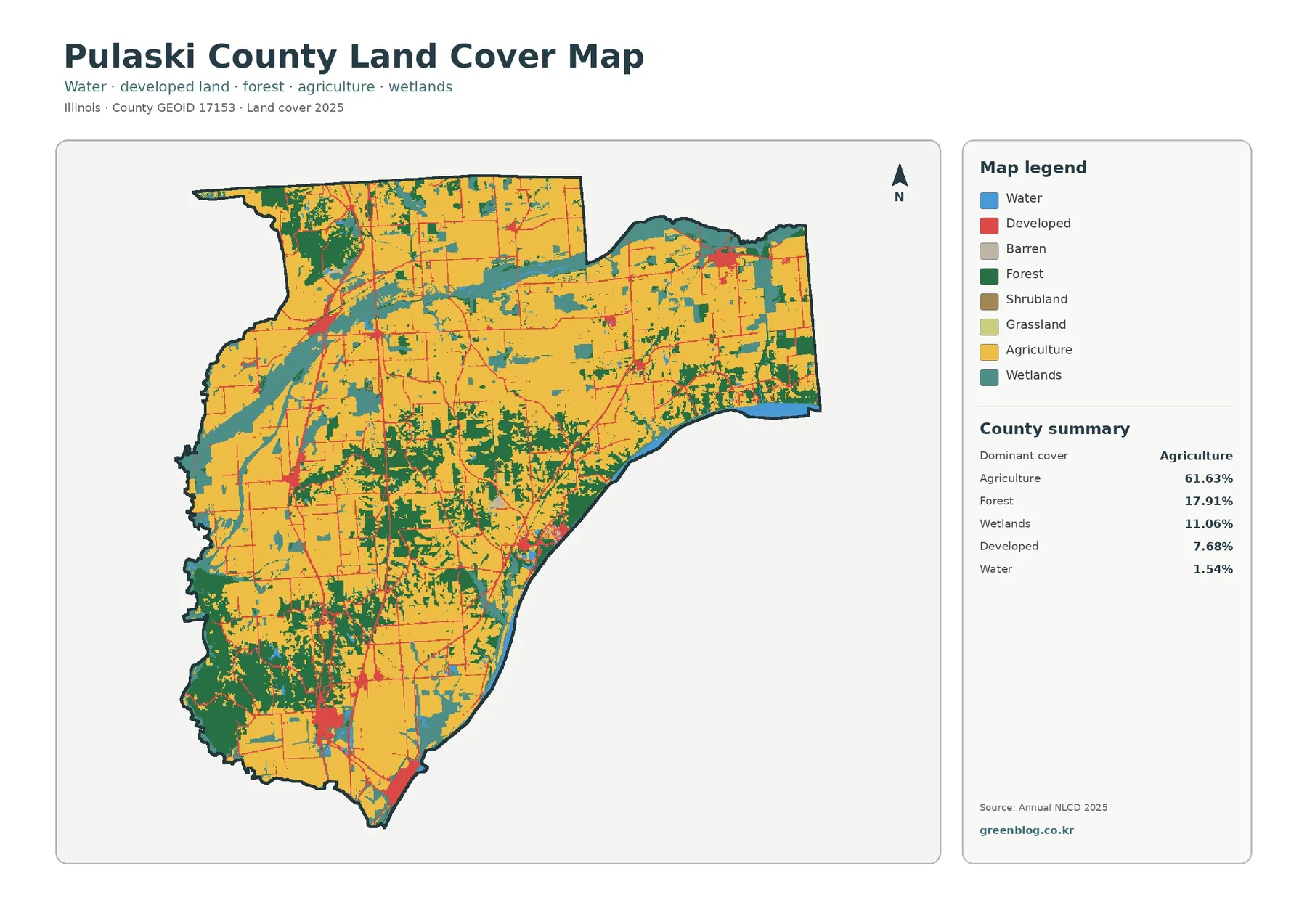
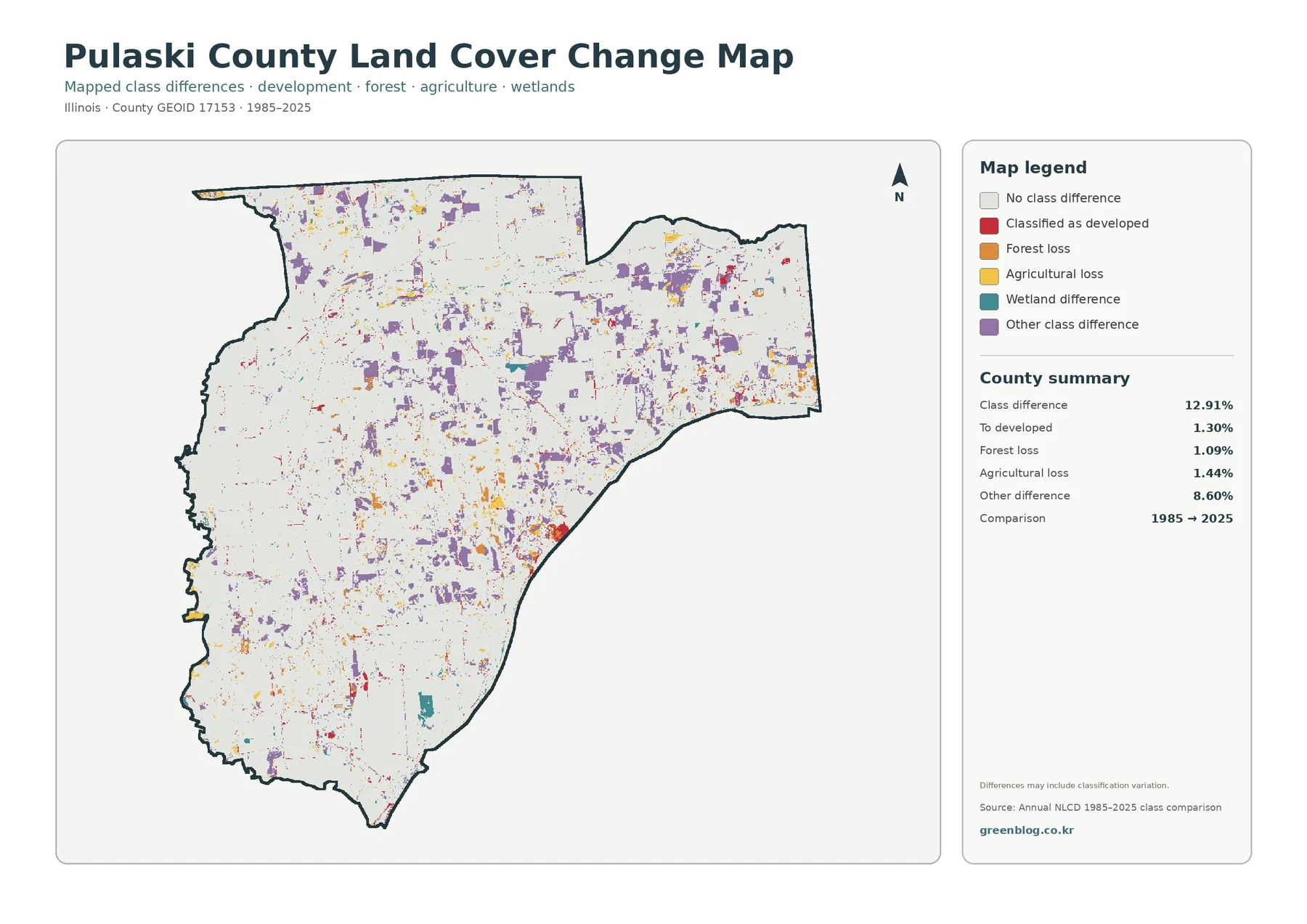
Pulaski County sits near the southern end of Illinois, where broad farm fields share a relatively small county with substantial forest, wetlands, water, and several separate developed centers. The 2025 summary classifies 61.63% of the county as agriculture, 17.91% as forest, 11.06% as wetlands, 7.68% as developed land, and 1.54% as water. The four maps on this page separate those patterns into an overall land-cover view, a forest-and-farmland view, an impervious-surface view, and a 1985–2025 class-difference view.
The map set is designed for both quick reference and closer comparison. Start with the overall map to see the county-wide mix, then use the specialized views to compare wooded areas, cropland, wet ground, paved surfaces, and mapped differences between two dates. The four original JPG maps are available together in one download near the end of the article, which makes the set useful for teaching, presentations, local environmental context, and printed reference sheets.
Table of Contents
A farm county with a much more varied southern landscape
Agriculture is the dominant cover, but it does not create a uniform sheet across Pulaski County. Large agricultural blocks are especially easy to see across much of the north and central interior. Farther south, the pattern becomes more mixed as forest patches widen and connect, while wetlands occupy long irregular areas beside and between fields. Smaller wooded pockets also break up the northern farm pattern. This combination is more informative than the county-wide percentage alone because it shows where the major covers meet.
Land cover is a description of what is on the surface, not a zoning map or a parcel ownership record. A cell classified as agriculture indicates a mapped surface category; it does not tell the reader whether that parcel has an agricultural zoning designation or whether it may be developed. The same caution applies to wetlands and developed land. These maps are best used to compare broad surface patterns at county scale.
What 61.63% agriculture misses at first glance
The county summary makes agriculture the clear first-place category at 61.63%. Forest is a distant second at 17.91%, yet that forest is visually important because it forms larger connected patches in the south and branching belts through the middle of the county. Wetlands account for another 11.06%. Together, forest and wetlands cover almost three-tenths of the county, so natural cover remains a major part of the landscape even though cropland occupies the largest share.
Developed land reaches 7.68%, but it appears as multiple compact areas and narrow transportation lines rather than one continuous urban field. Water is only 1.54% by area, yet blue and wetland-colored corridors help define several edges and internal transitions. That is one reason the overall map works well for regional context: a small percentage can still be geographically important when it follows rivers, sloughs, or the county boundary.
Forest and farmland become easier to compare when development is muted
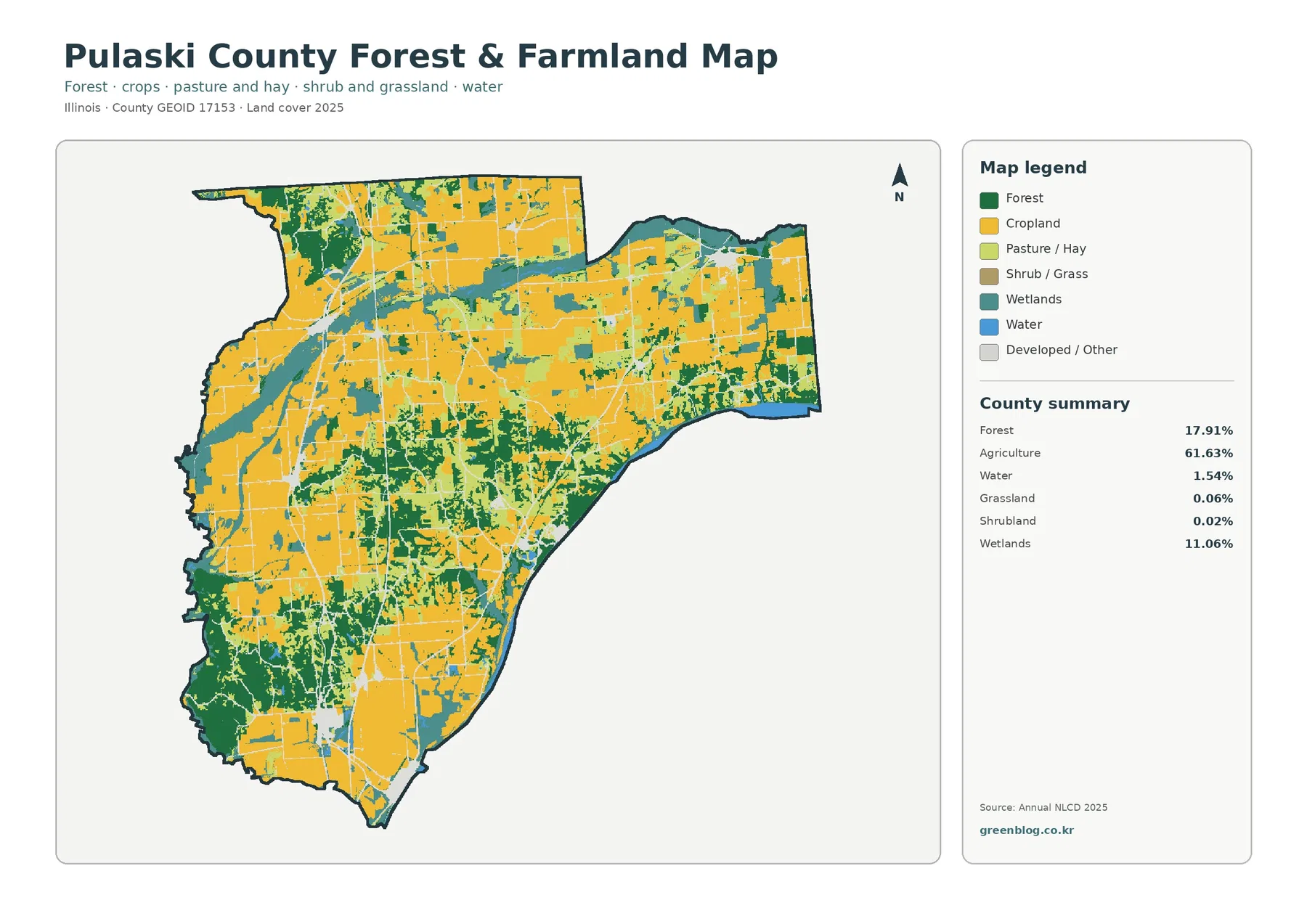
The forest-and-farmland map removes much of the visual competition from developed classes and gives priority to forest, cropland, pasture or hay, shrub and grass, wetlands, and water. In this view, the northern and central agricultural blocks look especially broad. The wooded south becomes equally clear, with dark green areas forming substantial patches rather than isolated dots. Central Pulaski County also contains a more intricate mixture of woods and fields than a simple “farm county” label would suggest.
Grassland and shrubland are minor categories in the supplied summary, at 0.06% and 0.02% respectively. They should not be presented as major landscape types. Wetlands, by contrast, cover 11.06% and repeatedly appear beside forest and agricultural land. For a lesson or presentation about the balance between working farmland and natural cover, this map is often easier to read than the full multi-class version.
Why the Cache River context matters to the wetland pattern
The mapped wetlands are not just a decorative fringe around the county. The Illinois Department of Natural Resources identifies Pulaski County as one of the counties containing the Cache River State Natural Area. That protected landscape includes floodplain forest, swamp, wetland, and aquatic communities, including the Lower Cache River Swamps. The land-cover map should not be used to assume that every teal cell belongs to the natural area, but the official landscape context helps explain why wetlands and bottomland forest deserve more attention here than they would in many heavily farmed Illinois counties.
An Illinois emergency-management plan for Pulaski County also places the county across major drainage areas associated with the Cache River and the Ohio River. It lists streams, sloughs, and water bodies within the county and identifies communities such as Mound City, Mounds, Ullin, Pulaski, Olmsted, New Grand Chain, and Karnak. Those details provide useful geographic context for the irregular wetland and water patterns visible in the supplied maps, while the map itself remains a generalized land-cover product rather than a hydrologic engineering map.
Paved and built surfaces form small clusters instead of a continuous urban zone
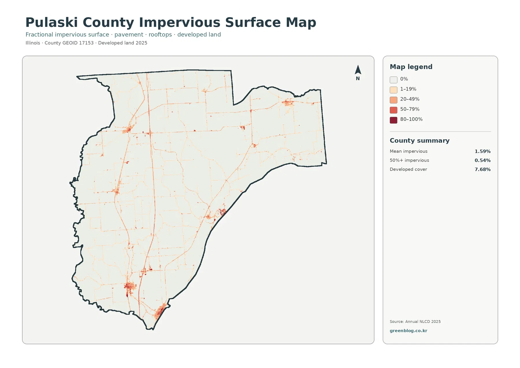
The impervious-surface map measures surfaces such as pavement and rooftops that do not readily absorb water. Pulaski County has a mean impervious value of 1.59%, and only 0.54% of the county is mapped at 50% impervious or higher. Most of the map therefore stays in the zero or low-percentage classes. Roads appear as thin lines, while several towns and developed areas create compact orange or red clusters at separated points.
This distribution helps distinguish the county from a metropolitan landscape. The developed cover class totals 7.68%, but much of it is low-intensity or open development rather than densely paved ground. A red or dark cell should not be interpreted as a specific building without additional local data. At this scale, the value of the map is to show where higher impervious percentages concentrate relative to the much larger agricultural, forested, and wetland surroundings.
The 12.91% class difference is not the same as a 12.91% development increase
The 1985–2025 comparison marks a class difference across 12.91% of the county. Within that total, 1.30% is classified as “to developed,” 1.09% as forest loss, 1.44% as agricultural loss, and 8.60% as other class difference. Because the “other” category is by far the largest, the total difference cannot be treated as a simple development or deforestation rate.
That distinction is visible on the map. Purple other-difference cells are scattered broadly, while red developed-change areas are smaller and more concentrated. Yellow and orange change classes also appear in many separate patches rather than one dominant front. Long-term comparisons can reflect genuine land-cover change, but they can also contain classification variation, edge effects, mixed pixels, or differences in imagery between dates. A specific site should therefore be checked against aerial photography or local records before assigning a cause.
A practical way to read the four maps together
Use the general land-cover map first when the goal is to explain the county as a whole. It makes the 61.63% agricultural share easy to compare with forest and wetland belts. If the question is specifically about farming versus natural cover, move to the forest-and-farmland map, where developed classes are less visually prominent. For settlement and pavement questions, the impervious map is more precise because it separates low and high fractions of hard surface. The change map belongs at the end of the sequence because it requires the most caution in interpretation.
The same workflow works well in classrooms and presentations. Students can identify the dominant county-wide cover, trace where forest becomes more continuous, and then compare those places with wetland corridors. A local planning presentation can use the impervious map to show that built surfaces are concentrated in several separate centers. An environmental lesson can pair the wetland distribution with the Illinois DNR material on the Cache River. None of those uses requires treating the map as a parcel-level authority.
Map scale, raster cells, and details the images cannot answer
The WebP images in the article are designed for online viewing. The download contains four original JPG files, each 2480×1754 pixels, matching the supplied package. Enlarging them can make labels and broad patterns easier to see, but it does not create new ground detail. Narrow tree lines, small drainage features, individual buildings, and parcel boundaries may be generalized or absent.
Annual NLCD is a raster classification, meaning the landscape is represented by a grid of cells. A cell may contain more than one real-world surface, yet the map must assign a category or percentage according to the dataset. Mixed pixels are especially important near roads, water edges, forest margins, and small developed sites. For that reason, the maps are appropriate for county-scale comparison, educational work, and broad environmental context, but they should not replace surveys, wetland determinations, zoning records, flood studies, or current site inspections.
Which JPG should you choose first?
Choose the overall land-cover JPG when you need one image that represents the county’s complete mix. Select the forest-and-farmland map for an agricultural or habitat comparison, and use the impervious map when roads, paved surfaces, or settlement clusters are the subject. The 1985–2025 map works best when a presentation explicitly discusses mapped class differences over time. Keeping each image at a readable size is usually more useful than shrinking all four into one dense figure.
Frequently Asked Questions
Is Pulaski County mostly farmland or wetlands?
Agriculture is the largest mapped category at 61.63%, so farmland is dominant at county scale. Wetlands still account for 11.06%, and forest adds another 17.91%. The supplied maps therefore show a farm-dominated county with a substantial wetland-and-forest component, especially where natural cover becomes more continuous in the southern and river-influenced parts of the landscape.
Does the 12.91% class difference mean 12.91% of the county was developed?
No. The “to developed” category is 1.30%. The largest component of the 12.91% total is the 8.60% other-difference category. The comparison can include both real land-cover change and classification variation, so the total should not be reported as a development rate.
What files are included in the Pulaski County download?
The ZIP contains four JPG files: the 2025 land-cover map, the forest-and-farmland map, the impervious/developed-land map, and the 1985–2025 land-cover change map. Each supplied JPG is 2480×1754 pixels.
Map File Information
The download contains four original Pulaski County JPG maps covering 2025 land cover, forest and farmland, impervious/developed land, and 1985–2025 land-cover class differences.
- Included Files: Use only the versions confirmed in the article and supplied images
- File Type: Use the confirmed download contents
- Intended Use: Printing, education, presentations, and map-based projects
Related Maps
- Adams County Illinois Land Cover Map
- Alexander County Illinois Land Cover Map
- Bond County Illinois Land Cover Map
Sources and References
- MRLC Annual NLCD Data – source portal for annual land-cover products.
- USGS Annual NLCD Land Cover Classification – explanation of the land-cover classification system.
- U.S. Census Bureau TIGER/Line Shapefiles – county boundary reference.
- Illinois DNR Cache River State Natural Area – official context for wetlands, floodplain forest, and protected natural areas extending into Pulaski County.
- Illinois IEMA Pulaski County Plan – county-specific background on waterways, drainage, communities, and earlier land-cover context.
Green Map creates custom-edited map images using open geographic data sources such as geoBoundaries, Natural Earth, OpenStreetMap, and government open data.
These maps are edited visual materials, not raw data files, and are provided for education, documents, presentations, and graphic reference.