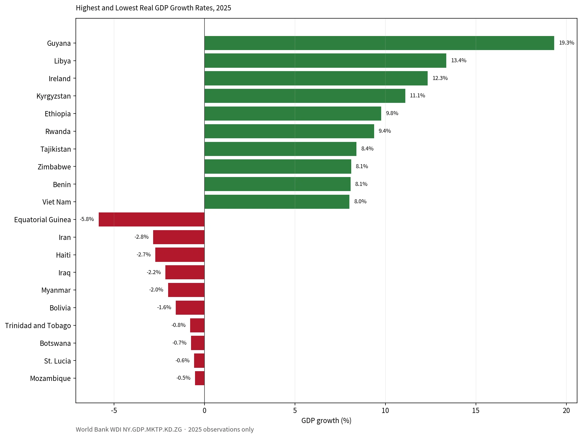
Global GDP growth map compares 2025 real GDP growth rates across countries using one World Bank indicator and one observation year. The source is World Development Indicators series NY.GDP.MKTP.KD.ZG. After removing World Bank regional aggregates and keeping only 2025 observations, the comparison contains 186 countries and economies. The map groups growth rates into broad ranges, while the second graphic shows the ten highest and ten lowest values.
GDP growth is a speed measure, not a size ranking. A very large economy can expand at a modest percentage rate, while a much smaller economy can record double-digit growth. That is why the countries at the top of a GDP growth table are not the same as the countries at the top of a current-dollar GDP table. The two measures answer different questions.
Across the 186 economies in this same-year set, the median growth rate is about 3.4% and the simple mean is 3.6%. Growth is positive in 176 economies and negative in 10. Forty-five record growth of at least 5%, and 11 are at or above 8%. A single annual rate cannot establish a long-run trend, but the spread is large enough to reveal clear geographic contrasts.
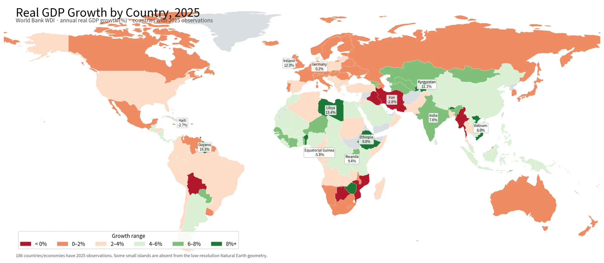
Table of Contents
What stands out on the global GDP growth map
Fast growth is not confined to one continent. Many African and Asian economies fall in the 4–8% bands, Guyana stands out sharply in South America, and Ireland is a major European outlier. Much of Europe sits in lower positive bands, but the continent is not uniform. The result is a patchwork rather than a simple north-south or rich-poor divide.
Guyana leads the 2025 observations at 19.3%, followed by Libya at 13.4%, Ireland at 12.3%, the Kyrgyz Republic at 11.1%, Ethiopia at 9.8%, and Rwanda at 9.4%. Tajikistan is 8.4%; Zimbabwe and Benin are just above 8.0%; Viet Nam is about 8.0%. These figures rank the pace of real output change in 2025. They are not rankings of economic size, living standards, or the overall quality of an economy.
At the lower end, Equatorial Guinea is -5.8%, Iran -2.8%, Haiti -2.7%, Iraq -2.2%, Myanmar -2.0%, and Bolivia -1.6%. Trinidad and Tobago, Botswana, St. Lucia, and Mozambique also show small contractions. Economies close to zero are better read as having little real output growth in the year rather than as meaningfully different because of a few tenths of a percentage point.
Highest and lowest real GDP growth rates in 2025
| Higher-growth economy | 2025 real GDP growth |
|---|---|
| Guyana | 19.3% |
| Libya | 13.4% |
| Ireland | 12.3% |
| Kyrgyz Republic | 11.1% |
| Ethiopia | 9.8% |
| Rwanda | 9.4% |
| Tajikistan | 8.4% |
| Zimbabwe | 8.1% |
| Benin | 8.1% |
| Viet Nam | 8.0% |
The high-growth group spans South America, North Africa, Europe, Central Asia, and East Africa. That diversity is important. The same 8–13% headline rate can emerge in economies with very different sector mixes, starting points, populations, and recent histories. The map is therefore best used to identify outliers and clusters first; country-specific causes require additional evidence.
| Lower-growth economy | 2025 real GDP growth |
|---|---|
| Equatorial Guinea | -5.8% |
| Iran, Islamic Rep. | -2.8% |
| Haiti | -2.7% |
| Iraq | -2.2% |
| Myanmar | -2.0% |
| Bolivia | -1.6% |
| Trinidad and Tobago | -0.8% |
| Botswana | -0.7% |
| St. Lucia | -0.6% |
| Mozambique | -0.5% |
How several large economies compare
Looking only at several large economies produces a different ranking. India is at 7.6%, Indonesia 5.1%, and China 5.0%. The United States is 2.2%, Brazil 2.3%, Canada 1.7%, the United Kingdom 1.4%, Japan 1.2%, South Korea 1.0%, France 0.8%, Mexico 0.6%, and Germany 0.2%. This is why the map colors India and China more strongly than many large Western European economies even though those European economies remain much larger than many fast-growing countries.
The contrast is a useful reminder to separate speed from scale. Comparing the United States at 2.2% with Guyana at 19.3% does not imply that Guyana has the larger economy. The growth rate is a year-over-year percentage change in real output; GDP level is the amount of output at a point in time. A large economy can add a large amount of output with a lower percentage increase.
Why the map uses 2025 only instead of each country’s latest value
International databases often have different latest years across economies. A “latest available” sort can therefore mix 2025, 2024, and older observations. That is useful when the goal is to show the newest number for each place, but it is not a strict same-year comparison. For this map, only observations labeled 2025 are retained. Economies whose latest available value is from another year are left out of the 2025 ranking and color comparison.
This choice trades some coverage for comparability. A valid 2024 figure is still useful for the economy it describes, but placing it next to a 2025 figure without a visible time distinction can be misleading. A cross-country snapshot should align the year; a country trend article should instead use the full time series.
Regional clusters are useful, but exceptions matter
The map shows broad areas of medium-to-fast growth across Africa and Asia, while many European economies fall in the 0–4% range. Yet the exceptions are just as informative. Ireland is above 12% in Europe. Africa contains several 8–10% economies but also Equatorial Guinea at -5.8%. South America includes the world’s highest 2025 observation in Guyana, while Bolivia is negative.
For that reason, a continental average is not a substitute for a country map. Neighboring economies can have very different annual growth rates, and similar colors do not imply the same underlying cause. The dataset supports a geographic statement about the distribution of 2025 real GDP growth. Explaining why an individual country accelerated or contracted requires separate sector, investment, policy, and base-year evidence.
What GDP growth measures—and what it does not
The World Bank indicator reports the annual percentage growth rate of GDP at market prices using constant-price data. In practical terms, it is designed to measure changes in real economic output rather than changes caused only by higher prices. It is therefore different from GDP in current U.S. dollars, GDP per capita, household income, employment, or inflation.
A high GDP growth rate says real output expanded rapidly in the measured year. It does not mean every household’s income rose at the same pace, and it does not show whether the gain was evenly distributed. A negative rate likewise does not mean every industry contracted. The map works best as a first-pass economic geography tool, not as a one-number score of wellbeing or investment attractiveness.
Source and mapping method
The values come from the World Bank World Development Indicators GDP growth (annual %) series, indicator code NY.GDP.MKTP.KD.ZG. This article keeps only 2025 observations and excludes World Bank regional and income-group aggregate rows. That leaves 186 countries and economies in the comparison.
The visualization joins the values to a low-resolution world country boundary layer. Very small islands and some special territories are not represented in that geometry, so an economy can have a 2025 statistical observation and still be absent from the rendered map. The table and calculations are based on the statistical rows, not on whether a polygon is visible at this map scale.
Frequently Asked Questions
Does this map show nominal GDP growth?
No. World Bank indicator NY.GDP.MKTP.KD.ZG is the annual growth rate of GDP at market prices using constant-price data. It is a real-growth measure and is different from current-dollar GDP size.
Are all values on the map from 2025?
Yes. Because the latest available year can differ by economy, this article keeps only countries and economies with a 2025 observation so the colors refer to the same year.
Is the fastest-growing economy also the largest economy?
No. GDP growth is a percentage change in real output from the previous period. Economic size is a separate level measure, so a smaller economy can grow faster than a much larger one.
Related Articles
Country maps provide useful geographic context for several of the strongest 2025 growth observations. Guyana, Ireland, and India are all prominent in this comparison, while the South America map helps place the Guyana outlier beside its regional neighbors.
- Printable Guyana Map for Classrooms, Presentations, and Editing
- Ireland Map Set with Color, Basic and Outline Versions
- India Maps Download Collection
- South America Map: Printable Country Map Collection
Green Map creates custom-edited map images using open geographic data sources such as geoBoundaries, Natural Earth, OpenStreetMap, and government open data.
These maps are edited visual materials, not raw data files, and are provided for education, documents, presentations, and graphic reference.