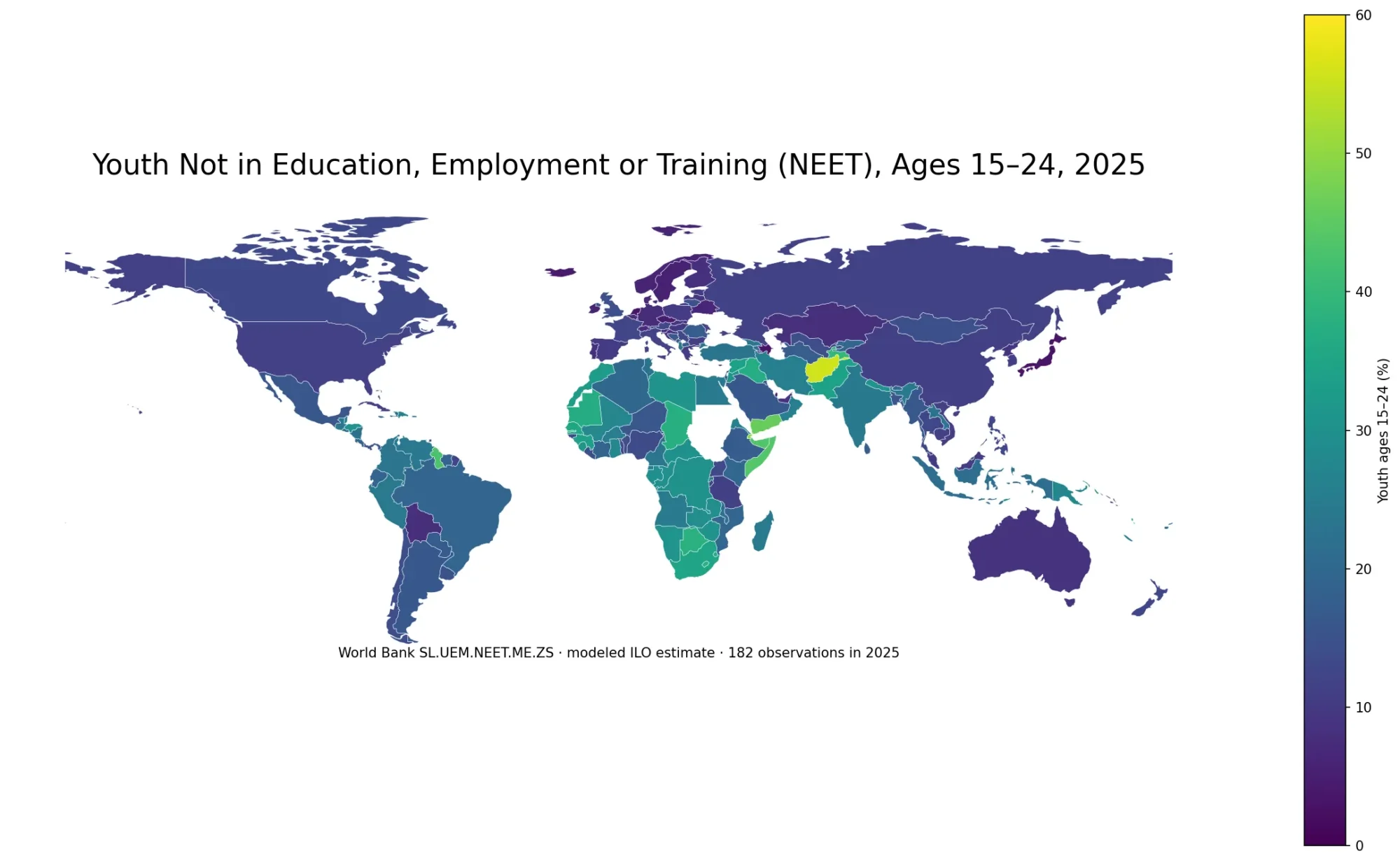
Government health spending can occupy a modest share of the economy in one country and a very large share in another. The World Bank indicator SH.XPD.GHED.GD.ZS measures domestic general government health expenditure as a percentage of GDP. In practical terms, a value of 5% means that public health expenditure financed from domestic public sources was equivalent to about 5% of that economy’s GDP in the observation year. It does not directly measure healthcare quality, access, life expectancy, hospital capacity, or household out-of-pocket costs.
The latest non-empty observations cover 193 economies, but they are not all from the same year. There are 185 observations from 2023, seven from 2024, and one from 2021. The map should therefore be read as a latest-available comparison for 2021–2024, not as a uniform 2024 world ranking. Across all 193 latest observations, the median is 3.15% of GDP and the mean is 3.73%.
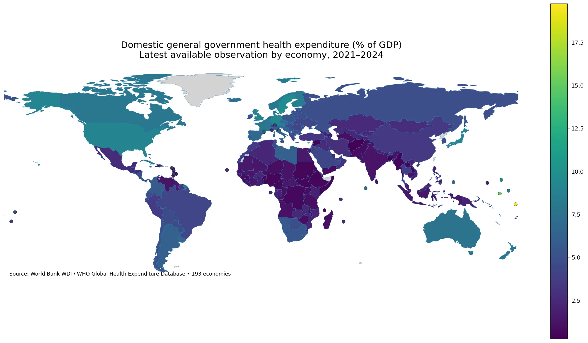
Table of Contents
What the indicator measures
The numerator is public expenditure on health from domestic sources, while the denominator is GDP. That distinction matters because this is not the same question as “what share of the government budget goes to health?” A separate indicator uses total general government expenditure as the denominator. It is also different from the share of current health expenditure financed by domestic government sources. Those related measures can all be useful, but each answers a different financing question.
Using GDP as the denominator places public health spending in the context of the entire economy. A country can have a large health budget in absolute currency terms but a lower percentage if its economy is very large. Another economy can have a smaller absolute budget yet a higher GDP share. The ratio is therefore most useful for comparing the economic scale of domestic public health spending, not for ranking the quality or efficiency of health systems.
World Bank metadata identifies the WHO Global Health Expenditure Database as the underlying source and notes that estimates are prepared under the System of Health Accounts 2011 framework. That common framework improves international comparability, but policy interpretation still requires context such as population structure, health needs, prices, coverage arrangements, fiscal capacity, and the mix of public and private financing.
The observation years are closely aligned, but not identical
Of the 193 economies, 185—about 95.9%—have a 2023 observation. The seven 2024 observations are Canada, France, Denmark, Colombia, Luxembourg, Chile, and Korea, Rep.; Ukraine is the only economy whose latest value in this dataset is from 2021. This is a much narrower year spread than many “latest available” global datasets, but the small mismatch still matters when interpreting close ranks.
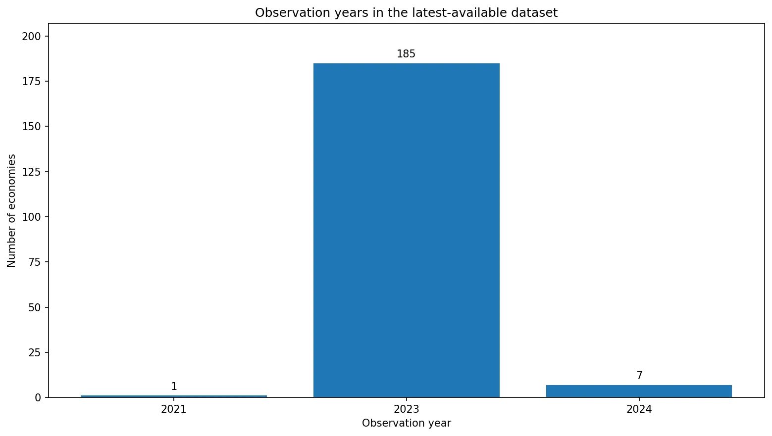
For a cleaner same-year comparison, the 185 economies observed in 2023 can be analyzed separately. Their median is 2.95% of GDP and their mean is 3.63%. The median for all latest observations is slightly higher at 3.15% because the seven 2024 observations all fall between 4.91% and 7.94%. This is a useful reminder that even a small number of newer observations can shift summary statistics.
The highest shares combine small island economies and major high-spending countries
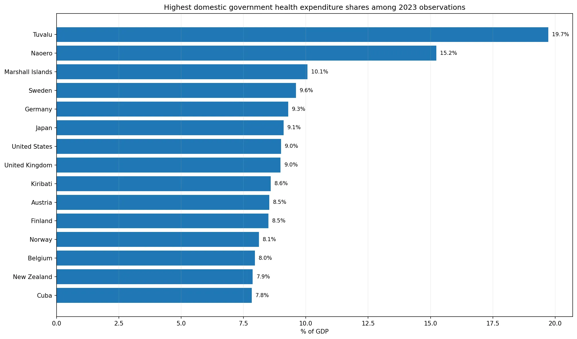
Tuvalu has the highest latest value at 19.72% of GDP, followed by Naoero at 15.23% and the Marshall Islands at 10.06%; all three are 2023 observations. Sweden is next at 9.60%, Germany at 9.29%, Japan at 9.11%, the United States at 9.01%, and the United Kingdom at 8.99%. The upper end therefore includes both very small Pacific economies and large economies, which cautions against treating a high ratio as the product of a single structural factor.
| Economy | Observation year | Share of GDP |
|---|---|---|
| Tuvalu | 2023 | 19.72% |
| Naoero | 2023 | 15.23% |
| Marshall Islands | 2023 | 10.06% |
| Sweden | 2023 | 9.60% |
| Germany | 2023 | 9.29% |
| Japan | 2023 | 9.11% |
| United States | 2023 | 9.01% |
| United Kingdom | 2023 | 8.99% |
The map also shows a broad band of relatively high values across parts of Northern and Western Europe. Norway records 8.12%, Spain 6.75%, Italy 6.14%, and the Netherlands 6.72%. Australia is at 7.66% and New Zealand at 7.87%, while Japan stands out in East Asia at 9.11%. These geographic clusters are descriptive patterns, not evidence that neighboring countries share the same financing model or health outcomes.
At the lower end, many economies remain below 1% of GDP
Afghanistan records 0.25%, Haiti 0.30%, Bangladesh 0.31%, the Syrian Arab Republic 0.40%, Benin 0.49%, Myanmar 0.50%, South Sudan 0.50%, and Lao PDR 0.53%. Across the full latest-available dataset, 29 economies are below 1% of GDP. Ninety-nine are at or above 3%, 51 are at or above 5%, and only three reach 10% or more.
| Economy | Observation year | Share of GDP |
|---|---|---|
| Afghanistan | 2023 | 0.25% |
| Haiti | 2023 | 0.30% |
| Bangladesh | 2023 | 0.31% |
| Syrian Arab Republic | 2023 | 0.40% |
| Benin | 2023 | 0.49% |
| Myanmar | 2023 | 0.50% |
| South Sudan | 2023 | 0.50% |
| Lao PDR | 2023 | 0.53% |
A low percentage should not be simplified into a claim that government plays no role in health. The denominator is the entire economy, and this indicator captures domestic public financing rather than every source of health spending. Private financing, household payments, and external resources belong to different parts of the health-financing picture. To understand overall health spending or financial burden on households, this ratio should be read alongside current health expenditure, public financing shares, private financing shares, and out-of-pocket expenditure indicators.
The 2023 distribution centers near 3% of GDP
Among the 185 same-year observations from 2023, the median is 2.95%. The first quartile is 1.46% and the third quartile is 4.93%, so the middle half of economies falls within that range. The mean, 3.63%, is higher than the median because exceptionally high values such as Tuvalu and Naoero stretch the upper tail. For describing a typical economy, the median and interquartile range are therefore more informative than the mean alone.
Several large economies illustrate the spread within the same year. The United States records 9.01%, Japan 9.11%, Germany 9.29%, and Sweden 9.60%, all well above the 2023 median. China is at 3.39%, Brazil at 4.29%, Mexico at 2.68%, India at 1.30%, Indonesia at 1.45%, and Kenya at 1.95%. Same-year comparisons like these reduce the risk of mistaking data freshness for a structural financing difference.
The seven 2024 observations should be treated as newer updates, not a separate trend
The 2024 values are Canada 7.94%, France 7.89%, Denmark 7.83%, Colombia 5.68%, Luxembourg 5.12%, Chile 5.11%, and Korea, Rep. 4.91%. Every one of these values is above the 2023 median, but that does not show that the ratio rose from 2023 to 2024. A trend statement requires each economy’s own time series, not a comparison between different countries observed in different years.
The ratio can change because health spending changes, because GDP changes, or because both move at different rates. Public health expenditure could rise in currency terms while its GDP share falls if the economy expands faster. Conversely, the share could rise during an economic contraction even without a comparable increase in health spending. For that reason, the percentage should not be translated directly into statements about budget growth.
What the map can and cannot tell you
The map is useful for locating broad spatial differences. It highlights high shares in several European countries, unusually high values in a few Pacific island economies, and lower shares across parts of South Asia and several African economies. It also makes neighboring contrasts visible, reminding us that health-financing structures can differ sharply across borders.
The map does not identify the cause of those differences. Demographics, healthcare prices, fiscal capacity, social insurance arrangements, policy choices, conflict, and economic cycles can all matter, but they require additional evidence. Nor does the indicator measure value for money. Two countries can devote the same share of GDP to domestic public health spending while obtaining very different coverage, service quality, or health outcomes.
Source and rules for comparison
The data use the World Bank World Development Indicators series Domestic general government health expenditure (% of GDP), code SH.XPD.GHED.GD.ZS. The World Bank identifies the WHO Global Health Expenditure Database as the source. The indicator is annual and reported as a percentage of GDP.
For cross-country comparison, first check the observation year. If a strict same-year view is required, use the 185 observations from 2023. Second, keep the denominator in mind: this is GDP, not total government spending and not total current health expenditure. Third, avoid turning a high spending share into a verdict on health-system performance. Used with those limits, the indicator is a clear way to see how large domestic public health spending is relative to each economy.
Frequently Asked Questions
What does domestic government health expenditure as a share of GDP measure?
It compares public health expenditure financed from domestic sources with the size of the economy. It is different from health’s share of the government budget or government financing as a share of total health spending.
Are all 193 observations from the same year?
No. There are 185 observations from 2023, seven from 2024, and one from 2021. The 2023 subset is the cleanest same-year comparison.
Does a higher percentage mean a better health system?
No. The indicator measures spending relative to GDP, not quality, access, efficiency, or health outcomes. Those questions require additional indicators.
Related Articles
Green Map creates custom-edited map images using open geographic data sources such as geoBoundaries, Natural Earth, OpenStreetMap, and government open data. These maps are edited visual materials, not raw data files, and are provided for education, documents, presentations, and graphic reference.