The raw 2024 GDP deflator index values in this dataset range from 91.89 to 671,640.45. Zimbabwe is highest at 671,640.45, followed by Sudan at 657,078.98 and Argentina at 82,492.35, while the median across 184 countries and territories is only 129.99. The ratio between the largest and smallest raw index levels is about 7,309 to one. That enormous spread is real in the published index values, but it is not a valid ranking of which country had the highest inflation in 2024.
The reason is built into the indicator name: the base year varies by country. A GDP deflator index expresses the price level of domestically produced output relative to a country’s own base year. If two countries use different base years, their 2024 index levels do not share a common starting point. The map therefore answers where raw 2024 index levels are unusually high or low, but it should not be read as an international cost-of-living or annual-inflation map.
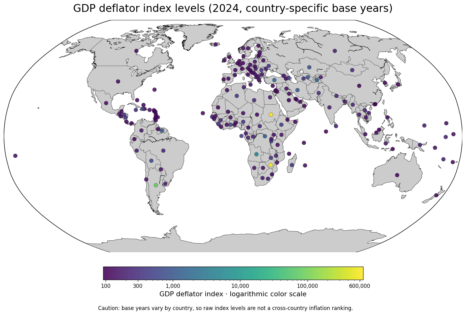
Table of Contents
The base-year warning matters more than the ranking
An index is normally anchored around 100 in its reference period. When that reference period differs across countries, a value of 120 in one country and 1,200 in another are not measurements from the same starting line. One country may use a relatively recent base year while another may use an older one, so cumulative price changes and the choice of base year are both embedded in the raw index level.
That is why Zimbabwe and Sudan exceeding 600,000, or Argentina exceeding 80,000, does not mean their 2024 annual inflation rates were hundreds or thousands of times those of countries near 100. Likewise, Guyana’s value of 91.89 does not prove that it had the world’s lowest inflation. For cross-country inflation comparisons, changes over a common interval or another harmonized measure are more appropriate than the raw index level.
The largest raw index values are extreme, but they are not an inflation league table
Sorting the published values places Zimbabwe and Sudan far above the rest, followed by Argentina. Angola is at 5,045.66, Türkiye at 1,886.14, Tajikistan at 1,462.53, the Democratic Republic of the Congo at 1,156.93, and Iran at 1,155.51. This table is useful for identifying extreme raw index levels that deserve further investigation of base years and time series, not for ranking current inflation performance.
| Raw-index order | Country or territory | 2024 GDP deflator index |
|---|---|---|
| 1 | Zimbabwe | 671,640.45 |
| 2 | Sudan | 657,078.98 |
| 3 | Argentina | 82,492.35 |
| 4 | Angola | 5,045.66 |
| 5 | Türkiye | 1,886.14 |
| 6 | Tajikistan | 1,462.53 |
| 7 | Democratic Republic of the Congo | 1,156.93 |
| 8 | Iran (Islamic Republic of) | 1,155.51 |
| 9 | Suriname | 983.84 |
| 10 | Uzbekistan | 792.99 |
The arithmetic mean is 7,899.96, while the median is only 129.99. That gap is a warning against using the mean as a typical value. A handful of enormous index levels pull the average upward, while most observations are much closer to the 100–200 range. For this distribution, the median and broad value bands are much more informative than the mean.
Most observations are between 110 and 200, with a very long upper tail
The middle half of the dataset lies between 117.87 and 189.31. Seventy-five observations are in the 110–129.9 band and 49 are in the 130–199.9 band. Together those two bands account for roughly two-thirds of the dataset. At the same time, eight observations exceed 1,000 and three exceed 10,000, which produces the very long upper tail visible in the map.
| 2024 raw-index band | Countries or territories | Share of observations |
|---|---|---|
| Below 110 | 17 | 9.2% |
| 110–129.9 | 75 | 40.8% |
| 130–199.9 | 49 | 26.6% |
| 200–499.9 | 28 | 15.2% |
| 500–999.9 | 7 | 3.8% |
| 1,000–9,999.9 | 5 | 2.7% |
| 10,000 or more | 3 | 1.6% |
A linear color scale would compress almost all countries into nearly the same shade because Zimbabwe, Sudan, and Argentina dominate the numerical range. The map therefore uses a logarithmic color scale. This makes geographic differences visible, but it does not solve the base-year comparability problem. Similar colors do not prove similar recent inflation, and very different colors do not prove that the difference was generated by recent price changes alone.
Neighboring countries can have radically different raw index levels
South America provides a clear example. Argentina is at 82,492.35, while Chile is at 148.45 and Uruguay at 171.55. Farther north, Guyana is at 91.89 while neighboring Suriname is at 983.84. Those contrasts are geographically striking, but they should first prompt a check of each country’s base year and time series rather than an immediate conclusion about current inflation.
A similar pattern appears around Türkiye, where the raw index is 1,886.14 compared with 117.93 in Greece and 142.63 in Bulgaria. In Central Asia, Kazakhstan and Uzbekistan are both near 792 while Tajikistan is at 1,462.53. Southern Africa is even more dramatic: Zimbabwe is at 671,640.45, Zambia at 408.10, and Botswana at 132.73. The map is valuable because it surfaces these local contrasts, but the indicator alone cannot identify a single cause for them.
Low raw index levels do not mean low prices or low inflation
At the bottom of the published 2024 index levels are Guyana at 91.89, Saudi Arabia at 99.75, Macao at 100.36, Dominica at 101.69, Australia at 102.63, Brunei at 104.85, China at 105.21, the Maldives at 105.41, Panama at 106.12, and Switzerland at 106.69. These are positions relative to each country’s own base year, not measures of the absolute cost of living.
| Low raw-index order | Country or territory | 2024 GDP deflator index |
|---|---|---|
| 1 | Guyana | 91.89 |
| 2 | Saudi Arabia | 99.75 |
| 3 | China, Macao Special Administrative Region | 100.36 |
| 4 | Dominica | 101.69 |
| 5 | Australia | 102.63 |
| 6 | Brunei Darussalam | 104.85 |
| 7 | China | 105.21 |
| 8 | Maldives | 105.41 |
| 9 | Panama | 106.12 |
| 10 | Switzerland | 106.69 |
A value near 100 may mean that the 2024 price level is close to the country’s reference-period level, but the reference period itself is not common across countries. That makes statements such as ‘countries near 100 have the most stable prices’ unreliable. If the goal is to compare price changes, it is more useful to calculate within-country changes over the same dates and then compare those changes across countries.
Changes over a common interval are more comparable than raw levels
One practical way to reduce the base-year problem is to compare each country’s GDP deflator between two common dates, such as 2020 and 2024, and calculate the percentage change within each country. Because the comparison is made inside the same index series, the arbitrary starting level matters much less. This dataset contains only the 2024 observation, so no multi-year change was invented for this article.
It is also important not to treat the GDP deflator and the consumer price index as interchangeable. The GDP deflator covers prices across domestically produced final goods and services, while a consumer price index focuses on a basket of goods and services purchased by households. For household cost-of-living questions, CPI-type measures are often more direct; for the overall domestic economy’s price level, the GDP deflator has a broader production-based scope.
What the 2024 map is actually good for
The map is useful for finding countries with unusually large raw index levels, locating regional contrasts, and identifying cases where a base-year or time-series check would be especially important. Zimbabwe, Sudan, and Argentina immediately stand out, while several neighboring pairs show large differences that would be easy to miss in a long table.
The map is not suitable for ranking 2024 inflation, purchasing power, living costs, or currency strength. Its colors represent raw 2024 GDP deflator index levels under country-specific base years. Using those levels as a performance ranking would ignore the indicator’s most important comparability limitation.
Data scope and source
The analysis uses 184 country and territory observations for 2024 from the UNESCO Institute for Statistics official API indicator NY.GDP.DEFL.ZS, titled ‘GDP deflator (base year varies by country)’. The published unit is an index value. Only the supplied 2024 observations are analyzed, so no annual inflation rate or multi-year change is inferred.
The official API response was collected on September 14, 2026. Countries without a supplied 2024 value are not assigned zero. Because the values span from roughly 92 to more than 670,000, the map uses a logarithmic color scale while the tables and prose retain the original published index values.
The key takeaway
The median raw 2024 index level is 129.99, and the simple ratio between the largest and smallest values is about 7,309 to one. Yet the central interpretive fact is that each country can use a different base year. The map is therefore valuable for spotting geographic outliers and contrasts, but the raw index level is not an internationally comparable inflation ranking. Cross-country comparisons should rely on changes over the same interval or another measure designed for direct comparison.
Frequently Asked Questions
Does a higher raw GDP deflator index mean a country has higher current inflation?
Not necessarily. Because base years vary by country, raw 2024 index levels do not provide a directly comparable ranking of annual inflation.
What is a better way to compare GDP deflators across countries?
Compare within-country changes over the same dates, then compare those percentage changes across countries rather than comparing the raw index levels.
Why does the map use a logarithmic color scale?
The published 2024 index levels span from roughly 92 to more than 670,000, so a linear scale would hide most differences among the majority of countries.
Related Maps
Green Map creates custom-edited map images using open geographic data sources such as geoBoundaries, Natural Earth, OpenStreetMap, and government open data.
These maps are edited visual materials, not raw data files, and are provided for education, documents, presentations, and graphic reference.