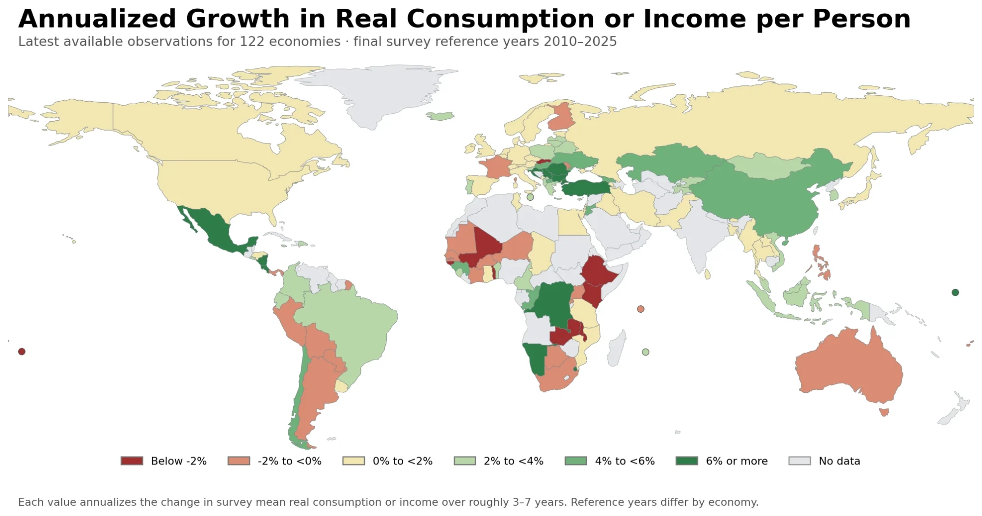
Headline GDP growth can be strong while gains at the lower end of the income distribution remain weak. This map asks a narrower distributional question: how quickly did real income or consumption per person grow for the bottom 40% of each country’s distribution over the comparison spell? The data include 122 latest available observations for World Bank indicator SI.SPR.PC40.ZG.
The median country observation is 2.16% per year and the simple unweighted mean is 2.42%. Ninety-seven observations are positive and 25 are negative. Those summaries are useful, but they are not a 2025 world ranking. The reference years in the underlying household-survey series range from 2010 to 2025, so every table and map in this article keeps the observation year visible.
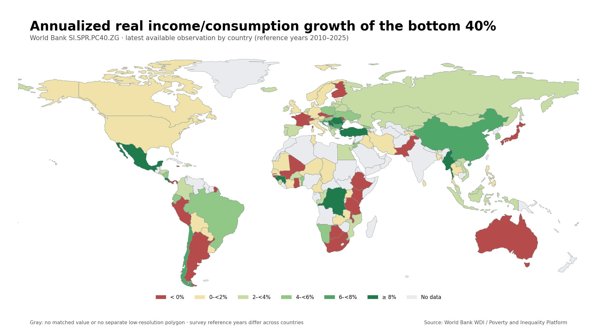
Table of Contents
What the bottom-40 growth indicator measures
World Bank metadata defines SI.SPR.PC40.ZG as the annualized average growth rate in real per-capita survey mean income or consumption for the bottom 40% of the population distribution. The calculation compares two household surveys that are judged sufficiently comparable and annualizes the change between them. The intended spell is roughly five years; the earlier survey is selected from about three to seven years before the latest survey.
The phrase “income or consumption” matters. Countries do not all use the same welfare aggregate in household surveys. Some series are income-based while others are consumption-based. The World Bank Poverty and Inequality Platform expresses the underlying real welfare measures using 2021 purchasing power parity, but differences in survey timing and design still limit fine-grained cross-country comparisons.
A value of 5% therefore means that the measured real income or consumption per person of the bottom 40% increased at an average annualized rate of about 5% over that country’s comparison spell. A negative value means the measured welfare aggregate fell on an annualized basis. It is not GDP growth, wage growth, or a direct poverty-rate change.
The map shows strong positives and negatives in the same regions
Several Central and Eastern European observations sit in the highest bands. Romania is 11.95% in 2023, Türkiye 10.03%, Serbia 8.69%, and Bulgaria 7.19%. Yet the region is not uniformly positive: the Slovak Republic is -1.87% in 2023 and Moldova is -1.77%. France is also negative at -0.76% in 2023. The geographic pattern is therefore one of sharp country contrasts rather than a single European trend.
Latin America also contains large differences among relatively recent observations. Costa Rica reaches 9.77% in 2025, Mexico 8.26% in 2024, Chile 7.75% in 2024, and Brazil 4.85% in 2024. Panama is -1.26% in 2024, Peru -0.61%, and Argentina -0.46%. These near-year comparisons are more informative than mixing them with much older observations without showing dates.
Across Asia, China is 7.21% in 2021 and Korea, Rep. 5.11% in 2021, while Indonesia records 3.33% in 2025. Japan is -0.72% in 2020 and Pakistan -1.70% in 2024. Africa is similarly mixed, but the date caveat is especially important: the Democratic Republic of the Congo is 9.44% from 2012 and Guinea 8.22% from 2012, whereas Mali is -3.33% in 2021 and Ethiopia -0.94% in 2021. The map should not turn an old survey spell into a claim about present conditions.
Highest and lowest latest observations
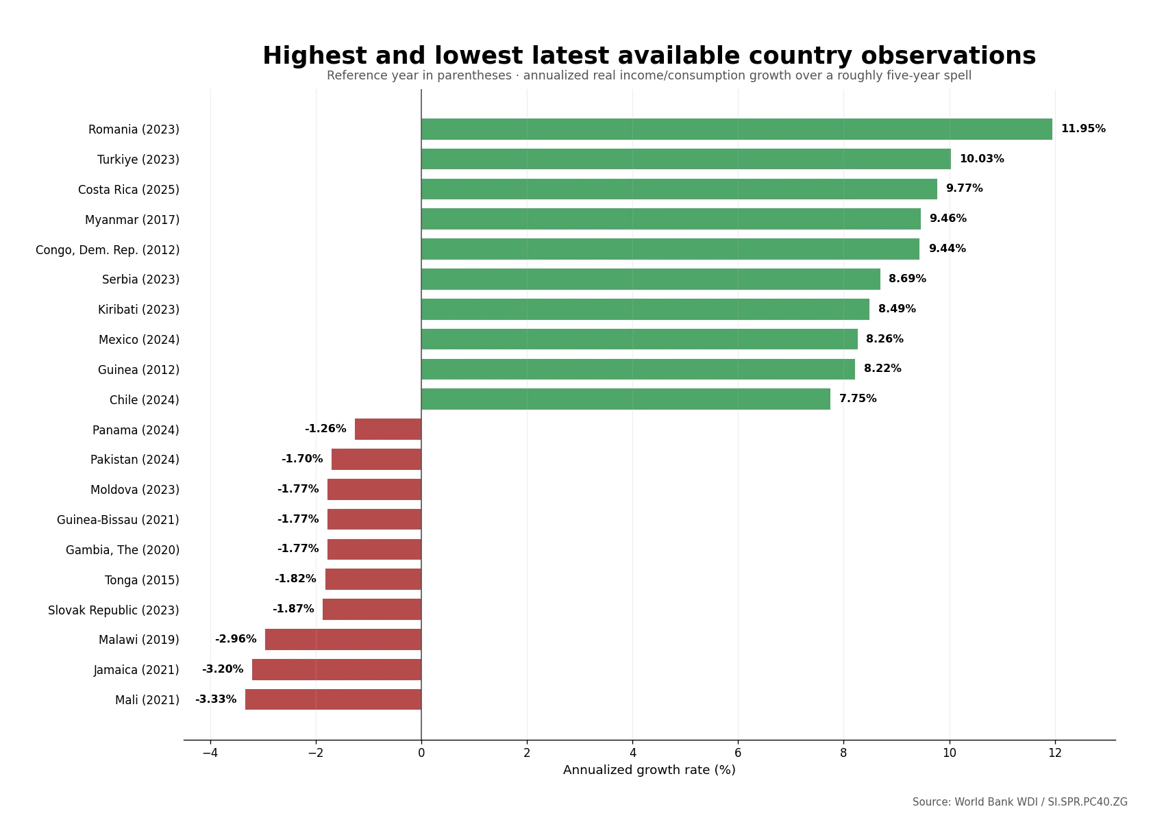
Romania and Türkiye are the only observations above 10% in the 122-row file. Costa Rica is notable because its 9.77% value is dated 2025, while Mexico and Chile are dated 2024. Myanmar, the Democratic Republic of the Congo, and Guinea also appear near the top, but their observations are much older. Calling this a ranking of the countries with the fastest current growth would therefore overstate what the data support.
| Country or economy | Reference year | Annualized growth |
|---|---|---|
| Romania | 2023 | 11.95% |
| Türkiye | 2023 | 10.03% |
| Costa Rica | 2025 | 9.77% |
| Myanmar | 2017 | 9.46% |
| Congo, Dem. Rep. | 2012 | 9.44% |
| Serbia | 2023 | 8.69% |
| Kiribati | 2023 | 8.49% |
| Mexico | 2024 | 8.26% |
| Guinea | 2012 | 8.22% |
| Chile | 2024 | 7.75% |
At the negative end, Mali is -3.33%, Jamaica -3.20%, and Malawi -2.96%. Pakistan and Panama provide relatively recent negative observations from 2024, while the Slovak Republic and Moldova are dated 2023. A negative rate describes the direction of the measured bottom-40 welfare aggregate over the comparison spell; the single indicator does not identify the cause.
| Country or economy | Reference year | Annualized growth |
|---|---|---|
| Mali | 2021 | -3.33% |
| Jamaica | 2021 | -3.20% |
| Malawi | 2019 | -2.96% |
| Slovak Republic | 2023 | -1.87% |
| Tonga | 2015 | -1.82% |
| Gambia, The | 2020 | -1.77% |
| Guinea-Bissau | 2021 | -1.77% |
| Moldova | 2023 | -1.77% |
| Pakistan | 2024 | -1.70% |
| Panama | 2024 | -1.26% |
How selected major economies compare
A selected-economy table reinforces why this indicator should not be substituted for overall economic growth. Korea, Rep. records 5.11% in 2021 and China 7.21% in 2021. The United States is 0.30% in 2024, Germany 0.16% in 2022, and the United Kingdom 0.86% in 2021. Japan is -0.72% in 2020 and France -0.76% in 2023.
| Country or economy | Reference year | Annualized growth |
|---|---|---|
| Korea, Rep. | 2021 | 5.11% |
| China | 2021 | 7.21% |
| Japan | 2020 | -0.72% |
| United States | 2024 | 0.30% |
| Canada | 2022 | 1.88% |
| Mexico | 2024 | 8.26% |
| Brazil | 2024 | 4.85% |
| Indonesia | 2025 | 3.33% |
| Germany | 2022 | 0.16% |
| France | 2023 | -0.76% |
| United Kingdom | 2021 | 0.86% |
| Russian Federation | 2023 | 3.41% |
| Australia | 2018 | -0.49% |
| South Africa | 2014 | -0.18% |
The year column is as important as the percentage. Indonesia is represented by a 2025 observation, while South Africa’s latest available value is from 2014 and Australia’s is from 2018. A decimal ranking across such different survey years would create a false sense of precision.
Why the reference years do not line up
Unlike national-accounts indicators that can be updated every year, this measure depends on household surveys and on finding two survey rounds that can reasonably be compared. Survey frequency, publication schedules, and changes in questionnaire or welfare measurement differ by country. The World Bank consequently warns that comparisons across countries and over time require substantial caution.
Of the 122 observations, 54 are dated 2023–2025 and 89 are dated 2020 or later. Thirty-three are from before 2020. Only three observations are dated 2025: Costa Rica at 9.77%, Ecuador at 4.20%, and Indonesia at 3.33%. For that reason, the map is described as showing “latest available observations” rather than as a 2025 cross-section.
Positive bottom-40 growth does not automatically mean inequality fell
A positive SI.SPR.PC40.ZG value says the average real income or consumption of the bottom 40% increased over the measured spell. It does not tell us whether the bottom 40% gained faster than the rest of the population. If average welfare for the total population rose even faster, the bottom group could improve in absolute terms while the relative gap still widened.
A fuller shared-prosperity analysis compares bottom-40 growth with growth for the total population over a compatible spell. This analysis uses only SI.SPR.PC40.ZG, so the indicator by itself cannot support an “inequality improved” or “inequality worsened” verdict.
What the map can and cannot tell you
- It can show: whether the latest measured bottom-40 welfare spell for each reporting country was positive or negative and where unusually large annualized changes appear.
- It cannot replace: poverty rates, median income, wages, wealth distribution, cost of living, or GDP growth. Each of those requires a different measure.
- Cross-country caution: reference years differ and welfare aggregates can be income- or consumption-based, so small percentage gaps should not be treated as a precise league table.
- Map coverage: all 122 numeric rows are used in the statistics, while 117 match a polygon in the low-resolution world boundary layer. Small islands and separately reported economies may be present in the table but not visible as a distinct filled shape.
Source, coverage, and calculation method
The primary statistical references are the World Bank World Development Indicators metadata for SI.SPR.PC40.ZG and the Poverty and Inequality Platform. The World Bank describes the series as annualized growth in bottom-40 real per-capita survey mean income or consumption, calculated from comparable household surveys over a spell of roughly five years.
All summary values in this article were calculated from the 122 latest available country observations in the World Bank data. The median is 2.16%, the first quartile about 0.30%, and the third quartile about 3.66%. There are 25 negative observations, 35 from 0% to below 2%, 35 from 2% to below 4%, 14 from 4% to below 6%, four from 6% to below 8%, and nine at 8% or more.
The choropleth was generated from the supplied country ISO3 codes and a low-resolution Natural Earth boundary layer. Missing values were not imputed and were never converted to zero. France, Norway, and Kosovo required ISO fixes in the low-resolution fixture, while several small island economies remain statistical rows without a distinct polygon at this scale.
Frequently Asked Questions
What does the bottom 40% growth rate measure?
It measures the annualized change in real per-capita survey mean income or consumption for the bottom 40% of a country’s distribution over a roughly five-year comparison spell.
Is this a 2025 ranking of countries?
No. The 122 rows are each country’s latest available observation and their reference years range from 2010 to 2025. Only Costa Rica, Ecuador, and Indonesia are dated 2025.
Does a positive rate mean inequality declined?
Not necessarily. It means the bottom 40% experienced positive average real income or consumption growth, but inequality depends on how that growth compares with the rest of the population.
Is this the same as GDP growth?
No. GDP growth measures change in economy-wide output. SI.SPR.PC40.ZG is based on household surveys and focuses specifically on real income or consumption per person for the bottom 40%.
Related Articles
These Green Map articles answer adjacent questions about overall economic growth, economic output per person, and urban living conditions without treating those measures as substitutes for bottom-40 welfare growth.
- Global GDP Growth Map – Country Patterns in 2025
- Global GDP per Capita Map – Country Levels in 2025
- Global Slum Population Share Map – 2022 Country Comparison
Green Map creates custom-edited map images using open geographic data sources such as geoBoundaries, Natural Earth, OpenStreetMap, and government open data.
These maps are edited visual materials, not raw data files, and are provided for education, documents, presentations, and graphic reference.