The 2021 global oil-fired electricity share map compares how much of each country or economy’s electricity production came from oil-based fuels. The underlying measure is World Bank World Development Indicators series EG.ELC.PETR.ZS, “Electricity production from oil sources (% of total).” Its numerator is electricity generated from crude oil and petroleum products, while its denominator is total electricity production from all sources. It is therefore a generation-mix indicator, not a measure of crude-oil output, petroleum exports, power-plant capacity, or total oil consumption.
The cleaned common-year file contains 217 World Bank country/economy master rows. A numeric 2021 value is available for 209 rows and 8 remain missing. Across the 209 numeric observations, the simple unweighted mean is 29.0% and the median is 4.5%. The first quartile is 0.6% and the third quartile 61.9%. That large gap between the median and upper quartile matters: many economies sit near the bottom of the 0–100% scale while another substantial group relies on oil for a very large share of electricity generation.
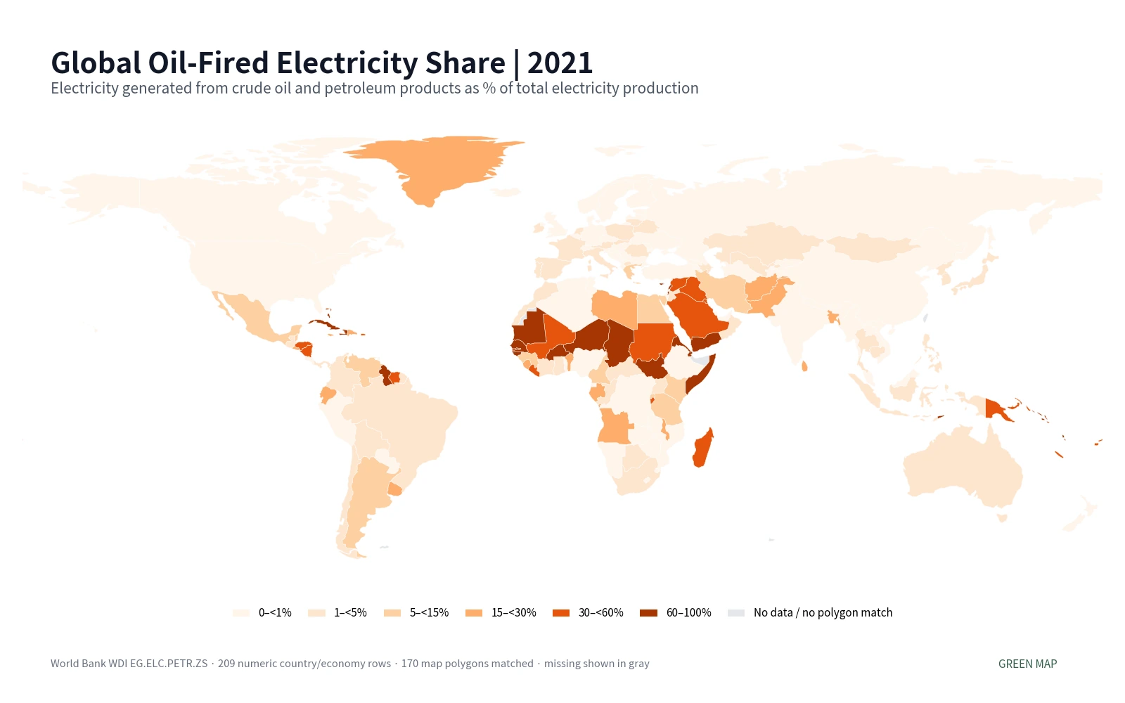
Table of Contents
What the oil-fired electricity share actually measures
The World Bank definition uses “oil” broadly enough to include crude oil and petroleum products used as inputs for electricity generation. A reported 40% therefore means that roughly two-fifths of the economy’s total electricity production in that year came from oil-based fuels under the source methodology. It does not mean that 40% of the country’s total energy use was oil, nor that 40% of its installed generating capacity was oil-fired.
This distinction also separates the indicator from total fossil-fuel electricity. Coal and natural gas are not part of the oil numerator. They still contribute to total electricity production in the denominator, just as nuclear, hydro, wind, solar and other sources do. An economy can consequently have a very low oil share while still producing substantial electricity from other fossil fuels. Treating an oil-generation map as a fossil-generation map would collapse different fuel categories into one and would answer a different question.
The indicator is equally separate from the size of an oil industry. An oil-producing or exporting country does not automatically have a high oil-fired electricity share, because its power system may rely mainly on gas, coal, hydro, nuclear or renewables. A country with modest petroleum production can still report a high percentage if oil products dominate its electricity-generation mix. The map should therefore be read as a power-sector composition map rather than a map of petroleum wealth or reserves.
The cross-country distribution is strongly split between very low and very high shares
Of the 209 numeric observations, 66 are below 1%, equal to 31.6% of the sample. At the opposite end, 55 are at or above 50%, 50 are at or above 75%, and 30 are at or above 90%. This is not a distribution tightly clustered around one typical value. Instead, a large low-share group coexists with a substantial set of economies where oil accounts for most electricity output.
| 2021 oil-fired electricity share | Countries/economies | Share of 209 |
|---|---|---|
| 0–<1% | 66 | 31.6% |
| 1–<5% | 43 | 20.6% |
| 5–<15% | 12 | 5.7% |
| 15–<30% | 17 | 8.1% |
| 30–<60% | 18 | 8.6% |
| 60–100% | 53 | 25.4% |
The median of 4.5% means half of the numeric country/economy observations are below about that level. The simple mean is much higher at 29.0% because the upper tail contains many observations in the 60–100% range. Neither number is the global share of electricity generated from oil. The simple mean gives an island economy and a very large electricity market exactly the same statistical weight. A global generation share would require weighting each economy by its total electricity production.
The highest observations are concentrated near the top of the 0–100% scale
Comoros and Sint Maarten are both reported at 100.0% in the supplied 2021 file. Timor-Leste is 99.6%, The Bahamas 99.3%, St. Martin 99.2%, and South Sudan 99.0%. The upper group includes many Caribbean and Pacific island economies and territories, along with several countries in Africa. The statistical table is important here because a number of small territories with very high values are too small to appear as separate polygons on a 1:110m world map.
| Country or economy | 2021 oil-fired electricity share |
|---|---|
| Comoros | 100.0% |
| Sint Maarten (Dutch part) | 100.0% |
| Timor-Leste | 99.6% |
| Bahamas, The | 99.3% |
| St. Martin (French part) | 99.2% |
| South Sudan | 99.0% |
| Turks and Caicos Islands | 98.5% |
| Gambia, The | 98.4% |
| Grenada | 98.0% |
| British Virgin Islands | 97.7% |
A high percentage should not be turned into a ranking of electricity quality, generating efficiency, energy security, or total oil use. A small system can record a 90% share with relatively little electricity in absolute terms, while a much larger power market can generate more oil-fired electricity in GWh but show a low percentage because other sources are much larger. Share and scale answer different questions.
Zero observations must be kept separate from missing data
There are 12 economies with a reported value of exactly 0.0%: Albania, Andorra, Armenia, Bhutan, Georgia, Lao PDR, Latvia, Montenegro, Nepal, Tajikistan, Turkmenistan, Zimbabwe. Those are numeric observations, not missing records. The cleaned file separately preserves 8 missing 2021 rows as NA. Replacing missing values with zero would create false low-share observations and would change the mean, median, ranking and map classification.
Cartographic absence is a third condition that also needs to be separated. This article calculates statistics from all 209 numeric rows, but 170 polygons are directly colored in the low-resolution Natural Earth boundary layer. Small islands and separately reported territories can have valid statistical values without a distinct visible polygon at this scale. An uncolored or invisible place on the map should therefore not be assumed to have a zero value or a missing World Bank observation.
Selected large and oil-producing economies show why the metric needs careful interpretation
The selected comparison produces several useful contrasts. Kuwait is 48.91%, Saudi Arabia 41.29%, and Iraq 40.46%, while the United Arab Emirates is 0.55% and Qatar 0.26%. Iran is 14.55%. These differences demonstrate that the simple label “oil producer” does not determine the electricity-generation mix. The indicator measures what fuel generated electricity, not what resource an economy produces or exports.
| Economy | 2021 oil-fired electricity share |
|---|---|
| Kuwait | 48.91% |
| Saudi Arabia | 41.29% |
| Iraq | 40.46% |
| Iran, Islamic Rep. | 14.55% |
| Mexico | 13.03% |
| Japan | 3.80% |
| Brazil | 3.11% |
| South Africa | 2.43% |
| Indonesia | 2.42% |
| Australia | 1.76% |
| Korea, Rep. | 1.30% |
| France | 1.03% |
| United States | 0.83% |
| Germany | 0.77% |
| Canada | 0.66% |
| United Kingdom | 0.63% |
| United Arab Emirates | 0.55% |
| India | 0.28% |
| Qatar | 0.26% |
| China | 0.13% |
Among large Asian power markets, Japan is 3.80%, South Korea 1.30%, China 0.13%, India 0.28%, and Indonesia 2.42%. The United States is 0.83%, Germany 0.77%, the United Kingdom 0.63%, France 1.03%, and Canada 0.66%. Mexico is higher at 13.03%, while Brazil is 3.11% and Australia 1.76%. These are same-year composition percentages; they do not by themselves show whether the oil share has been rising or falling. A transition story requires a time series.
Why a share map cannot substitute for absolute generation data
Percentages make electricity systems of very different sizes comparable on one scale, but they deliberately discard information about total generation. An economy at 80% is not necessarily producing more oil-fired electricity than one at 5%. To answer an absolute-output question, the oil-fired electricity series in kWh or GWh and total electricity generation would be needed. This completed package contains only the verified share series, so it does not manufacture an absolute ranking from missing information.
The same limitation applies to emissions. A higher oil share indicates a larger role for oil within the power mix, but it is not enough to calculate power-sector carbon emissions. Total generation, plant efficiency, detailed fuel types and emission factors would be required. The safest use of this map is to identify where oil has a large or small role in electricity production and then decide which additional data are needed for a more specific question.
What the map can reveal—and what it cannot explain on its own
The choropleth reveals broad geographic contrasts. Several Middle Eastern and Sub-Saharan African countries fall in higher bands, while many large economies in Europe, North America and East Asia are in the lowest bands. The upper statistical tail also contains many small island economies that are difficult to see on the map itself. Those patterns are observations about the spatial distribution of the indicator, not evidence of one universal cause.
Explaining why a specific economy has a high or low oil share would require additional evidence on generation by fuel, power-plant fleets, electricity demand, gas and coal supply, hydropower resources, renewable generation, nuclear power, grid structure, fuel logistics and policy. Island systems may face different constraints from continental systems, but this single WDI series does not quantify those mechanisms. Keeping the descriptive map separate from causal explanation prevents the visual pattern from being overinterpreted.
Why the comparison is fixed to 2021
The package keeps one common reference year rather than mixing each country’s latest available observation. The 2021 dataset provides 209 numeric values out of 217 master rows, or about 96.3% coverage. If newer values are available for some economies but not others, a “latest” map can blend different years and make a spatial difference partly a time difference. A same-year snapshot gives the colors a clearer meaning.
This choice favors comparability over the newest possible number for every individual country. A country profile or trend analysis can and should check later observations where available. The purpose here is narrower: compare oil-fired electricity shares across countries and economies on one aligned 2021 basis without silently filling gaps from older or newer years.
Source, coverage and mapping method
The statistical series is World Bank World Development Indicators EG.ELC.PETR.ZS, “Electricity production from oil sources (% of total).” The World Bank metadata defines the measure as the share of total electricity production generated from oil sources, where oil includes crude oil and petroleum products, and identifies the IEA Energy Statistics Data Browser as the underlying source. The official definition is available in the World Bank WDI metadata glossary.
The cleaned comparison retains 217 World Bank country/economy master rows after aggregate regions and income groups have been excluded. It keeps 209 numeric 2021 observations and 8 source-missing rows without imputation. Every ranking, percentile and band count in this article is calculated directly from that cleaned CSV. The map joins ISO-3 identifiers to a low-resolution Natural Earth country layer; 170 polygons receive values, while the statistical sample remains all 209 numeric rows.
How to use this map for follow-up research
A useful workflow is to treat the map as a screening layer. For a high-share economy, the next questions might be whether the oil share has declined over time, which petroleum products are used, what other generation sources are available, and whether recent capacity additions are changing the mix. For a low-share economy, the next step is to identify which fuels or renewable sources occupy the space that oil does not.
The indicator can also be compared with renewable-electricity, electricity-access and broader energy-consumption measures, but their denominators must remain separate. A renewable share of final energy consumption is not the inverse of the oil share of electricity generation, and an electricity-access percentage says nothing directly about the fuel mix. Good comparison starts by keeping those questions distinct and then combining them only when the required supporting data are present.
Frequently Asked Questions
Is oil-fired electricity share the same as fossil-fuel electricity share?
No. EG.ELC.PETR.ZS covers electricity generated from crude oil and petroleum products. Coal and natural gas are separate fuel categories, so total fossil-fuel generation is a different indicator.
What was South Korea’s oil-fired electricity share in 2021?
The verified 2021 World Bank WDI observation for South Korea is about 1.30%. Japan is 3.80% and China 0.13% in the same common-year file.
Is the 29.0% simple mean the global oil-fired electricity share?
No. 29.0% is an unweighted mean across 209 country/economy observations. A global electricity share would need weights based on each economy’s total electricity production.
Does gray or missing map geometry mean the oil share is zero?
No. A row can be source-missing, or a small economy can have a valid statistic without a separate polygon in the low-resolution map. Reported 0.0% observations are kept distinct from both conditions.
Related Articles
These Green Map articles provide useful context for separating electricity generation mix from energy consumption, electricity access and broader economic patterns.
- Global Renewable Energy Share Map – 2021 Final Energy Consumption by Country
- Global Electricity Access Map – 2024 Country Comparison
- Global GDP Growth Map – Country Patterns in 2025
Green Map creates custom-edited map images using open geographic data sources such as geoBoundaries, Natural Earth, OpenStreetMap, and government open data.
These maps are edited visual materials, not raw data files, and are provided for education, documents, presentations, and graphic reference.