Wayne County is primarily an agricultural landscape in the 2025 land-cover data, but its map is not uniform. Agriculture accounts for 76.21% of the county, while a large wetland pattern breaks up the eastern side, wooded patches recur across the west and east, and a distinct developed cluster stands near the center. A smaller built-up cluster appears toward the southwest. The four maps on this page separate those patterns into overall land cover, forest and farmland, impervious surface, and 1985–2025 class change so each can be examined without treating them as the same measure.
The WebP images in the article are intended for quick viewing, and the four original JPG maps are available together in one ZIP below. They share the same County GEOID 17191 boundary, which makes it easy to compare the central developed area, eastern wetlands, scattered woodland, and broad farm areas from one map to the next. Land cover describes what the ground surface is classified as in satellite-based data. It does not establish parcel ownership, zoning, legal wetland boundaries, or whether a particular site can be developed.
Table of Contents
A large farm landscape is interrupted by wetlands, woodland, and a compact developed core
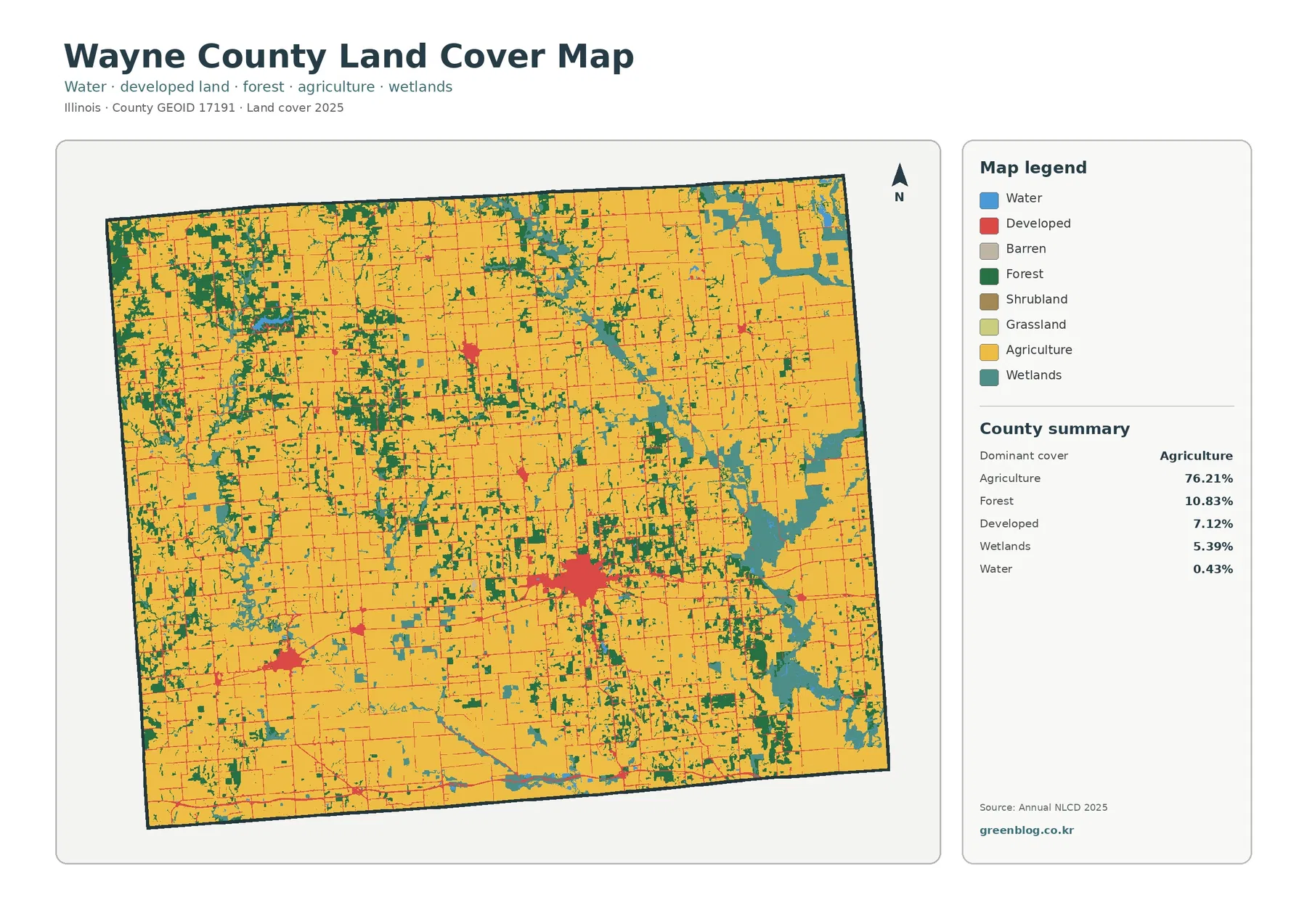
The 2025 summary lists agriculture at 76.21%, forest at 10.83%, developed land at 7.12%, wetlands at 5.39%, and water at 0.43%. Grassland is 0.01% and shrubland rounds to 0.00%. The general land-cover map makes the dominance of agriculture obvious because yellow covers most of the county. The strongest exception is on the eastern side, where teal wetland areas form broad, irregular patches. Red developed land is concentrated in a central cluster, while a smaller red area appears in the southwest and minor built patches are scattered elsewhere.
Forest is distributed differently from the farmland. Green woodland does not form one continuous block; instead, it appears in irregular strips and patches across the northwest, western half, central area, and eastern side. Some of the clearest woodland is near the extensive wetland pattern in the east. The contrast between large agricultural areas and narrow or broken natural-cover patches is one of the county’s most visible characteristics. Looking at the spatial arrangement first helps keep the later percentage comparisons in context.
Eastern wetlands create the strongest break in the agricultural pattern
Wetlands account for 5.39% of Wayne County, a smaller share than forest but a visually prominent one because much of the mapped wetland is concentrated in the east. Teal areas extend through the east-central and southeastern portions of the county, with additional patches toward the northeast. By comparison, wetlands are much less extensive across the western half. This uneven distribution matters: a countywide percentage alone cannot show that one side of the county contains far more wetland-classified surface than the other.
These wetland colors should be treated as land-cover classifications rather than regulatory boundaries. Annual NLCD is raster data, meaning the land is divided into grid cells and each cell receives a representative class. A cell roughly 30 meters across can contain a mix of wet ground, vegetation, field edge, open water, or other surfaces. The mapped wetland pattern is useful for county-scale comparison, but a permitting, conservation, or parcel-level decision requires a dataset designed for that legal or management purpose.
Open water is only 0.43% of the county. Blue cells appear around parts of the eastern wetland complex and in smaller locations elsewhere, but the map is not dominated by a single large lake. Keeping water and wetlands separate is important because they represent different surface classes. For a presentation or classroom comparison, the blue and teal areas can be used to show why “wet” landscapes are not all mapped under one category.
Impervious cover reveals how small the hard-surface footprint is outside developed centers
Wayne County’s mean impervious cover is 1.49%, and only 0.40% of the county has impervious cover of 50% or more. An impervious surface is a hard surface such as pavement, a parking lot, or a rooftop that does not readily absorb water. The map is pale across most farm, forest, and wetland areas, which is consistent with the low countywide average. Darker values are concentrated in the central developed cluster, with smaller concentrations in the southwest and at a few other settlement points.
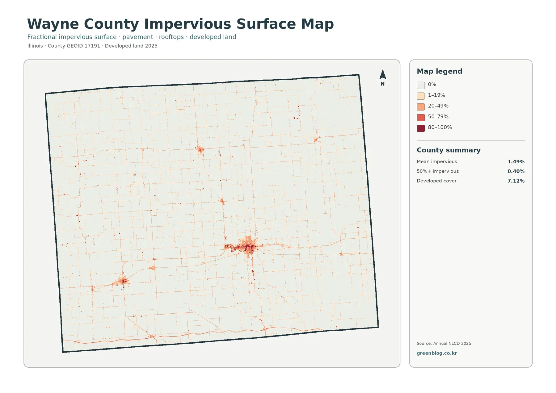
The thin linear traces crossing agricultural land are also useful to notice. They mark surfaces with higher impervious fractions than their surroundings, but this map is not a labeled road map and does not identify road names or traffic levels. Inside the central developed area, not every cell has the darkest value. Lawns, trees, open ground, and other permeable surfaces can be mixed with buildings and pavement. That is why developed land at 7.12% and mean impervious cover at 1.49% should not be treated as interchangeable statistics.
Impervious cover is helpful for broad comparisons of surface hardening, but it does not by itself measure runoff volume, drainage capacity, or flood hazard. A dark cluster indicates that more of the ground is covered by hard surfaces relative to nearby rural land. Evaluating drainage or flood risk would require rainfall, elevation, soils, stream networks, and infrastructure data in addition to the land-cover information shown here.
The forest-and-farmland view makes western and eastern woodland patches easier to follow
The forest and farmland map removes some visual competition from the full land-cover legend. Agriculture still fills most of the county, but the 10.83% forest share becomes easier to trace. Wooded areas recur through the northwest and west, continue in smaller strips near the center, and appear again around parts of the eastern wetland landscape. The pattern is not a single forest block. It is a network of irregular patches and narrow areas separated by extensive cultivated ground.
The agricultural surface is also more varied than a simple percentage suggests. In the northern and central portions, large farm areas are interrupted by smaller woodland and wetland patches. The east has more frequent breaks where teal wetland areas and green forest divide the yellow agricultural surface. The southwest contains broad farmland but also a small developed cluster and several natural-cover patches. These differences are easier to recognize when the simplified map is compared directly with the full land-cover image.
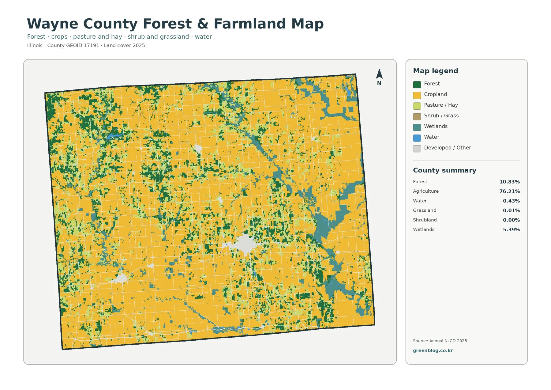
It would be inappropriate to claim from this map alone that a particular stream, soil type, or land-management practice caused the wooded pattern. The supplied image shows where forest is classified, not why it occurs there. For county-level interpretation, the strongest supported statement is that woodland is unevenly distributed and appears more frequently in certain western and eastern sections than in the broad farm-dominated interior.
Developed land is concentrated rather than spread evenly across the county
Developed land makes up 7.12% of Wayne County. The largest red cluster is near the middle of the county, where a compact built area stands out clearly against the surrounding fields. A second, smaller cluster appears to the southwest. Narrow red traces and small patches extend through other agricultural areas, but they are much less prominent than the central concentration. This pattern shows why a countywide developed percentage needs a map: most of the developed class is not distributed uniformly across the agricultural landscape.
NLCD developed classes can include more than rooftops and pavement. Lower-density developed areas often contain lawns, trees, soil, and other permeable surfaces mixed among buildings and roads. The impervious map therefore provides a necessary second view. In Wayne County, the developed footprint is visibly broader than the darkest impervious surface because the two datasets answer different questions—one classifies developed land cover, while the other estimates the fraction of hard surface within each cell.
The 1985–2025 comparison is dominated by “other” class differences
The change map compares the 1985 and 2025 land-cover classifications. Wayne County has a total class difference of 11.73%. Within that total, 0.97% is mapped as conversion to developed, 0.49% as forest loss, 0.80% as agricultural loss, and 9.24% as other class difference. The final category is by far the largest component, which is a critical caution when interpreting the headline total. It would be misleading to describe 11.73% as a direct measure of confirmed land-use conversion.
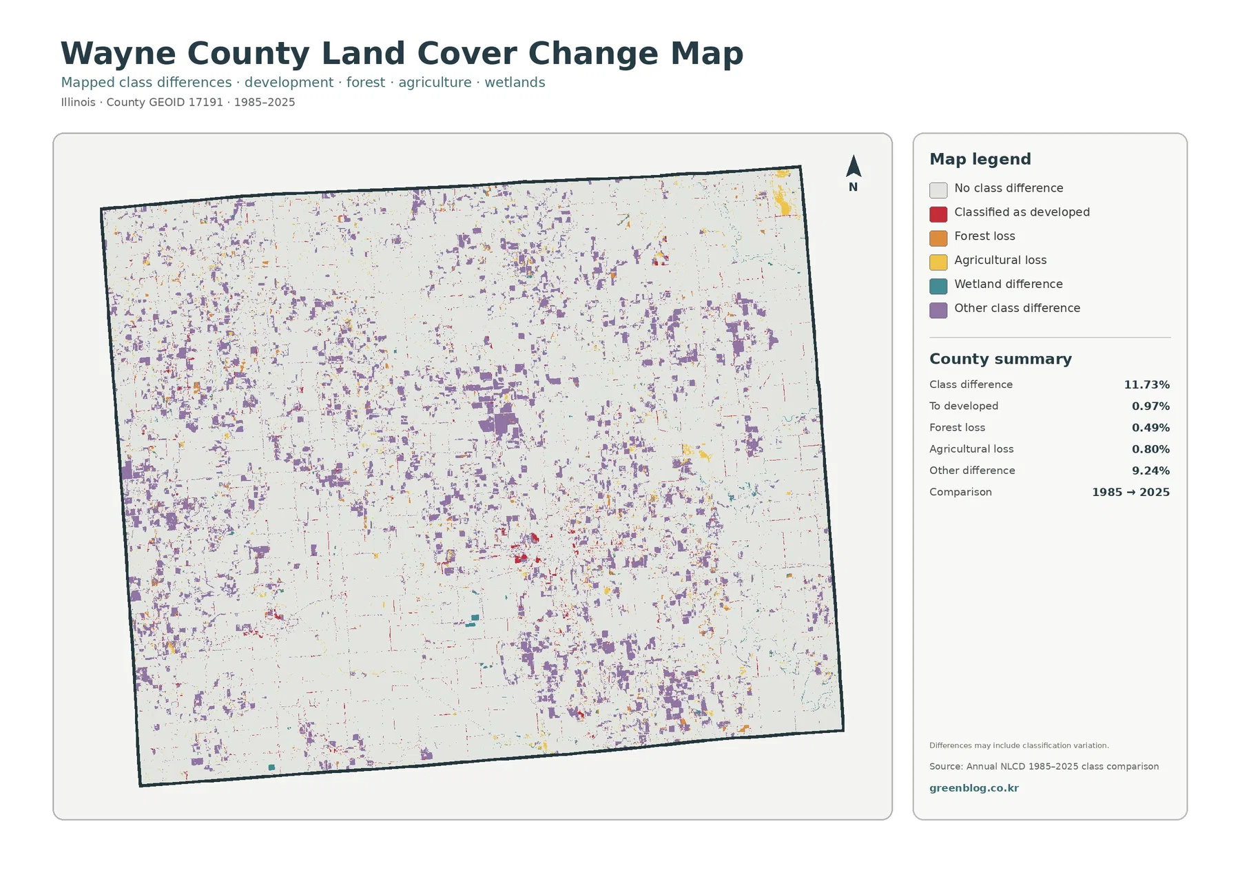
Change cells are scattered widely rather than confined to a single part of the county. Purple “other difference” patches appear across the north, west, center, east, and south. Red developed-change cells are visible around the central built cluster and in smaller locations, while yellow and orange categories occur in scattered patches through agricultural and wooded areas. The eastern wetland landscape also contains multiple change colors. The map therefore records a broad mosaic of classification differences rather than one continuous zone of change.
Long-term classification comparisons can reflect real development or vegetation change, but they can also be influenced by acquisition date, classification methods, and mixed pixels along boundaries. Wayne County’s 9.24% “other” difference is especially important because it forms most of the 11.73% total. Verifying what actually changed at a specific location requires additional evidence such as multiple NLCD years, aerial photography, or local records.
Reading the same locations across all four maps prevents common interpretation errors
The central developed cluster is a useful example. It appears as a broad red area on the general map, but the impervious map shows the highest hard-surface values concentrated in a smaller core and along selected connections. The change map adds another layer by marking some cells as conversion to developed and others as different change categories. Not every current developed cell is necessarily a post-1985 addition, and not every developed cell is heavily impervious. Aligning the maps keeps those distinctions clear.
The eastern side provides a very different comparison. Teal wetlands are prominent on the general map, while the forest-and-farmland view makes the intermixing of agriculture, forest, and wetlands easier to trace. The same area is mostly light on the impervious map, sharply contrasting with the central built cluster. On the change map, small classification differences appear throughout the eastern landscape. Together, the four views distinguish present cover, hard-surface intensity, and long-term class comparison without collapsing them into a single conclusion.
The southwest cluster can be read in the same way. It is a small developed island within a much larger agricultural setting on the land-cover map. The impervious image highlights only the harder-surfaced parts, while the change map shows scattered differences around and beyond the cluster. Repeating this comparison at several locations is more informative than relying on county averages alone.
Thirty-meter raster cells are useful for broad patterns, not parcel decisions
Annual NLCD is raster data. In simple terms, the landscape is divided into grid cells and each cell is assigned a representative land-cover value. A cell roughly 30 meters across can contain a field edge, trees, a narrow road, a building, and a small water feature at the same time. The final class simplifies that mixture. This matters most along boundaries such as the eastern wetland edges, the woodland-farmland transitions in the northwest, and the outer edge of the central developed area.
For that reason, the Wayne County maps work well for comparing large patterns: agriculture dominates most of the county, wetlands are much more prominent in the east, woodland is scattered but recurring, and hard surfaces are concentrated in a few built centers. They are not substitutes for parcel boundaries, zoning maps, engineering surveys, wetland delineations, or ownership records. The correct use depends on the scale of the question.
A practical reading method is to start with the broad color pattern and then zoom in only where needed. Single isolated cells can be affected by mixed surfaces or classification uncertainty, while larger clusters are more reliable for describing county-scale structure. The same caution applies to the change map: a small patch of difference should be investigated rather than automatically treated as confirmed land-use conversion.
Choose the map that matches the question you are trying to answer
The general land-cover map is the best starting point when the goal is to explain the full surface composition in one image. It shows how the 76.21% agricultural share relates spatially to forest, wetlands, developed land, and water. The forest-and-farmland map is cleaner when the main question is how agricultural areas are interrupted by woodland and wetland cover. The impervious map is more appropriate for comparing hard-surface intensity, and the change map is designed to locate cells whose 1985 and 2025 classifications differ.
For a classroom, report, or presentation, the four maps can be placed side by side and used to ask specific questions. Why does a county with more than three quarters agriculture still show a large eastern wetland pattern? Why is developed cover 7.12% while mean impervious cover is only 1.49%? Where do change cells overlap current forest, wetlands, or developed areas? Questions like these turn the maps into evidence rather than decorative background. Always keep the legend, year, and data limitations visible when the image is reused.
Download the four Wayne County JPG land-cover maps
The ZIP includes the Wayne County general land-cover map, forest-and-farmland map, impervious-surface/developed-land map, and the 1985–2025 land-cover change map as JPG files. All four use the same County GEOID 17191 boundary, so the central developed core, eastern wetland areas, woodland patches, and surrounding farmland can be compared at the same locations. The WebP images in the article are optimized for browsing; the JPG set is convenient for local reference, documents, classroom work, and presentations.
Frequently Asked Questions
Why does Wayne County show 7.12% developed land but only 1.49% mean impervious cover?
Developed land can include lawns, trees, soil, and other permeable surfaces mixed with roads and buildings, especially in lower-density areas. Impervious cover measures the fraction of hard surfaces such as pavement and rooftops. The two statistics therefore describe different characteristics of the landscape, and the central developed area is broader than the darkest part of the impervious map.
Can the eastern wetland pattern be used as an official wetland boundary?
No. The map classifies land cover in raster cells and is appropriate for broad county-scale comparison. It is not a legal wetland delineation. Parcel, permitting, or regulatory work should use the official datasets and field methods required for that purpose.
Does the 11.73% class difference mean 11.73% of Wayne County definitely changed land use?
No. The total includes 9.24% in the “other class difference” category, along with 0.97% to developed, 0.49% forest loss, and 0.80% agricultural loss. Classification methods, acquisition timing, and mixed cells can contribute to differences. Confirming real change at a specific location requires additional imagery or records.
Sources and reference data
- MRLC Annual NLCD Data – annual land-cover and impervious-surface datasets
- USGS Annual NLCD Land Cover Classification – classification and legend documentation
- U.S. Census Bureau TIGER/Line Shapefiles – county boundary and standard geographic data
Map File Information
Download the four original JPG maps for Wayne County to compare agriculture, forest, wetlands, developed land, impervious surface, and 1985–2025 classification differences.
- Included Files: Land cover map, forest & farmland map, impervious & developed land map, land cover change map
- Intended Use: County comparison, land-cover reference, impervious-surface review, and 1985–2025 class-change comparison
Related Maps
- Adams County Illinois Land Cover Map
- Alexander County Illinois Land Cover Map
- Bond County Illinois Land Cover Map
Green Map creates custom-edited map images using open geographic data sources such as geoBoundaries, Natural Earth, OpenStreetMap, and government open data.
These maps are edited visual materials, not raw data files, and are provided for education, documents, presentations, and graphic reference.