The global unemployment rate map compares 2025 unemployment across countries using one internationally harmonized indicator rather than mixing unrelated national headline series. The measure is World Bank World Development Indicators series SL.UEM.TOTL.ZS: unemployment as a percentage of the total labor force, using the modeled ILO estimate. After removing regional and income-group aggregates and keeping only 2025 observations, the comparison contains 182 countries and economies.
The same-year set has a median unemployment rate of about 5.1% and a simple, unweighted mean of about 6.7%. Five economies are at or above 20%, 15 are at or above 15%, and 16 are below 2%. The mean gives every economy the same weight, so it is not the unemployment rate for the world labor force as a whole. It is a descriptive summary of the distribution across country observations.
The strongest visual cluster is in southern Africa. Eswatini is at 34.2%, South Africa 32.4%, Botswana 24.5%, Namibia 19.3%, and Lesotho 16.3%. Yet nearby Mozambique is 6.6%, Zambia 5.9%, and Tanzania 1.6%, so the map also shows why continental averages can hide large differences between neighboring labor markets.
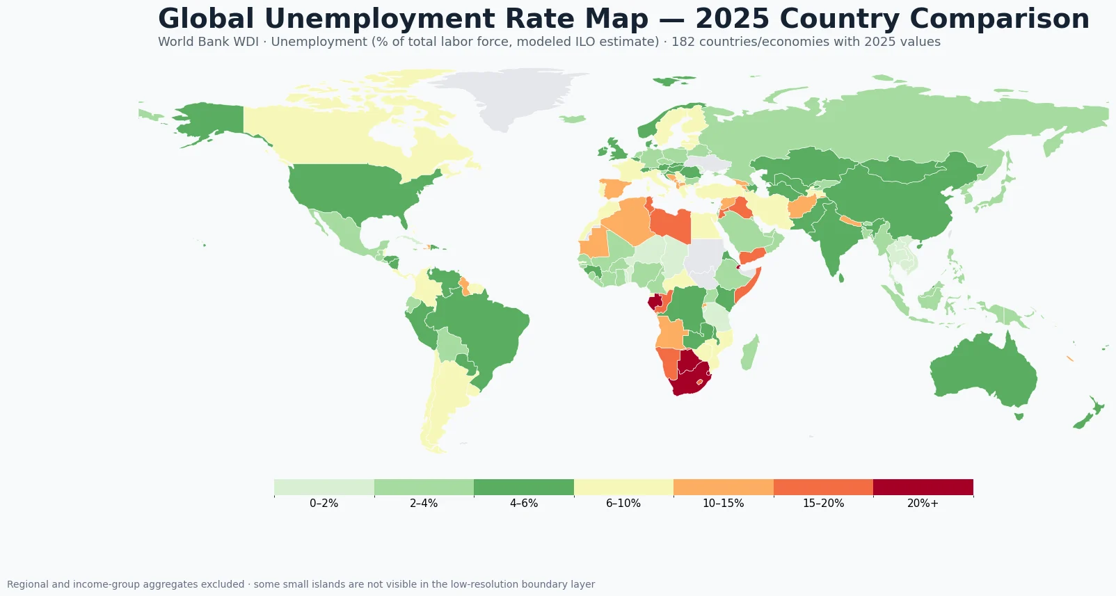
Table of Contents
What stands out on the global unemployment rate map
High unemployment is not spread evenly across entire continents. Southern Africa contains several adjacent high-rate economies, but other parts of Africa range from the low single digits to the teens. North Africa itself forms a gradient rather than one block: Libya is 18.8%, Tunisia 15.1%, Algeria 11.6%, Morocco 9.0%, and Egypt 6.8%.
Europe also has wide variation. Spain is 10.4%, Finland 9.5%, and Sweden 8.7%, while Germany is 3.7%, Poland 3.0%, and Czechia 2.8%. France is 7.5%, Italy 6.4%, and Portugal 6.2%. Similar colors can suggest a regional cluster, but nearby economies can still differ by several percentage points, so the map should not be used to infer a common cause without additional evidence.
Asia and the Middle East span an even broader range. Qatar is 0.1%, Thailand 0.8%, Bahrain 1.1%, and Viet Nam 1.5%, while Jordan is 16.5%, Yemen 17.3%, Afghanistan 13.4%, and Syria 13.6%. This mixture is one reason a country map is more informative than a single regional average when the question is where unemployment is unusually high or low.
Highest and lowest unemployment rates in 2025
| Higher-unemployment economy | 2025 unemployment |
|---|---|
| Eswatini | 34.2% |
| South Africa | 32.4% |
| Djibouti | 26.0% |
| Botswana | 24.5% |
| Gabon | 20.2% |
| Congo, Rep. | 19.9% |
| Namibia | 19.3% |
| Somalia | 18.9% |
| Libya | 18.8% |
| St. Vincent and the Grenadines | 18.0% |
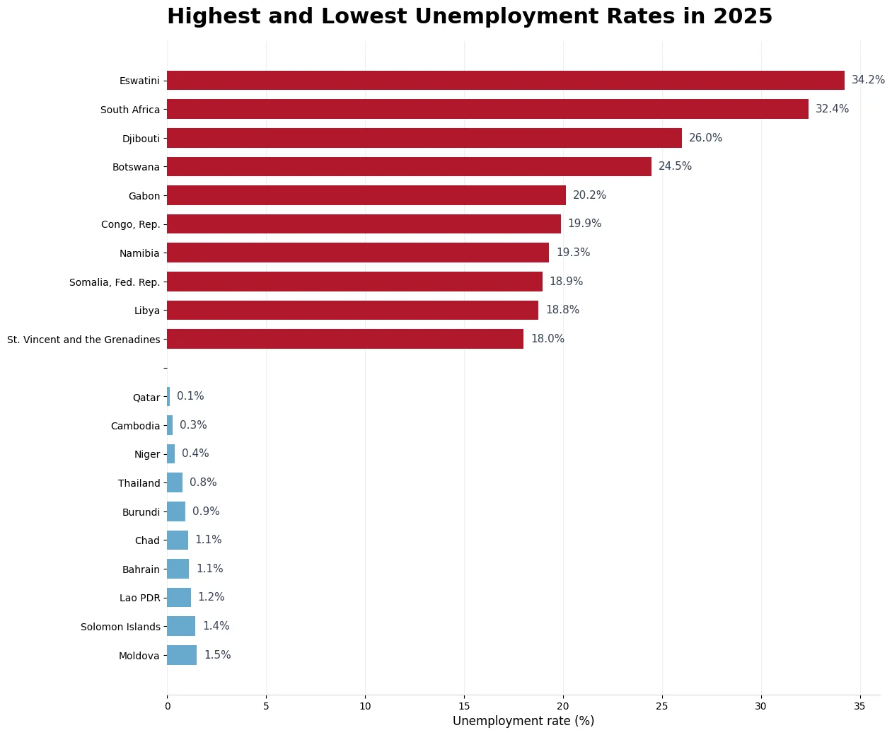
Most of the top ten are in Africa, and the southern African concentration is especially clear. But the list also contains Djibouti and Somalia in the Horn of Africa, Libya in North Africa, and St. Vincent and the Grenadines in the Caribbean. A similar rate does not imply a similar labor-market structure. The ranking identifies where the measured share is high; explaining why requires country-specific labor-force, demographic, sector, and policy evidence.
| Lower-unemployment economy | 2025 unemployment |
|---|---|
| Qatar | 0.1% |
| Cambodia | 0.3% |
| Niger | 0.4% |
| Thailand | 0.8% |
| Burundi | 0.9% |
| Chad | 1.1% |
| Bahrain | 1.1% |
| Lao PDR | 1.2% |
| Solomon Islands | 1.4% |
| Moldova | 1.5% |
The lowest values are geographically mixed as well, including the Gulf, Southeast Asia, Africa, the Pacific, and Eastern Europe. Qatar at 0.1% and Cambodia at 0.3% create a sharp numerical contrast with the high end of the table, but a low unemployment rate should not be treated as a complete labor-market score. People outside the labor force are not counted as unemployed, and underemployment, informality, wages, hours, and job security require separate measures.
Southern Africa forms the clearest high-unemployment cluster
Eswatini, South Africa, Botswana, Namibia, and Lesotho create the most visually continuous high-rate group on the map. Eswatini and South Africa are above 30%, Botswana is 24.5%, Namibia 19.3%, and Lesotho 16.3%. Because these economies are geographically adjacent, the choropleth reveals a regional pattern that is less obvious in a sorted table.
The pattern stops short of being a uniform southern African condition. Zimbabwe is 9.3%, Mozambique 6.6%, Zambia 5.9%, and Tanzania 1.6%. Geography is therefore a clue for where to investigate further, not an explanation by itself. The dataset does not contain the sector mix, labor-force participation, informal employment, age structure, migration, or policy variables needed to attribute causes.
How several large economies compare
| Economy | 2025 unemployment |
|---|---|
| Canada | 6.9% |
| Italy | 6.4% |
| Brazil | 6.0% |
| United Kingdom | 4.7% |
| China | 4.6% |
| India | 4.2% |
| United States | 4.2% |
| Australia | 4.1% |
| Germany | 3.7% |
| South Korea | 2.7% |
| Mexico | 2.7% |
| Japan | 2.5% |
Large economies occupy a narrower range than the global extremes. Canada is 6.9%, Italy 6.4%, and Brazil 6.0%. China is 4.6%, the United States and India are both around 4.2%, Australia 4.1%, and Germany 3.7%. South Korea and Mexico are about 2.7%, while Japan is 2.5%. France, at 7.5%, sits above several of the large economies listed here.
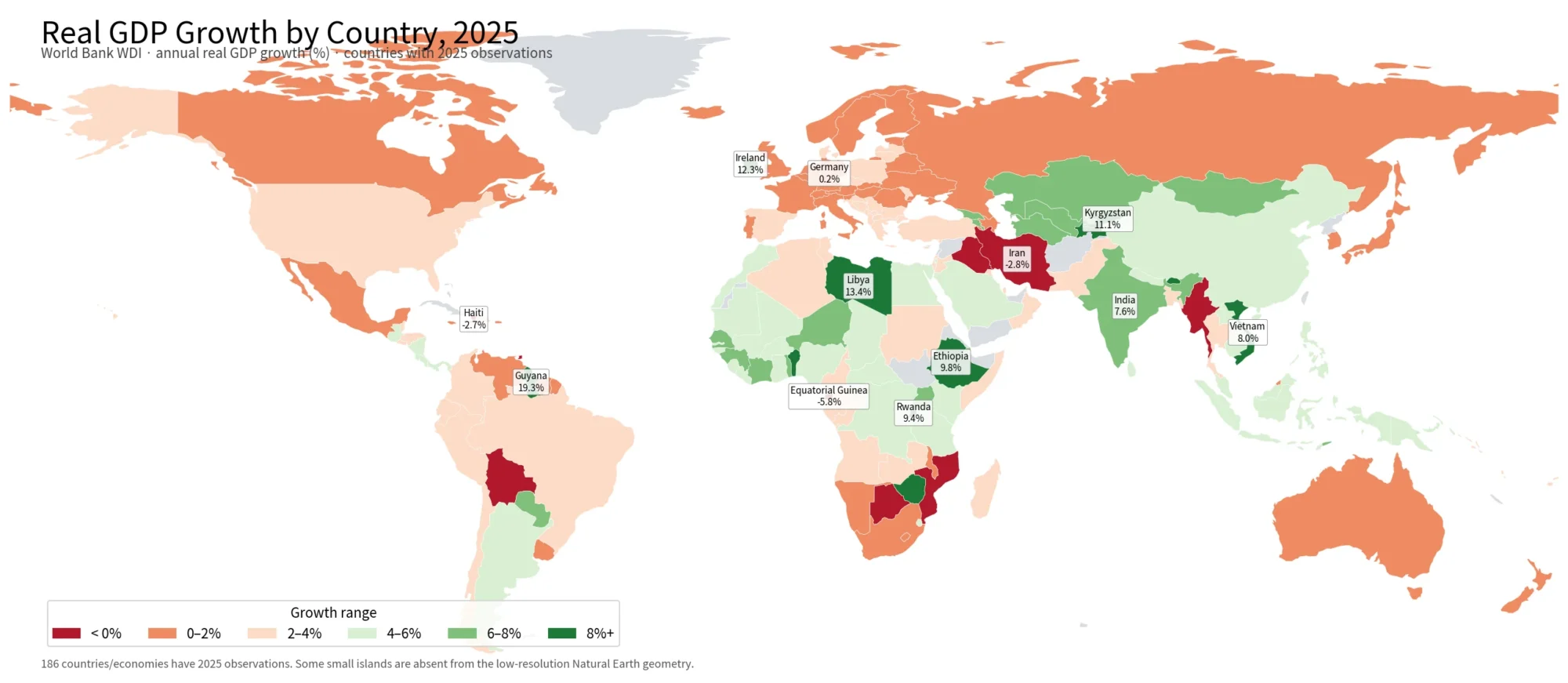
This comparison is useful precisely because unemployment is only one dimension. GDP growth, labor-force participation, wages, inflation, population, and employment quality answer different questions. Placing this map beside the site’s 2025 global GDP growth map shows that a fast-growing economy is not automatically the one with the lowest unemployment rate, and vice versa.
Why the comparison uses 2025 instead of each economy’s latest value
The source table contains a latest non-null observation for each entity, but a few country rows do not reach 2025. Lebanon and South Sudan have 2023 values, West Bank and Gaza and Sudan have 2022 values, and Ukraine has a 2021 value. Mixing those observations into a 2025 ranking would make it difficult to separate a labor-market difference from a time difference.
For that reason, this article keeps the 182 non-aggregate country/economy rows that have a 2025 observation. The trade-off is slightly lower coverage than a latest-available map, but the colors and rankings refer to the same year. A country trend article would use a different rule: it should follow the time series rather than discard older years.
What this unemployment indicator measures—and what it misses
World Bank series SL.UEM.TOTL.ZS is Unemployment, total (% of total labor force) (modeled ILO estimate). In plain language, it estimates the share of the labor force that is without work under the indicator framework. The modeled ILO series is designed to improve international comparability, so it is not necessarily identical to a monthly, seasonally adjusted, nationally published headline rate.
That comparability is valuable for a world map, but the measure is not a complete description of labor-market conditions. A person outside the labor force is not counted as unemployed simply because they do not have a job. People can also be employed while working fewer hours than they want, earning low wages, or working informally. Labor-force participation, underemployment, informality, earnings, hours, and job stability all need separate indicators.
A high value can therefore be read as a large measured share of the labor force without employment, but the map cannot identify the cause by itself. A low value likewise does not prove high living standards or high-quality employment. The strongest use of the map is diagnostic: identify outliers, clusters, and neighboring contrasts, then narrow the next stage of research.
Source and mapping method
The statistical source is the World Bank World Development Indicators unemployment series, indicator code SL.UEM.TOTL.ZS. Regional, income-group, and development-stage aggregate rows are excluded, and only country/economy observations labeled 2025 are retained. The Channel Islands appear as one combined World Bank economy row and are included in the statistical calculations, but the low-resolution country geometry does not provide one matching country polygon for that combined unit.
The choropleth joins values to a low-resolution world country boundary layer using ISO country codes. France and Norway require name-based fixes because the boundary fixture uses a code exception for those polygons. Very small islands and some special territories are omitted at this map scale. A gray area therefore can mean either that no 2025 observation was retained or that the statistical economy is not represented by a polygon in the low-resolution geometry.
The mean, median, and top/bottom rankings are calculated from the 2025 statistical rows whether or not a polygon is visible. The reported mean is an unweighted country mean, not a labor-force-weighted global unemployment rate. Producing a world labor-force-weighted rate would require matching each country’s labor-force size and applying explicit weights.
Frequently Asked Questions
Does this map simply combine each country’s own official unemployment rate?
No. For cross-country comparability it uses World Bank World Development Indicators series SL.UEM.TOTL.ZS, the modeled ILO estimate of unemployment as a share of the total labor force. National headline releases can use different methods or reference periods.
Are all observations in the comparison from 2025?
Yes. The calculations keep the 182 country/economy rows with a 2025 observation. Lebanon, West Bank and Gaza, Sudan, South Sudan, and Ukraine have older latest observations in the supplied series and are excluded from the same-year ranking.
Does a lower unemployment rate automatically mean a better labor market?
No. The unemployment rate describes the share of the labor force without work and seeking or available for work under the indicator framework. It does not by itself measure labor-force participation, underemployment, informality, wages, hours, or job quality.
Related Articles
The global GDP growth map provides the closest same-year economic comparison, while the country-map pages help place several of the strongest unemployment observations in geographic context. South Africa is one of the highest-rate large economies in this dataset, and the archive is useful for locating other country maps without turning the unemployment article into a general geography page.
- Global GDP Growth Map – Country Patterns in 2025
- South Africa Map: Printable Provincial Reference
- Zimbabwe Map of Eight Provinces and Two City Points
- Free Printable Map Download Archive
Green Map creates custom-edited map images using open geographic data sources such as geoBoundaries, Natural Earth, OpenStreetMap, and government open data.
These maps are edited visual materials, not raw data files, and are provided for education, documents, presentations, and graphic reference.